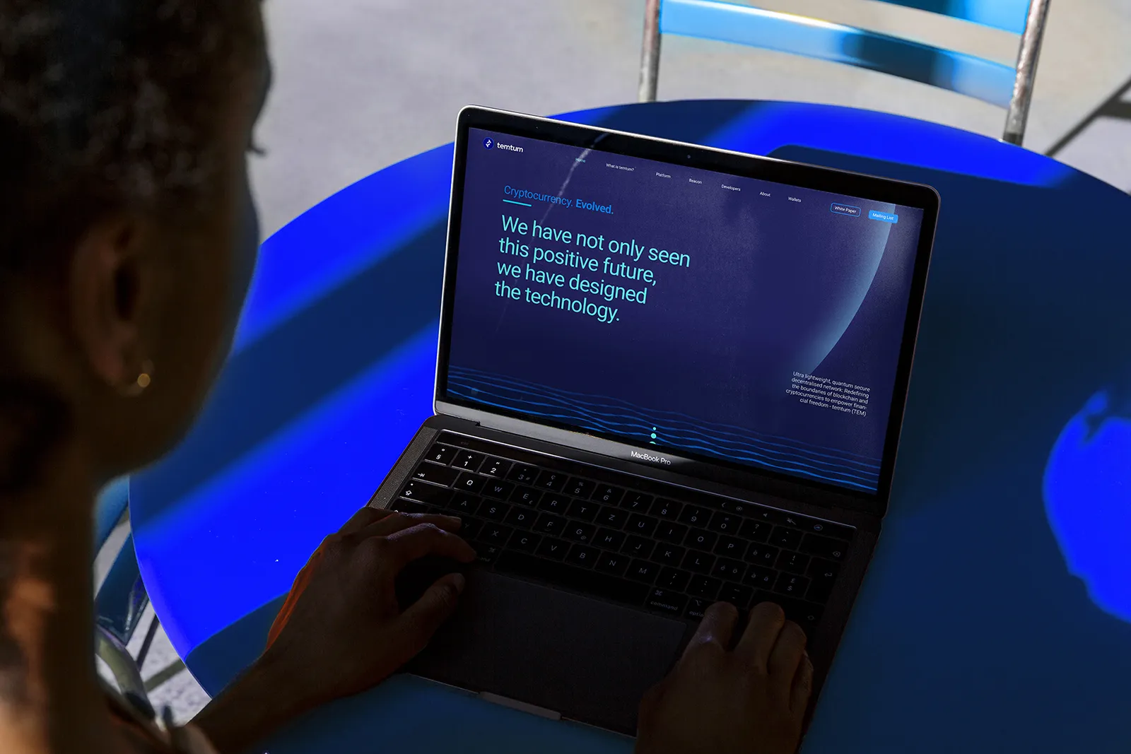
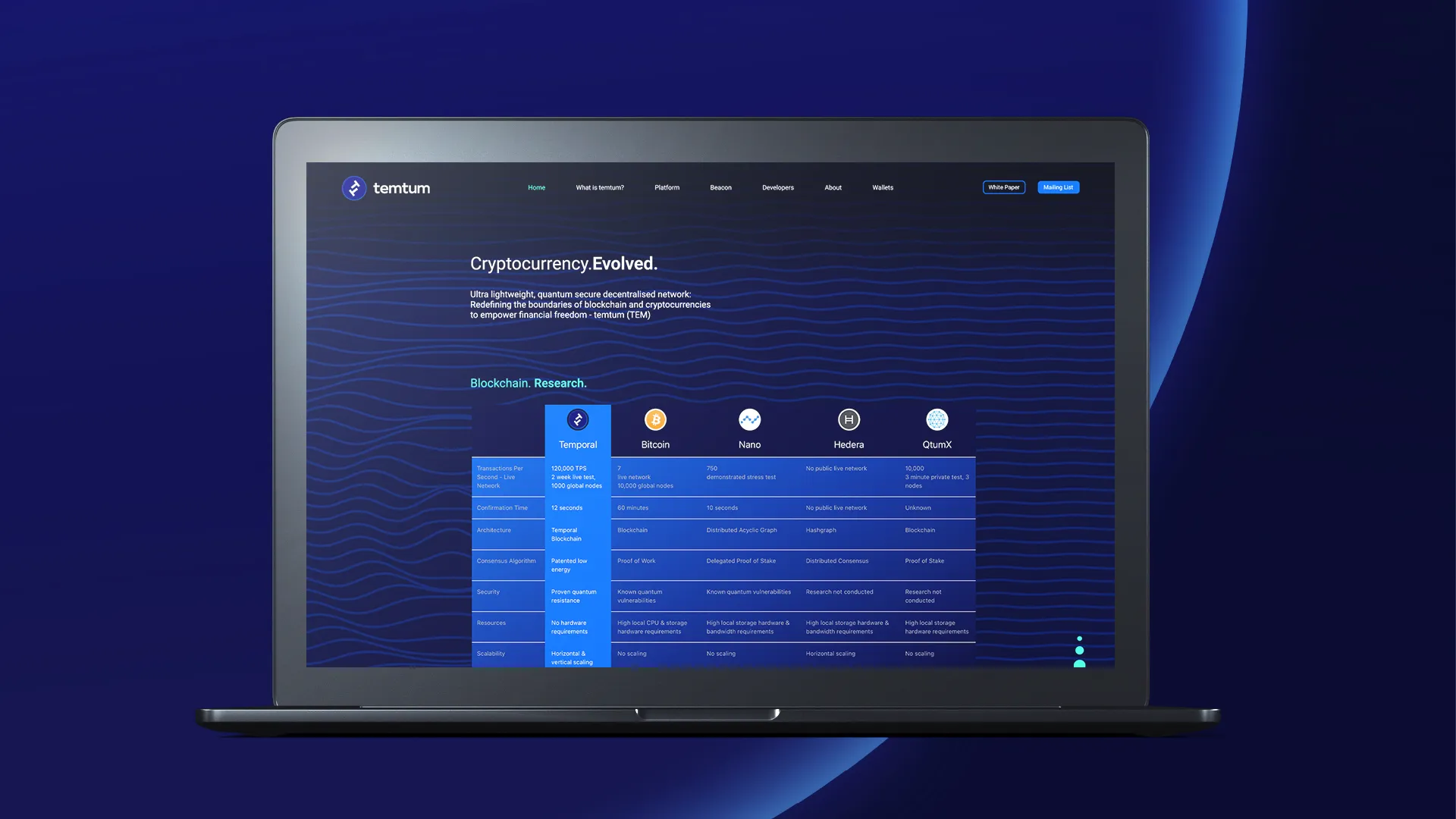
The branding work played a direct role in moving Temtum from concept to live product - wallets operational, API-first architecture deployed, and the identity proven across an extraordinary range of real-world devices: cars, Raspberry Pi, wearables, drones, and standard mobile.
Temtum became one of the rare crypto projects to demonstrate genuine universal accessibility - and a brand that made that claim believable before the product had to. Redefining what a crypto brand could be: clear, confident, and ready for scale.
The branding work played a direct role in moving Temtum from concept to live product - wallets operational, API-first architecture deployed, and the identity proven across an extraordinary range of real-world devices: cars, Raspberry Pi, wearables, drones, and standard mobile.
Temtum became one of the rare crypto projects to demonstrate genuine universal accessibility - and a brand that made that claim believable before the product had to. Redefining what a crypto brand could be: clear, confident, and ready for scale.
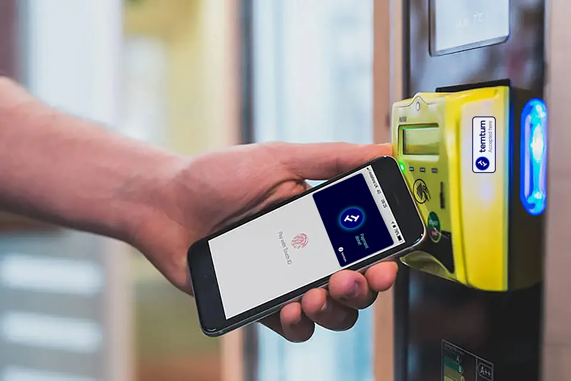
A payment method in your wallet for everyday use.
A payment method in your wallet for everyday use.
⮑ Outcome
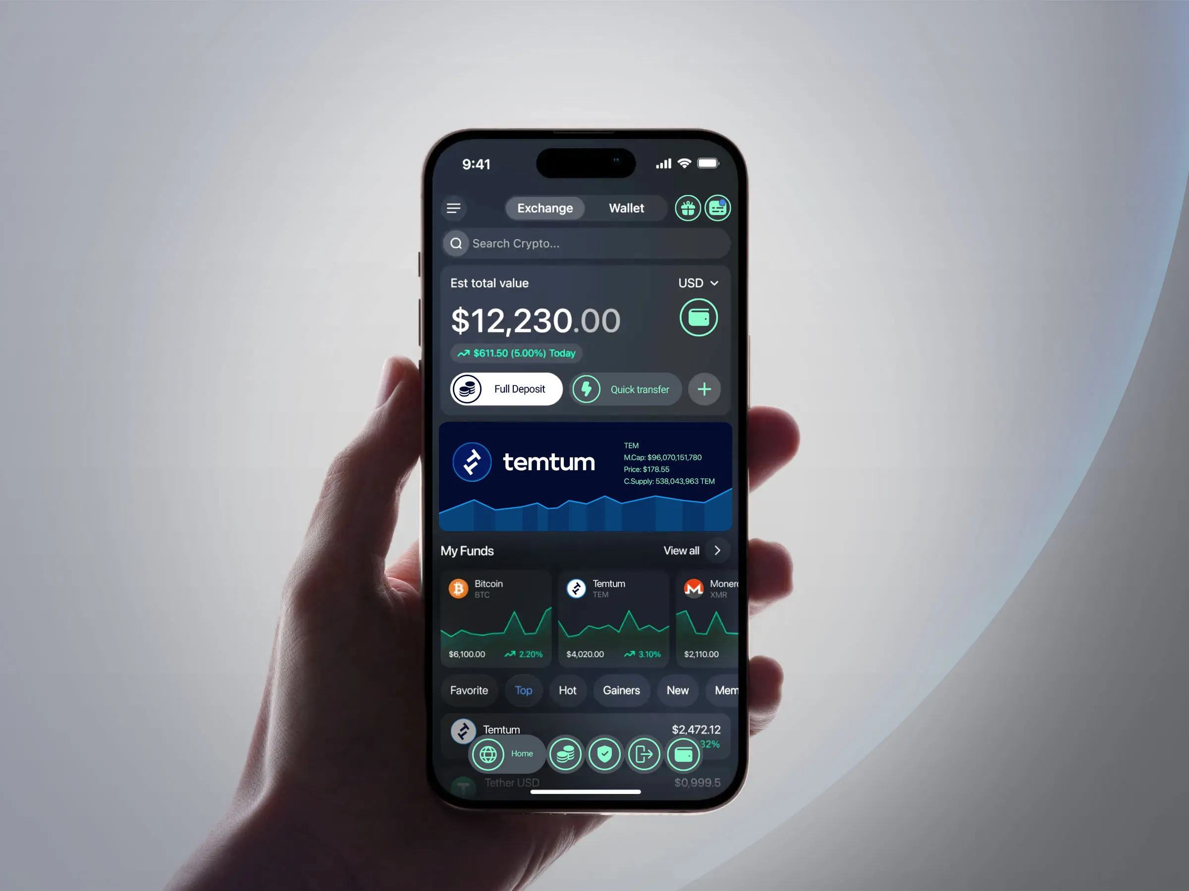

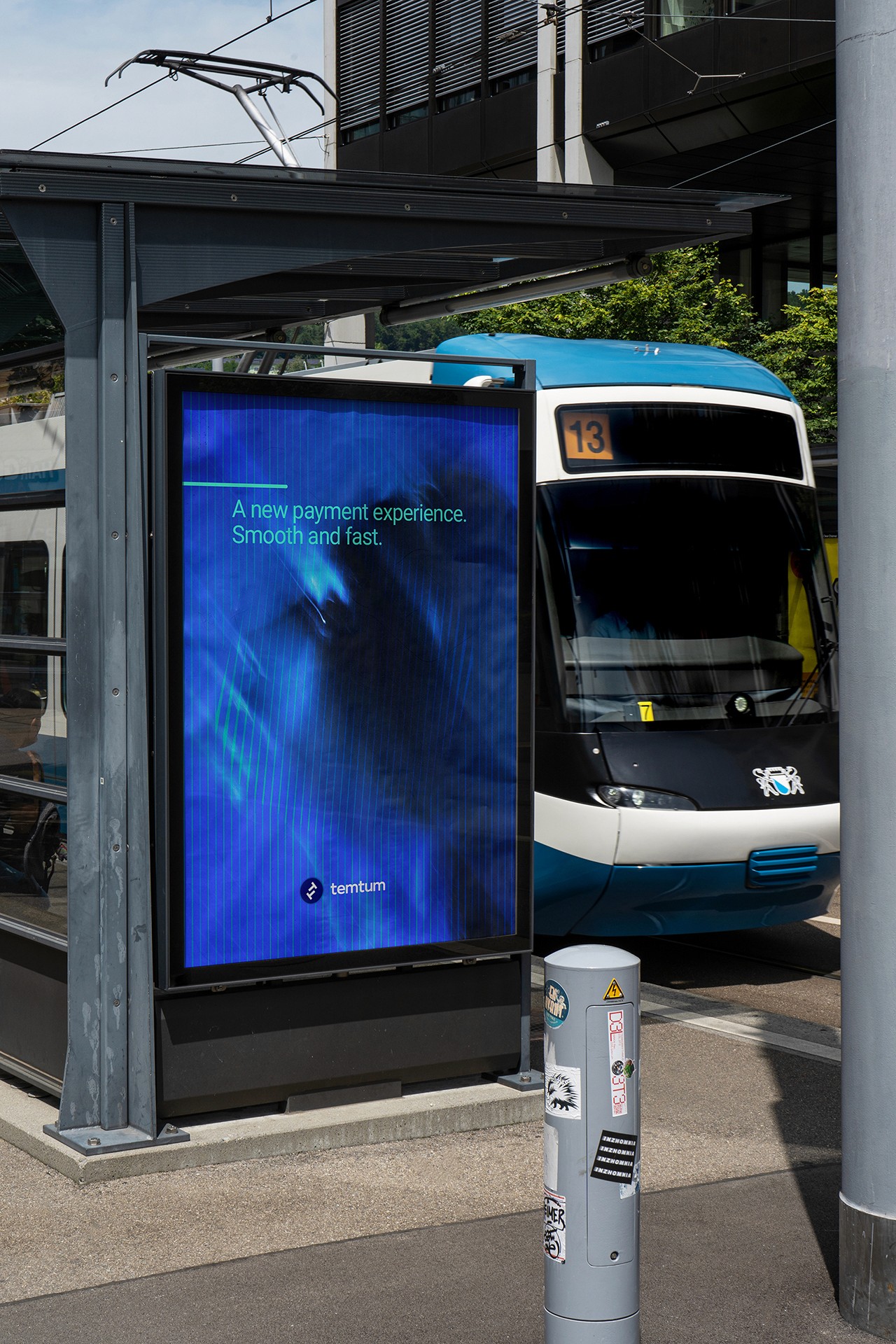

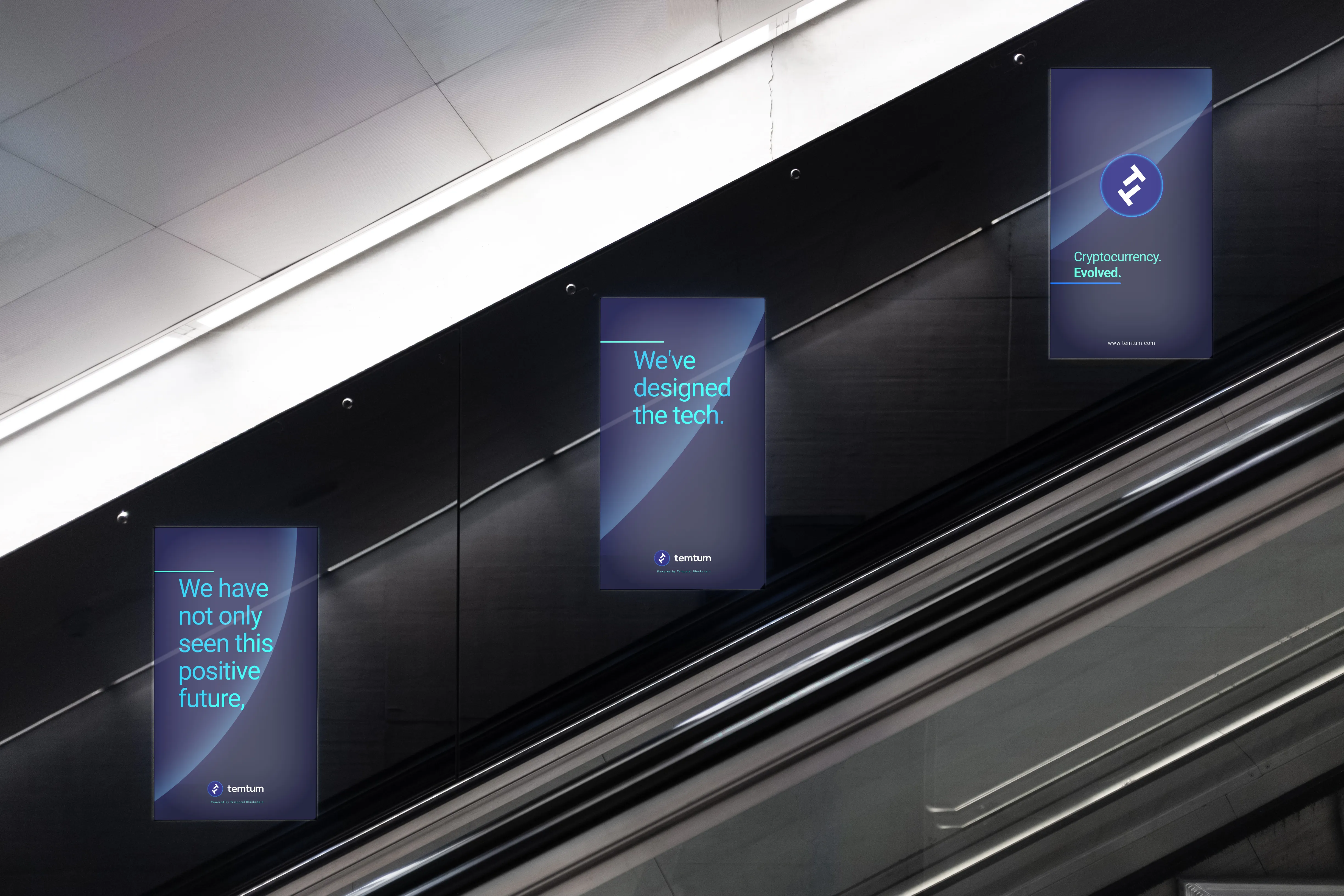
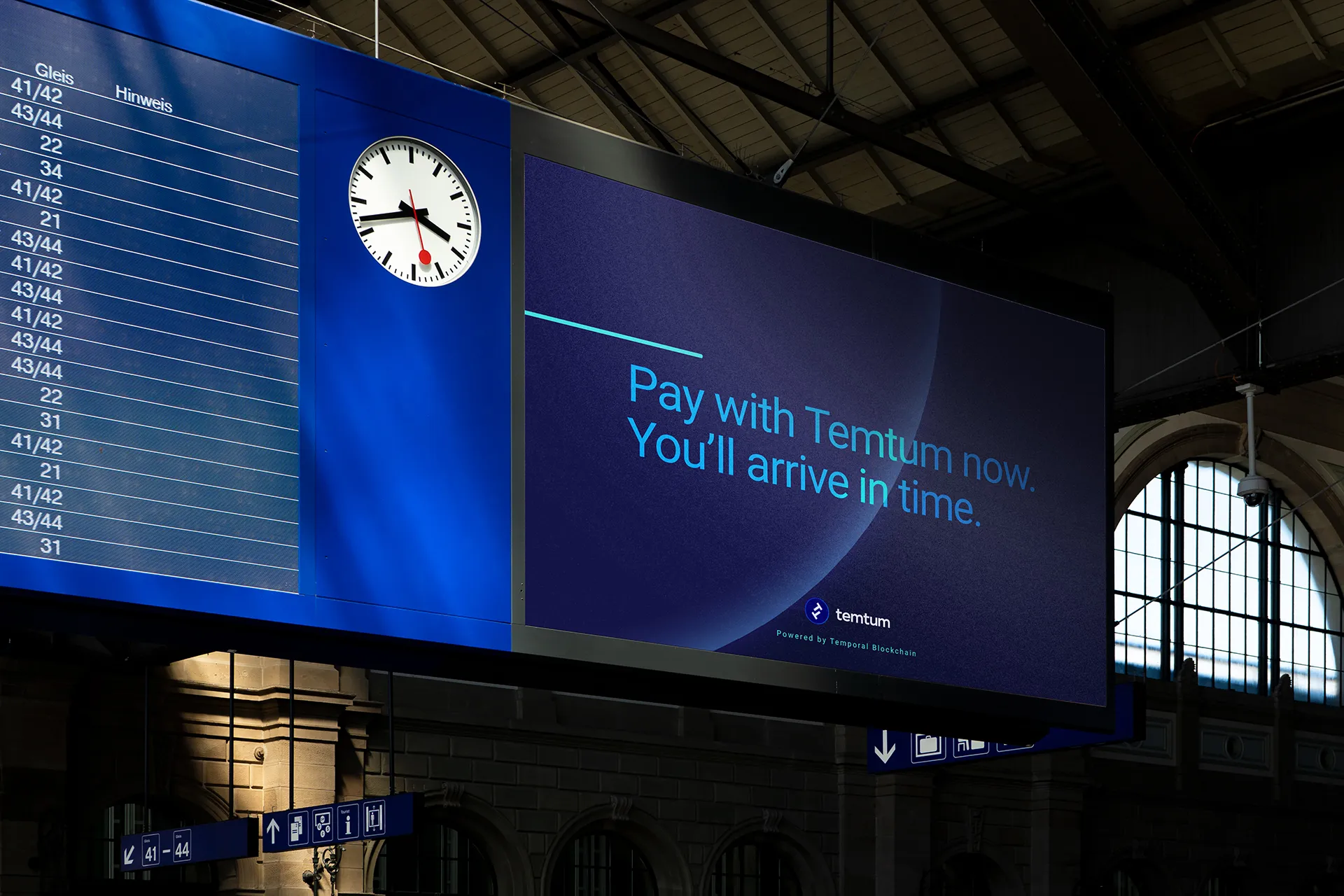
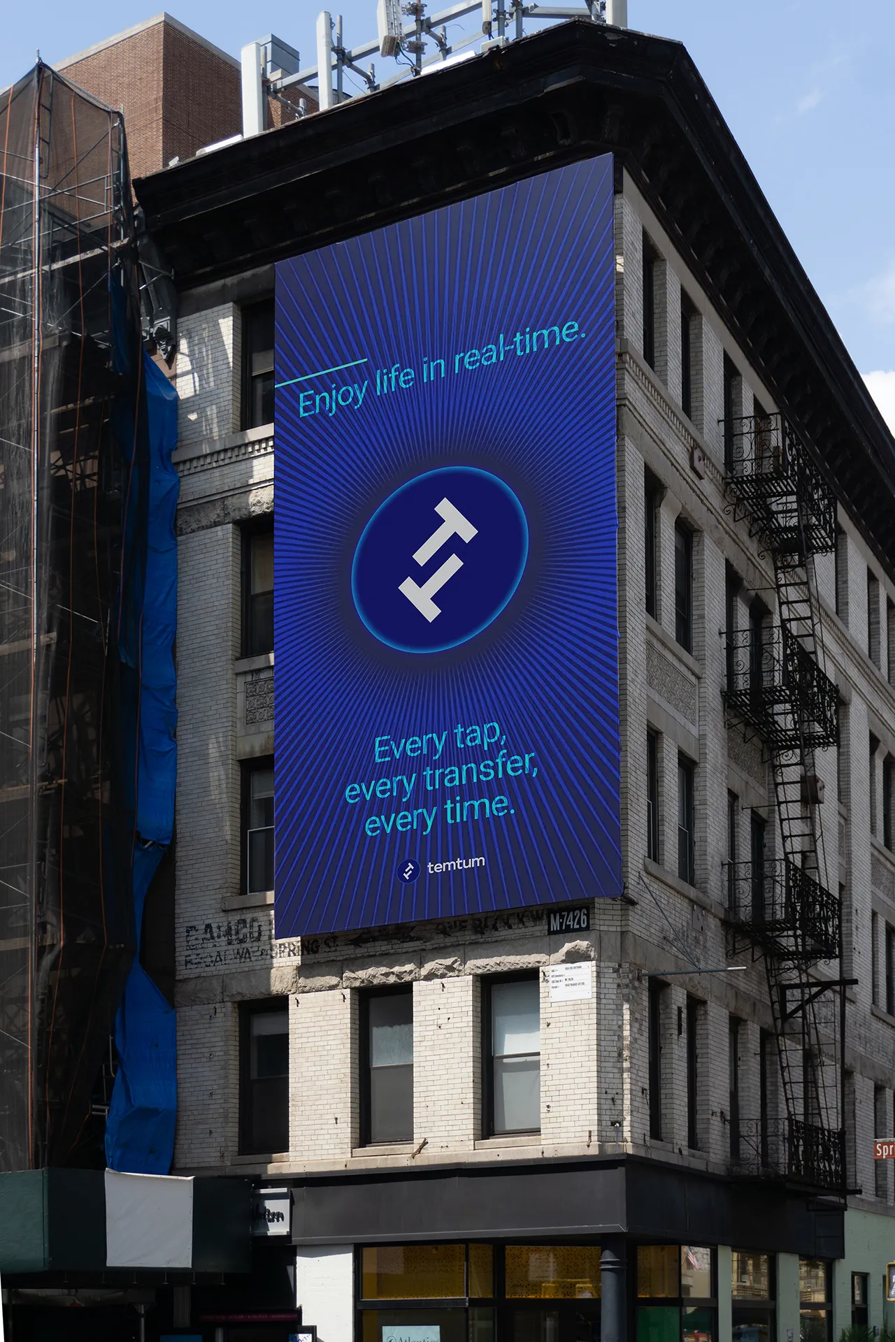
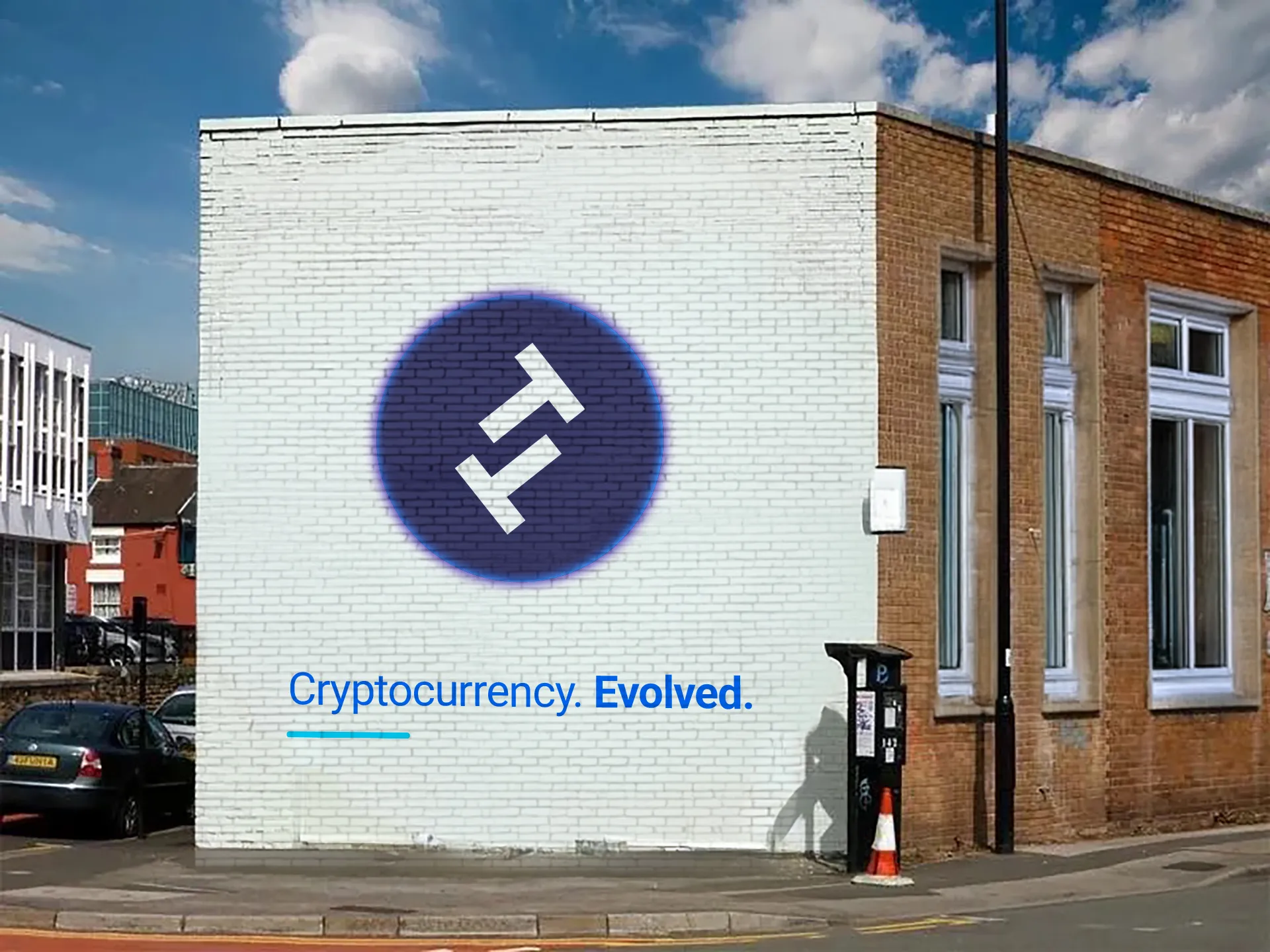
Technology made tangible.
Technology made tangible.
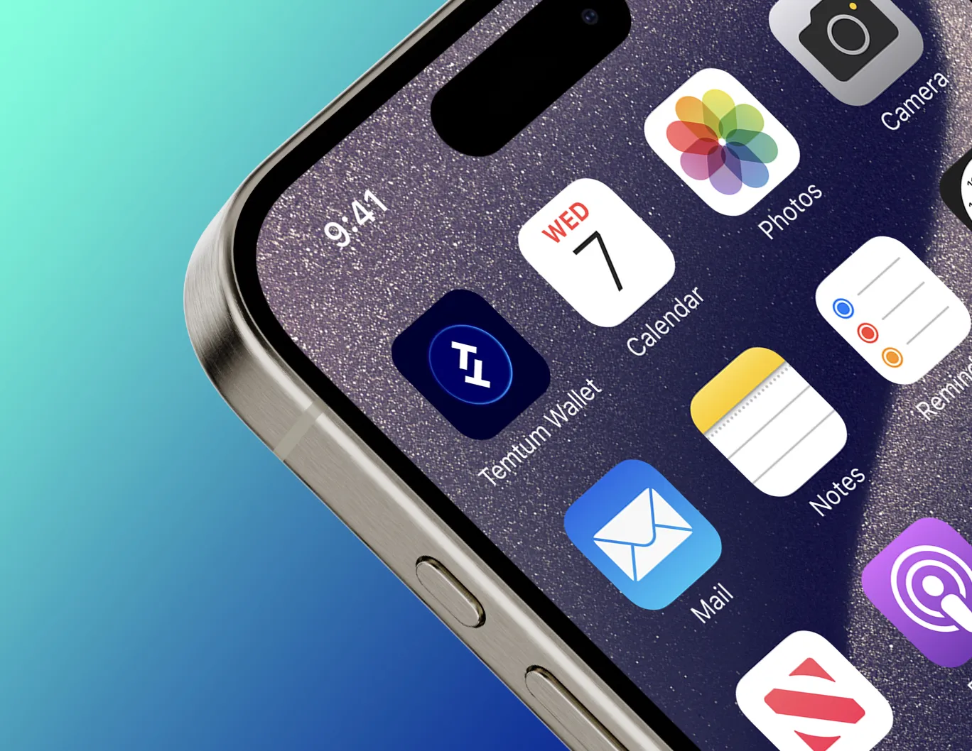
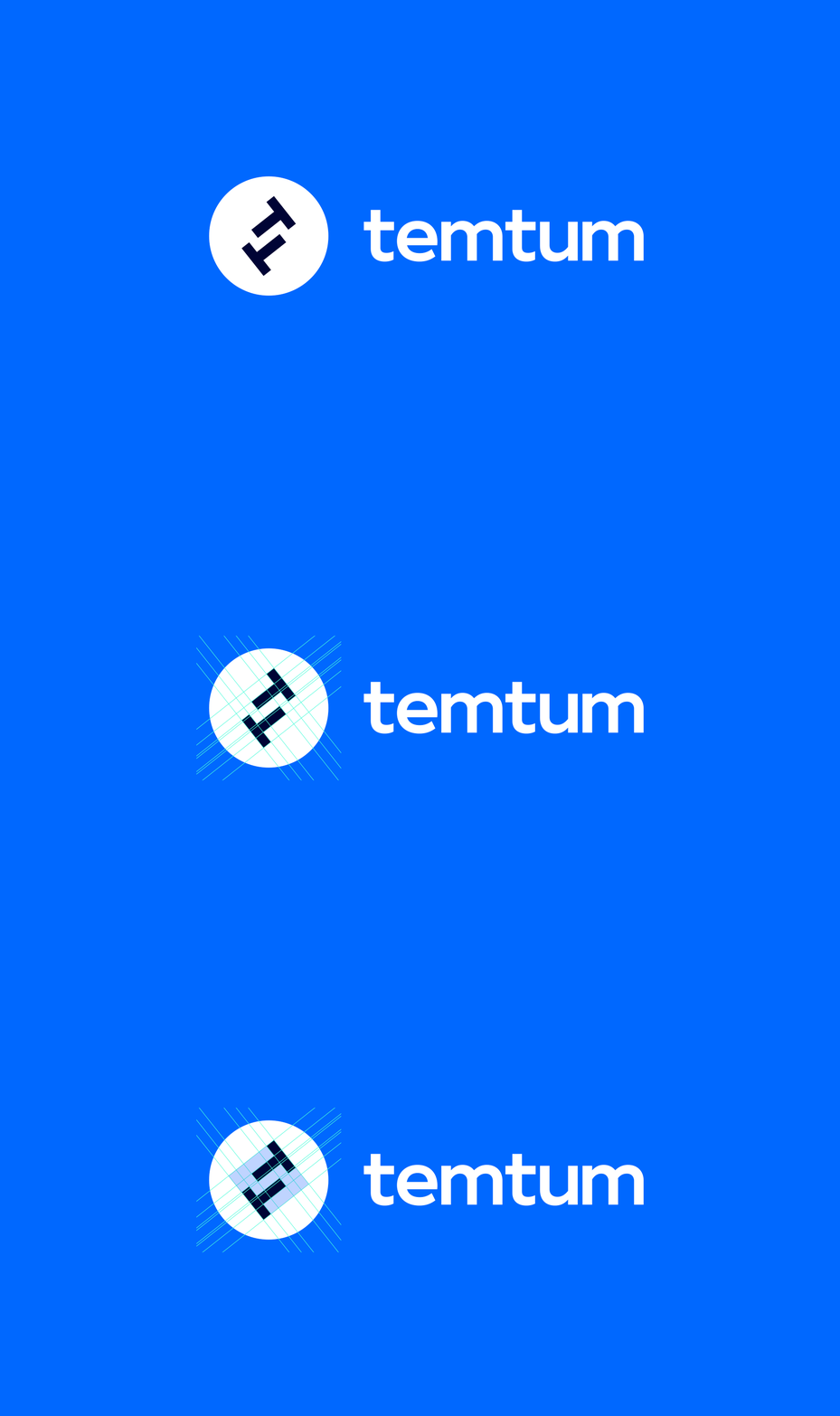
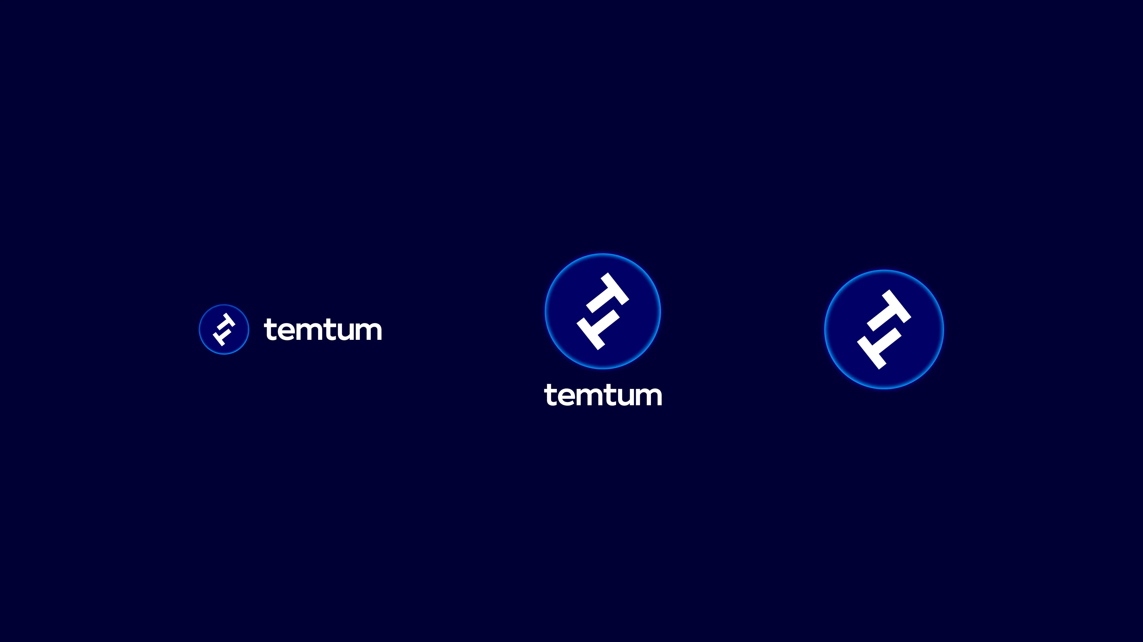
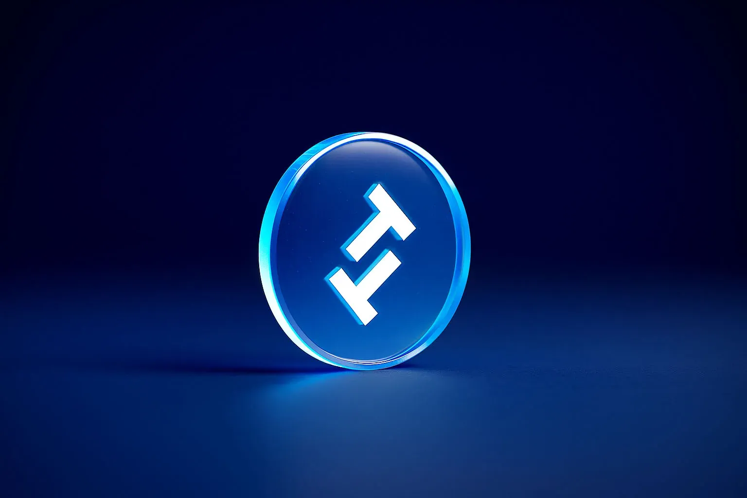
The primary visual asset had a single purpose: to make Temtum’s distinctiveness instantly recognisable in a visually crowded category. It needed to be simple, clear, and impactful while still expressing the features that set it apart. We explored using the double “T” as a symbol for the coin.
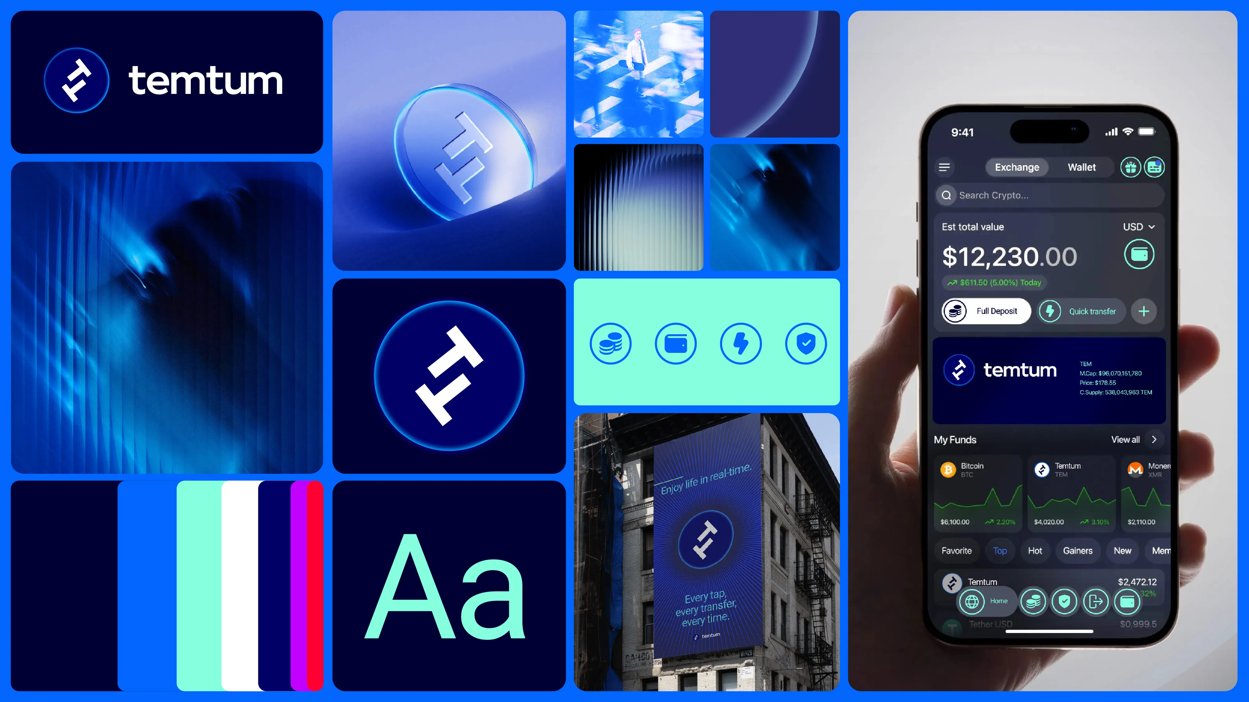
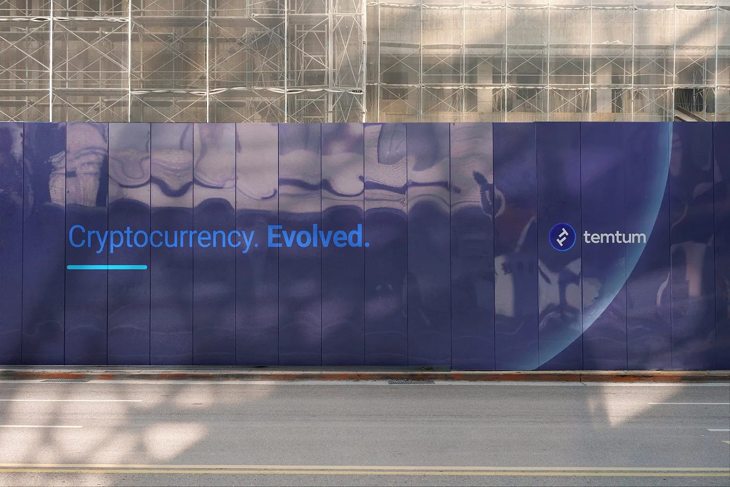
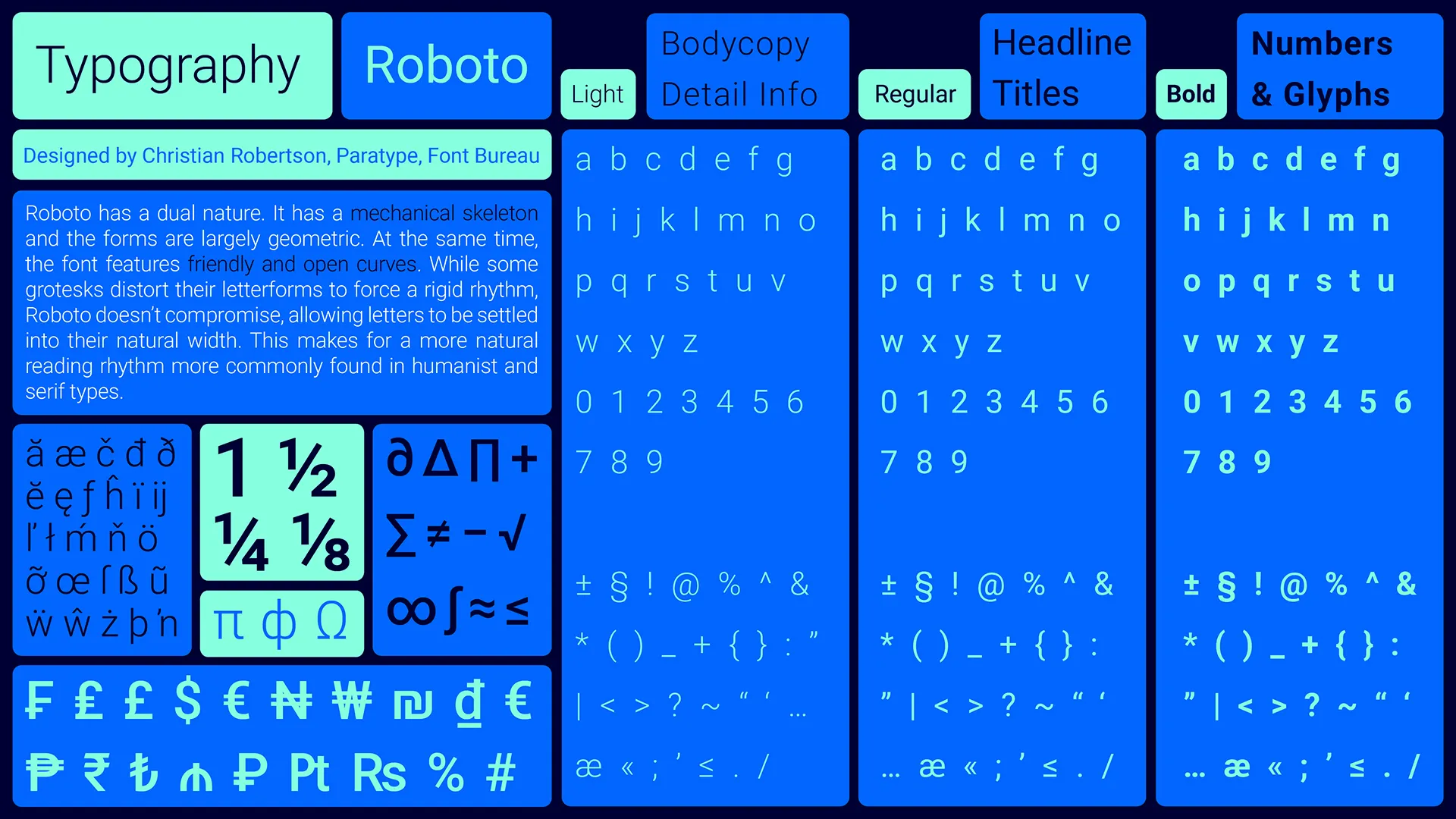
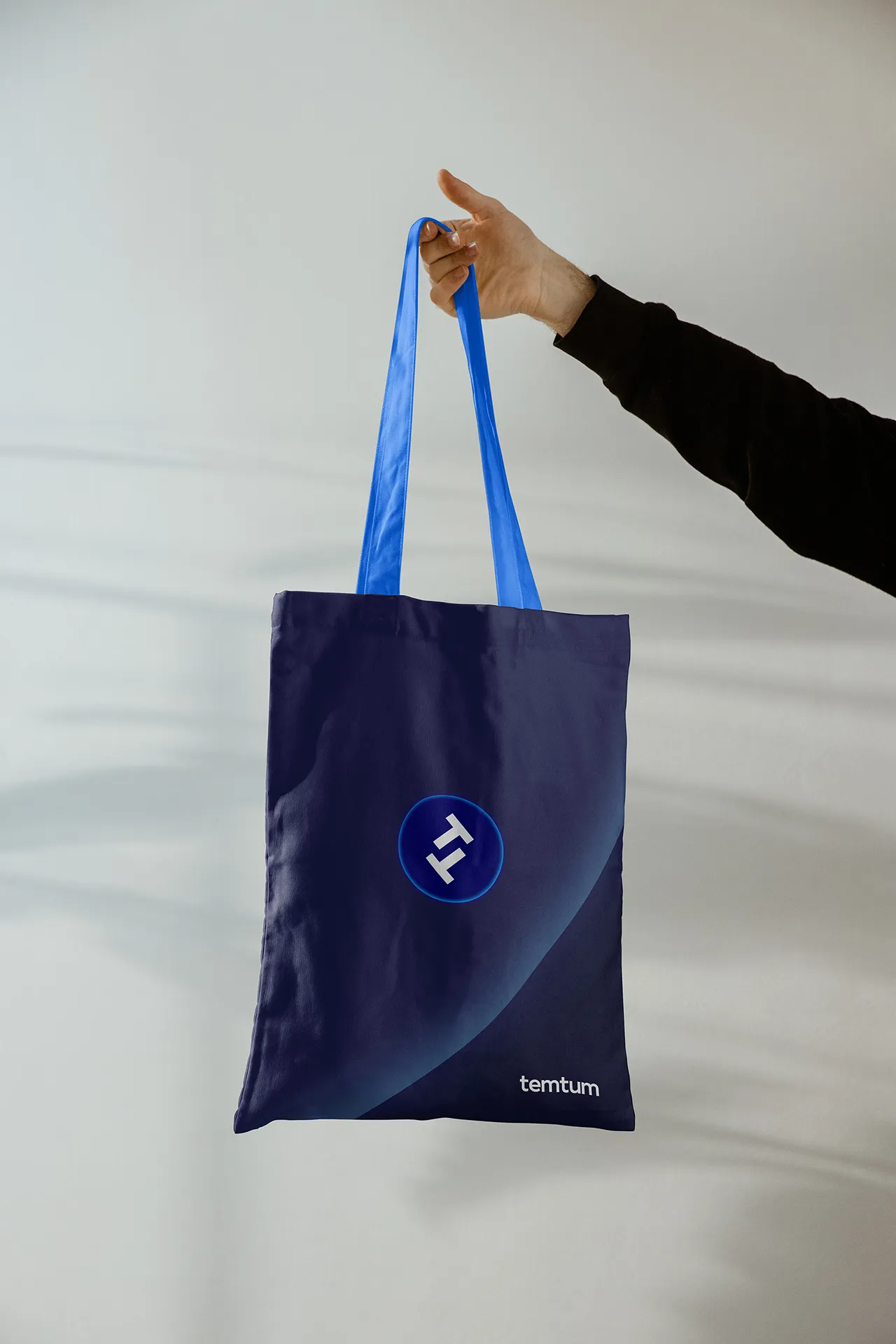
The visual identity translates speed and universality into a clean, confident system that can expand. A bold geometric mark, a purpose-built colour palette (electric blue, clean white, dark neutral), and a digital-first design language that performs across wallets, watches, drones, and mobile SMS interfaces simultaneously. The brand was designed to be tested in real-world environments from day one - not to live in a pitch deck.
The primary visual asset had a single purpose: to make Temtum’s distinctiveness instantly recognisable in a visually crowded category. It needed to be simple, clear, and impactful while still expressing the features that set it apart. We explored using the double “T” as a symbol for the coin.
The visual identity translates speed and universality into a clean, confident system that can expand. A bold geometric mark, a purpose-built colour palette (electric blue, clean white, dark neutral), and a digital-first design language that performs across wallets, watches, drones, and mobile SMS interfaces simultaneously. The brand was designed to be tested in real-world environments from day one - not to live in a pitch deck.
⮑ Design





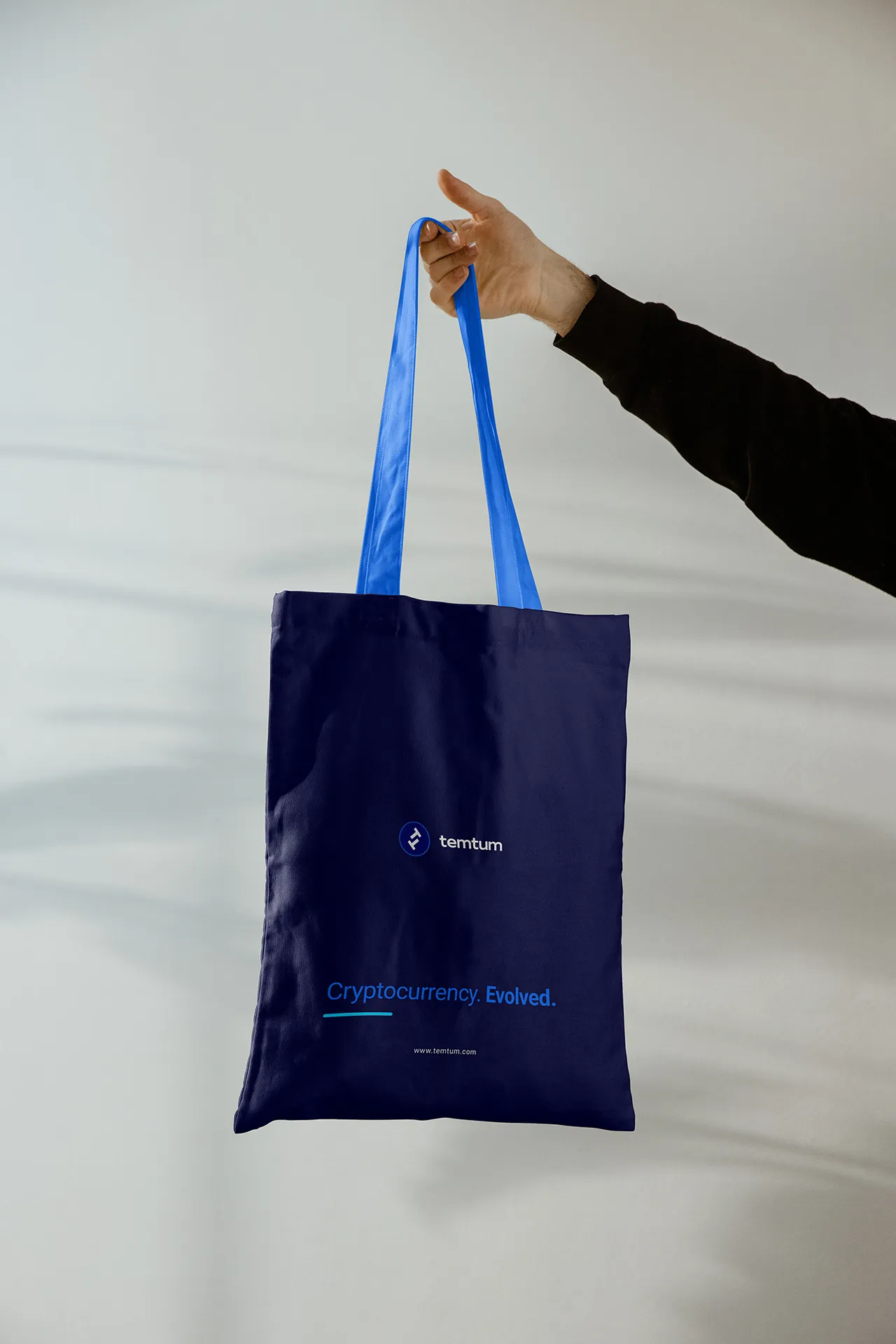
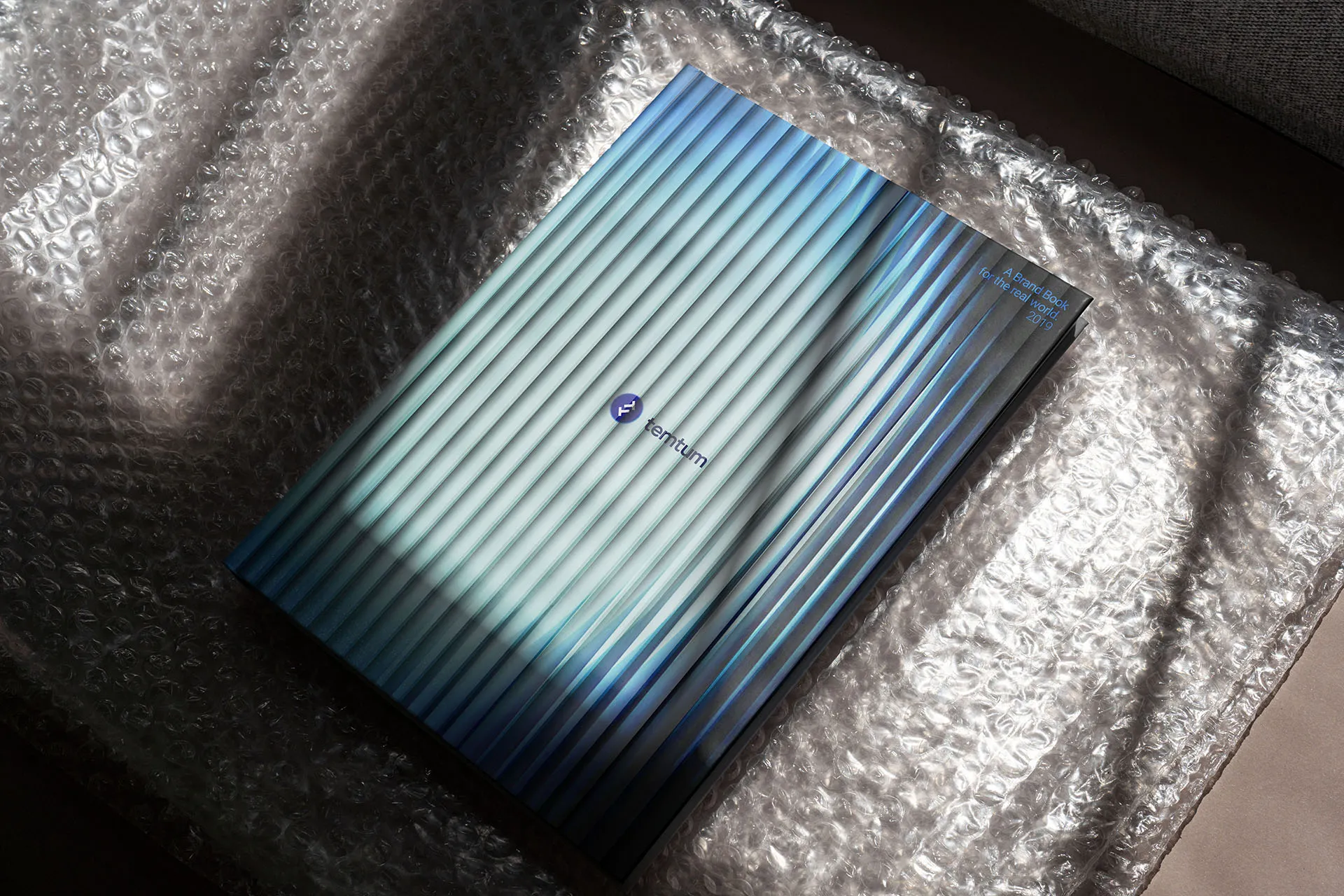
The strategic positioning is deceptively simple: make it universal. While competitors competed on complexity and financial returns, we positioned Temtum on accessibility - a currency designed for real ultra-fast transactions, in real environments, by real people. It is scalable, uses low resources and energy and is equipped with quantum security - all for frictionless payments and transfers.
The brand concept refuses the cryptographic mystique of the category and instead asks: what if money just worked? Anywhere, on anything, for anyone.
Currency that works everywhere.
Currency that works everywhere.
⮑ Concept & Strategy

A cryptocurrency built for the world, not the whitepaper.
A cryptocurrency built for the world, not the whitepaper.
In 2019, I was brought in to a small team of one account manager and one strategist to help define the identity of Temtum - a next-generation cryptocurrency. More than just another coin, Temtum was built to challenge the limitations of legacy blockchains: unlocking instant transactions, true scalability, real-world utility, and quantum-secure technology.
The ambition was clear: position Temtum not within the crypto hype cycle, but as a legitimate global payment solution, engineered for everyday use.
In 2019, I was brought in to a small team of one account manager and one strategist to help define the identity of Temtum - a next-generation cryptocurrency. More than just another coin, Temtum was built to challenge the limitations of legacy blockchains: unlocking instant transactions, true scalability, real-world utility, and quantum-secure technology.
The ambition was clear: position Temtum not within the crypto hype cycle, but as a legitimate global payment solution, engineered for everyday use.
⮑ Overview
⮑ Temtum
CLIENT
⮑ Branding
PROJECT
⮑ Cryptocurrency
SECTOR