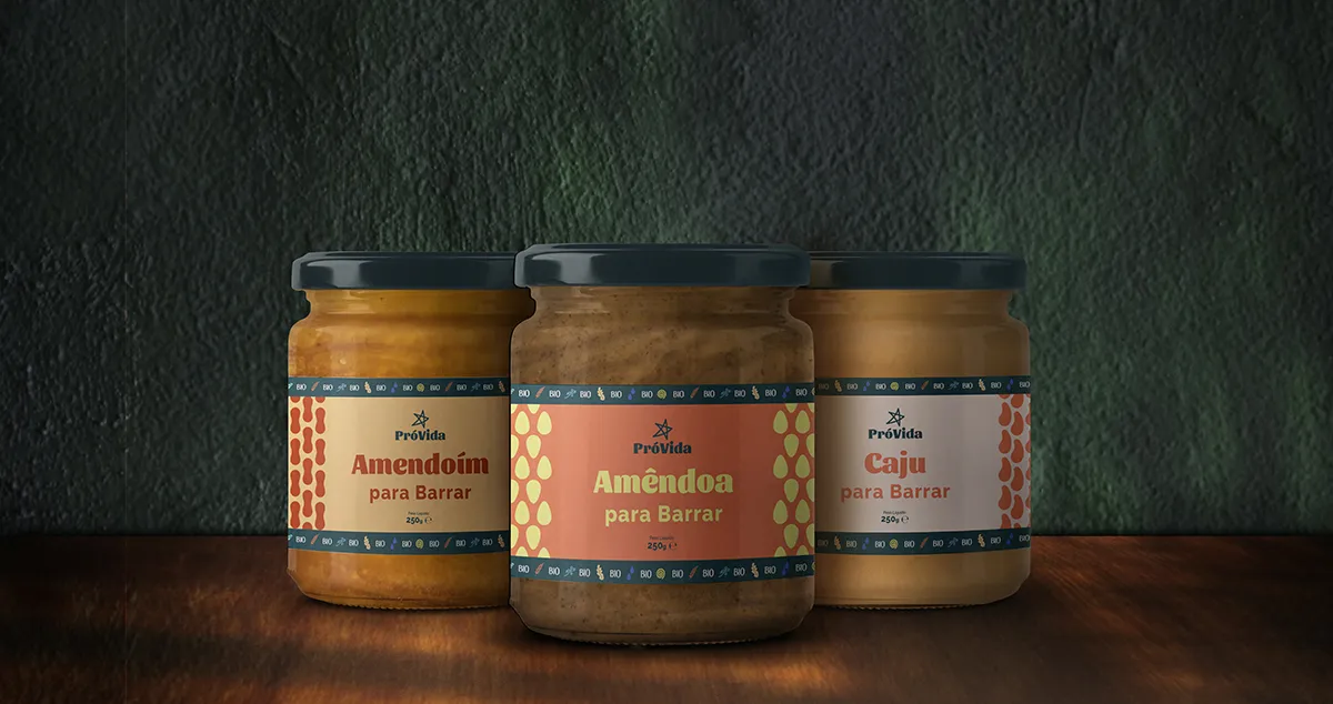
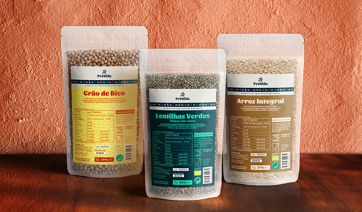
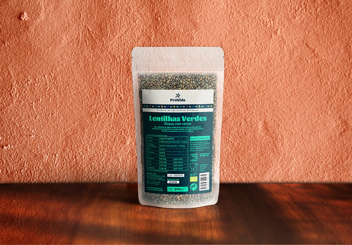
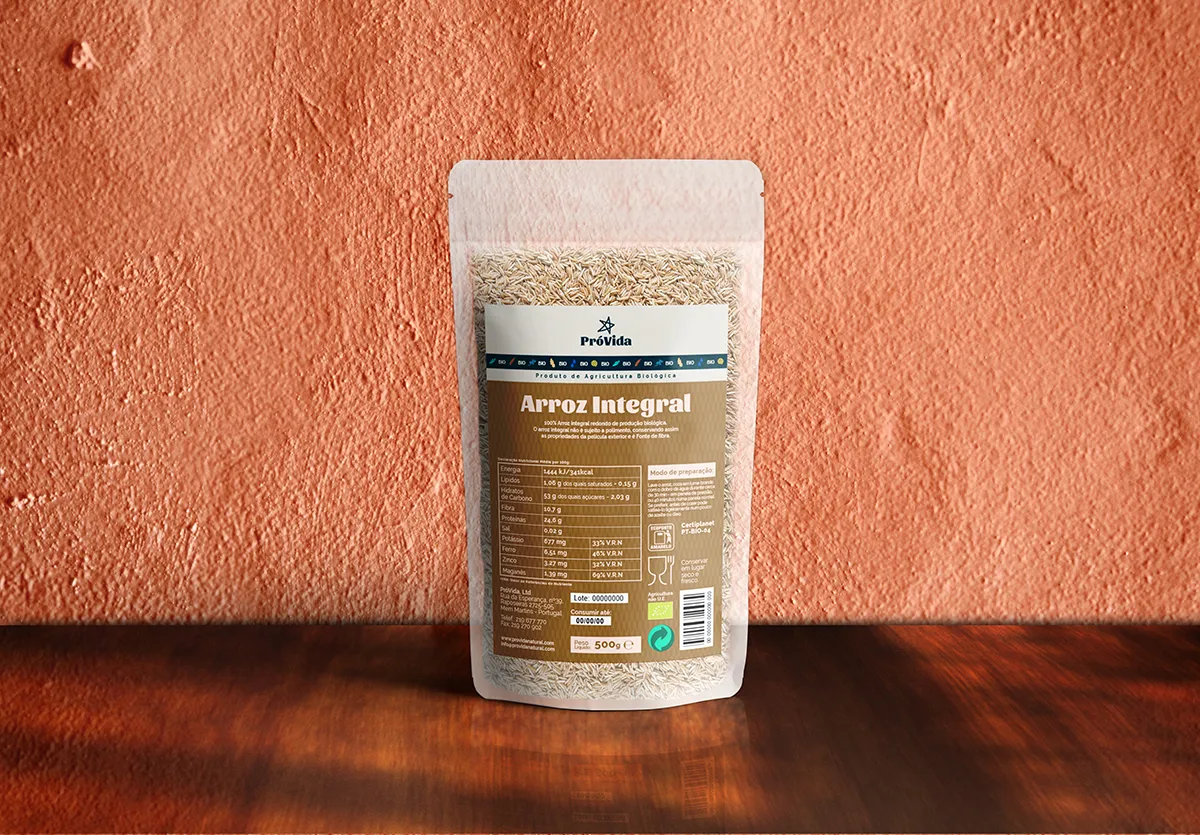
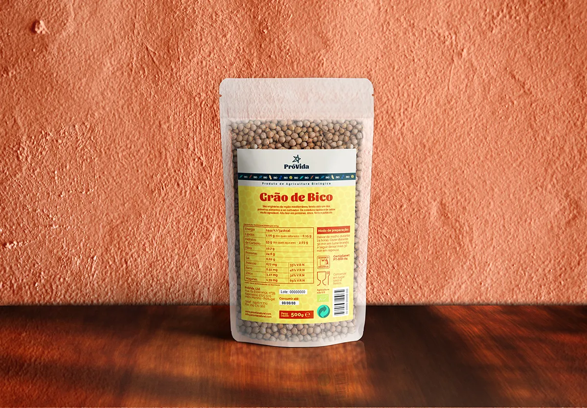
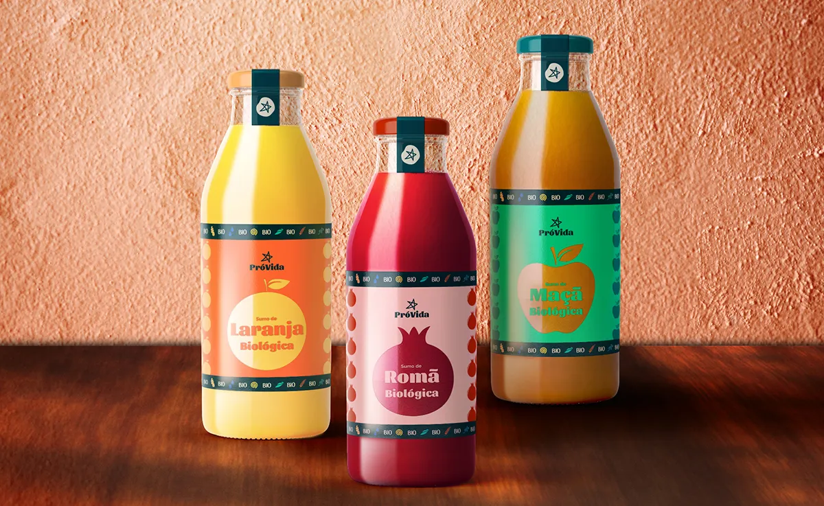
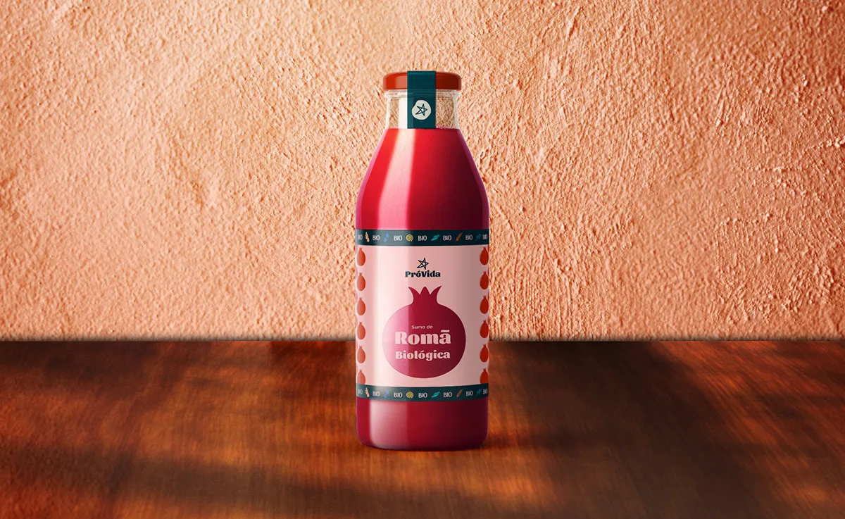
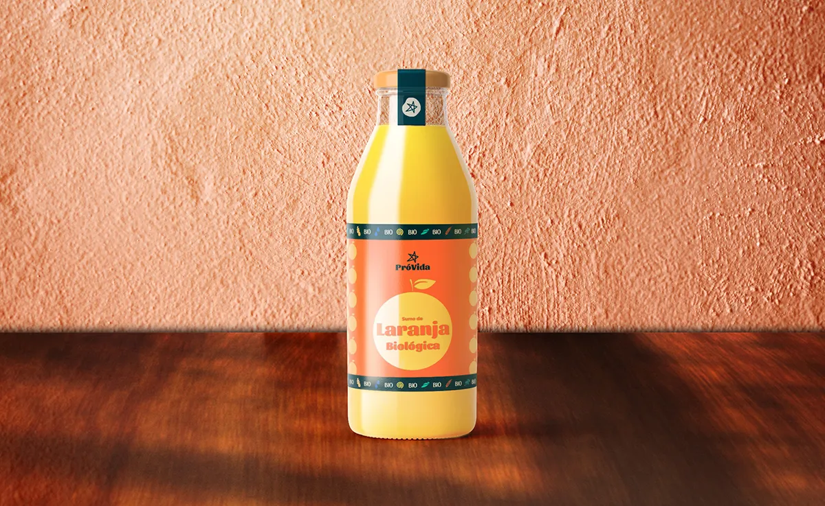
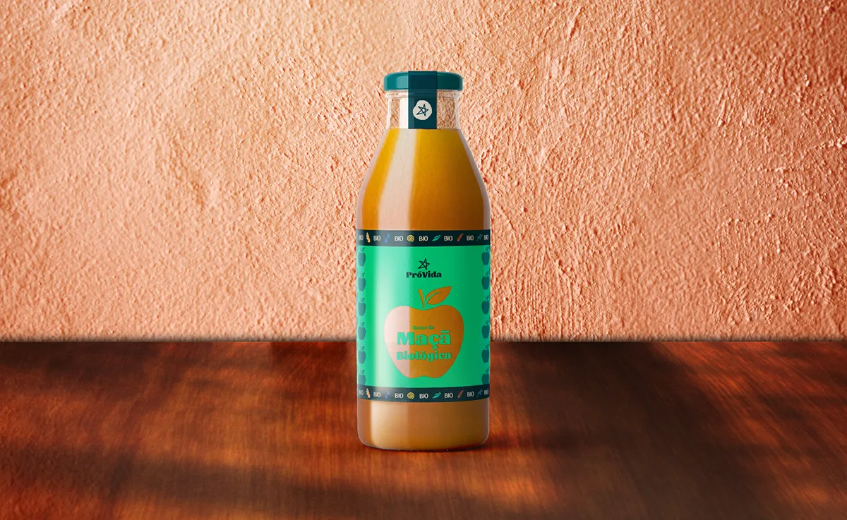
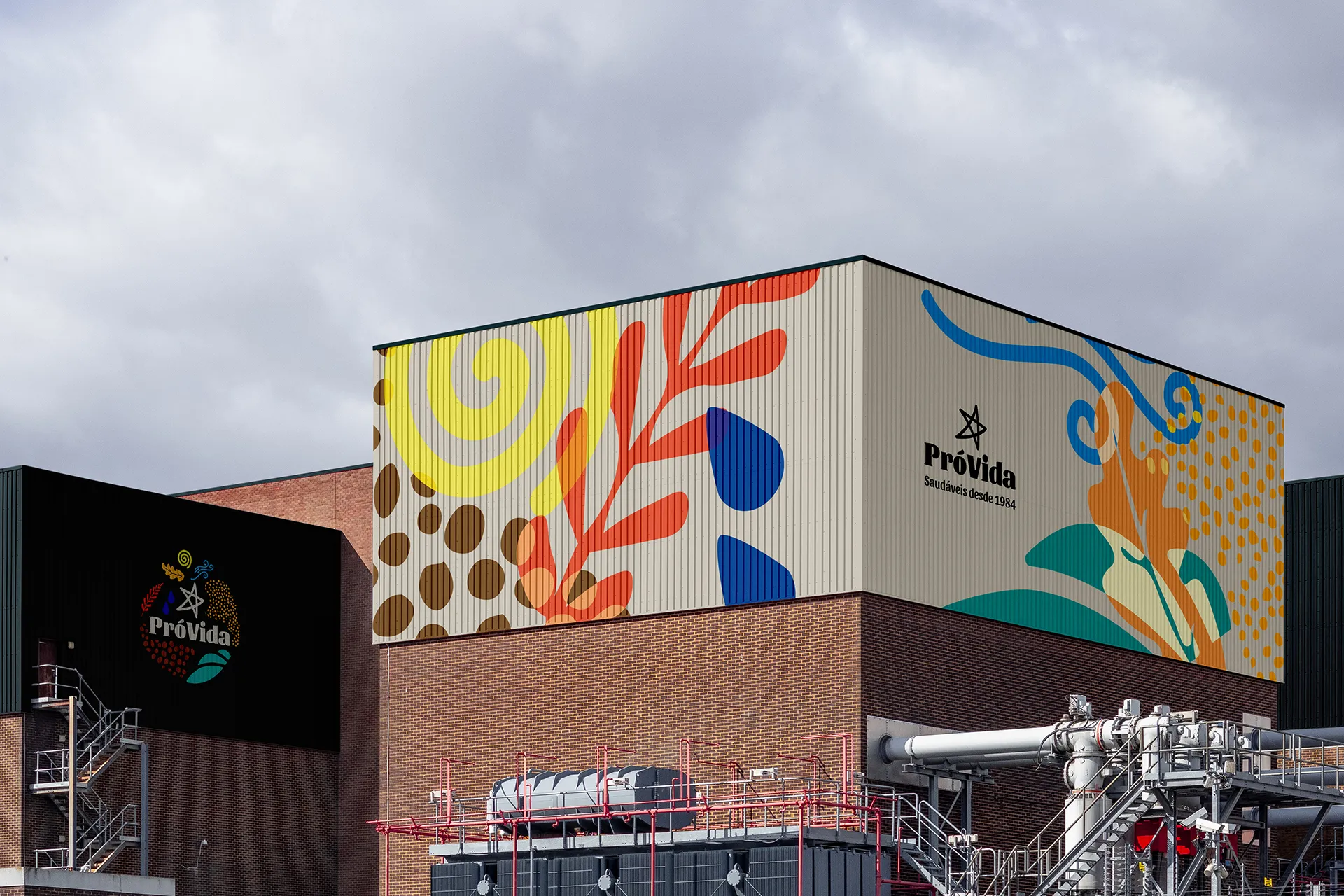
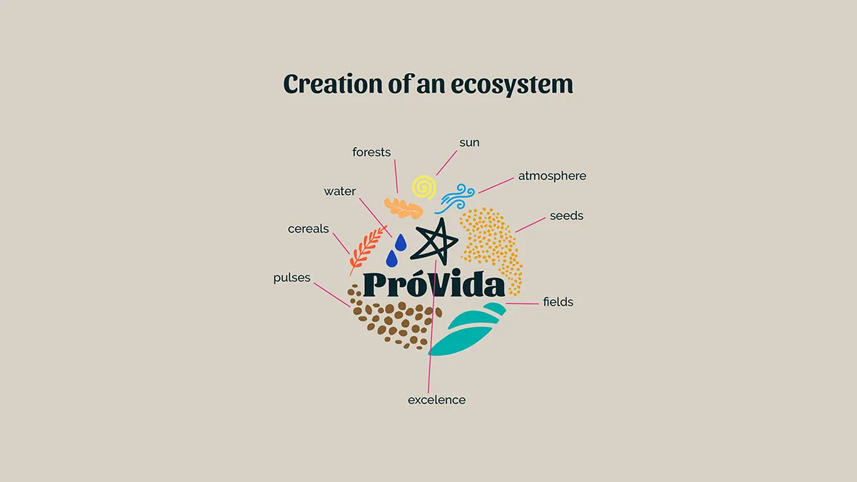
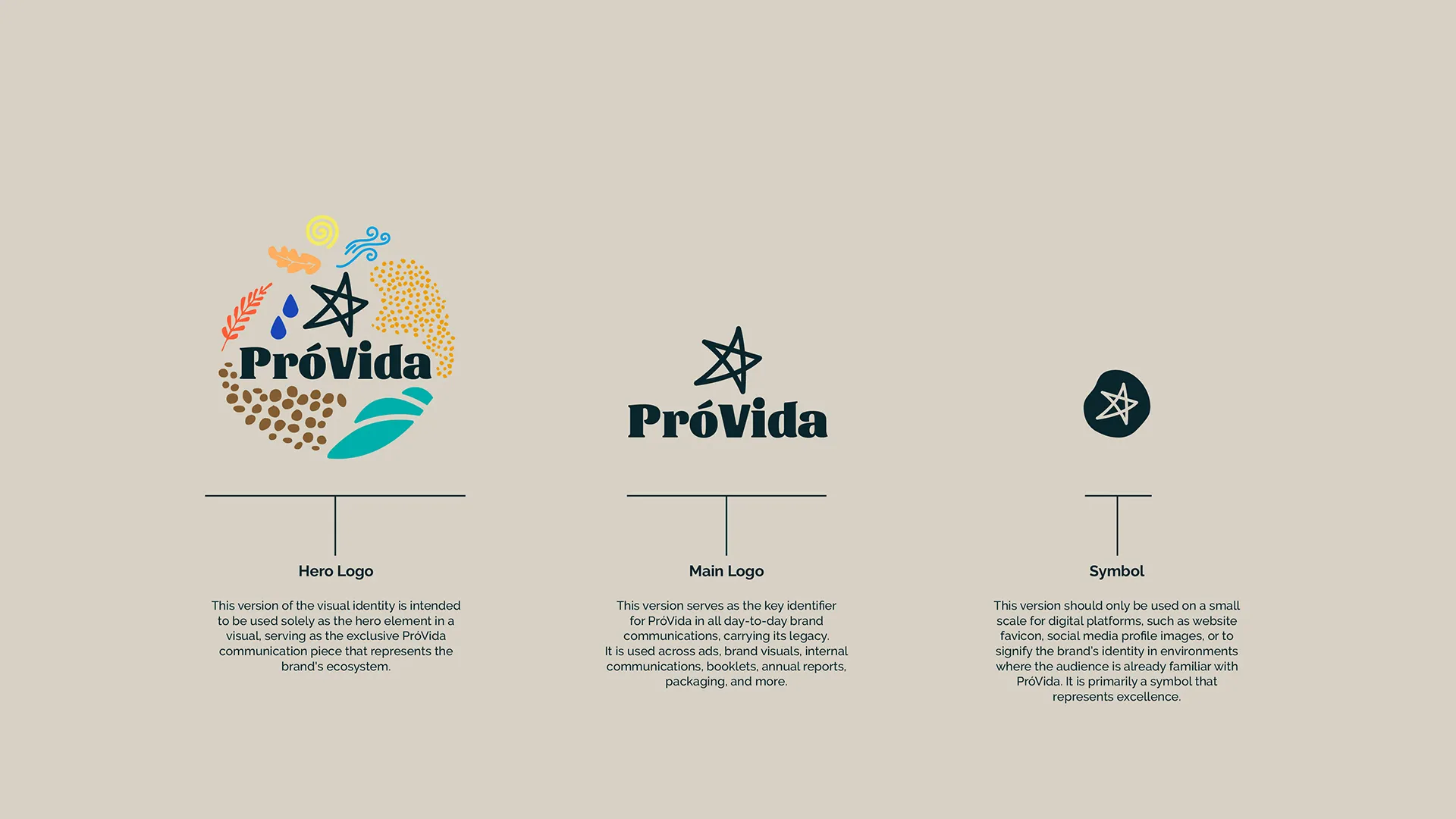
The rebrand aimed to create a holistic brand ecosystem that incorporates agricultural and environmental elements, embodying the natural and sustainable ethos of PróVida.
PróVida with a complete identity system applied across packaging, factory communications, and retail touchpoints. The visual language can successfully differentiated the brand in an overcrowded category, establishing a distinctive shelf presence and a unique tone of voice that resonates with health-conscious consumers who demand honesty over hype.
The rebrand aimed to create a holistic brand ecosystem that incorporates agricultural and environmental elements, embodying the natural and sustainable ethos of PróVida.
PróVida with a complete identity system applied across packaging, factory communications, and retail touchpoints. The visual language can successfully differentiated the brand in an overcrowded category, establishing a distinctive shelf presence and a unique tone of voice that resonates with health-conscious consumers who demand honesty over hype.
A brand as nourishing as the product.
A brand as nourishing as the product.
⮑ Outcome
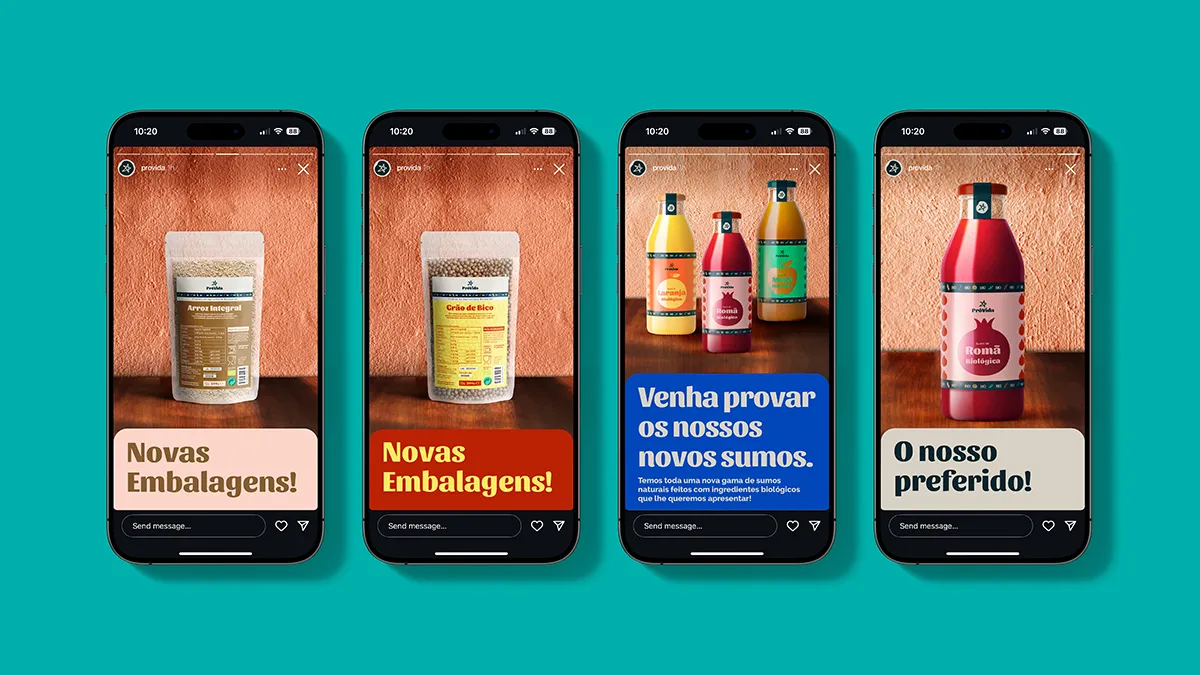
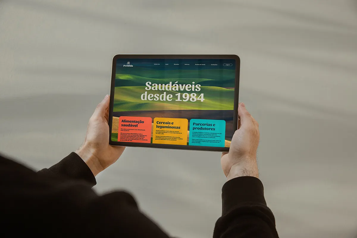
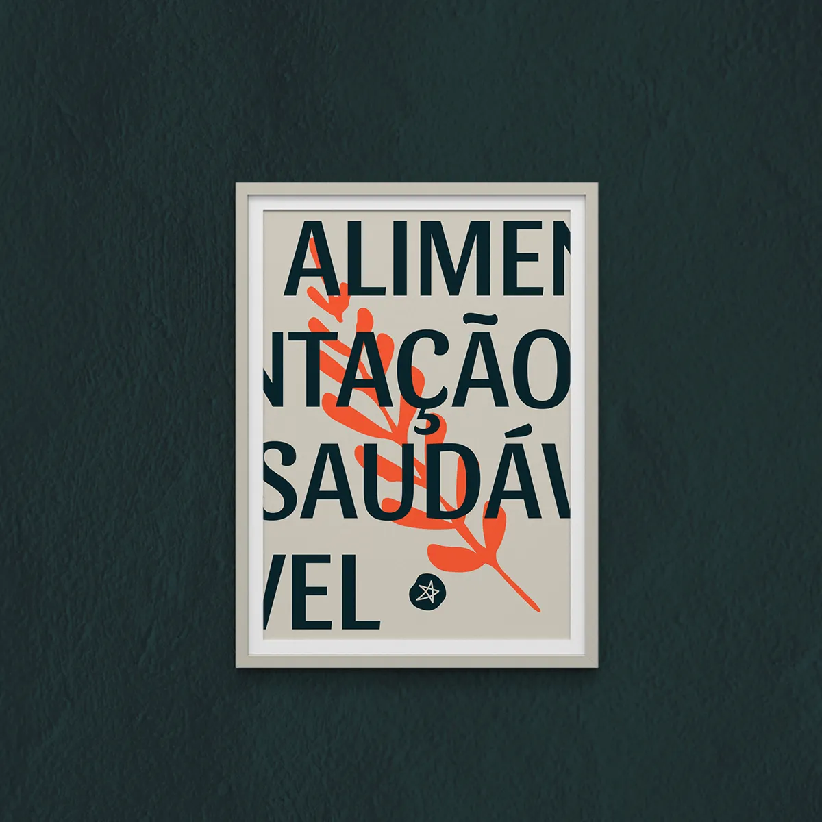
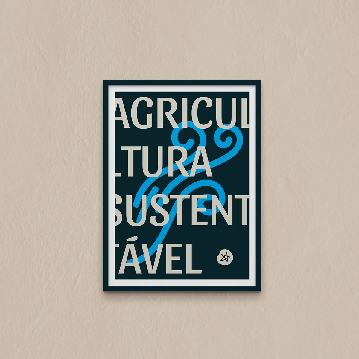
Warmth with backbone.
Warmth with backbone.
Despite its decades-long presence in the market, PróVida has never undergone a comprehensive rebrand. The brand no longer reflects its full potential or resonates with consumers’ expectations, and has fallen behind the expectations of a digitally fluent audience.
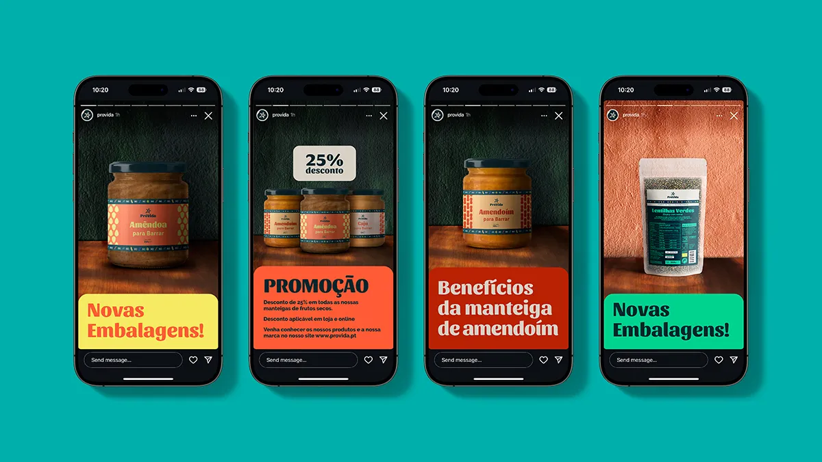
Defining a visual identity system aligned with the brand’s values building on the existing assets, leveraging digital platforms like social media for enhanced engagement, especially with a younger audience. Highlighting a new, simple, playful packaging system for the brand based on sustainable materials such as glass and compostable packaging.
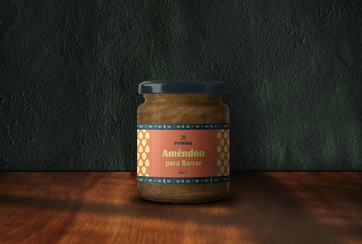
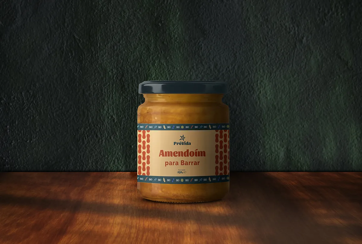
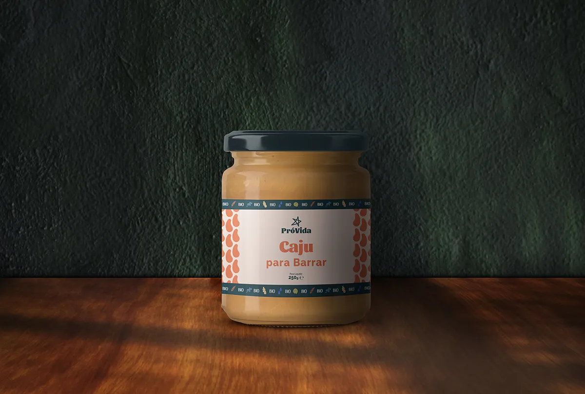
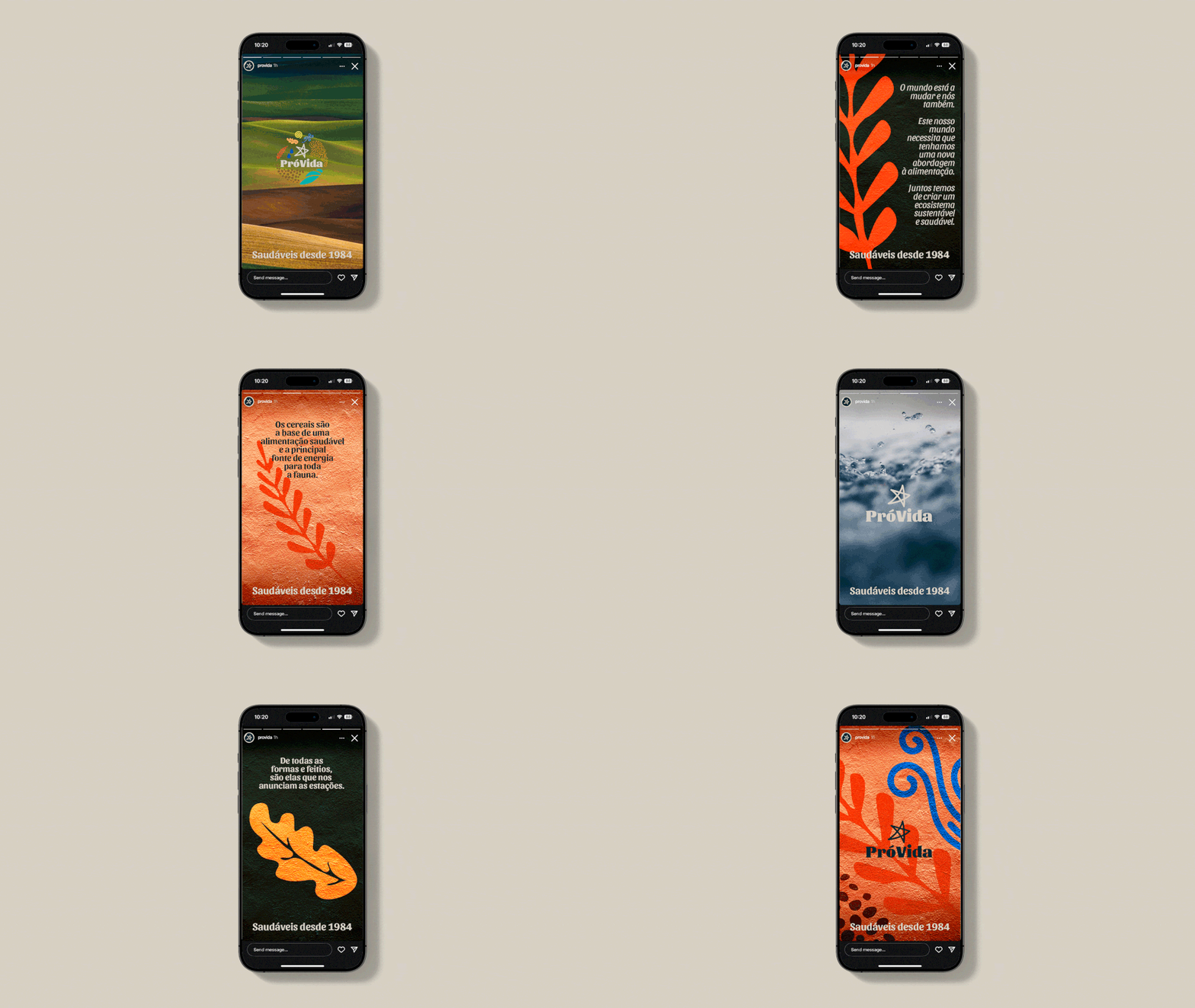
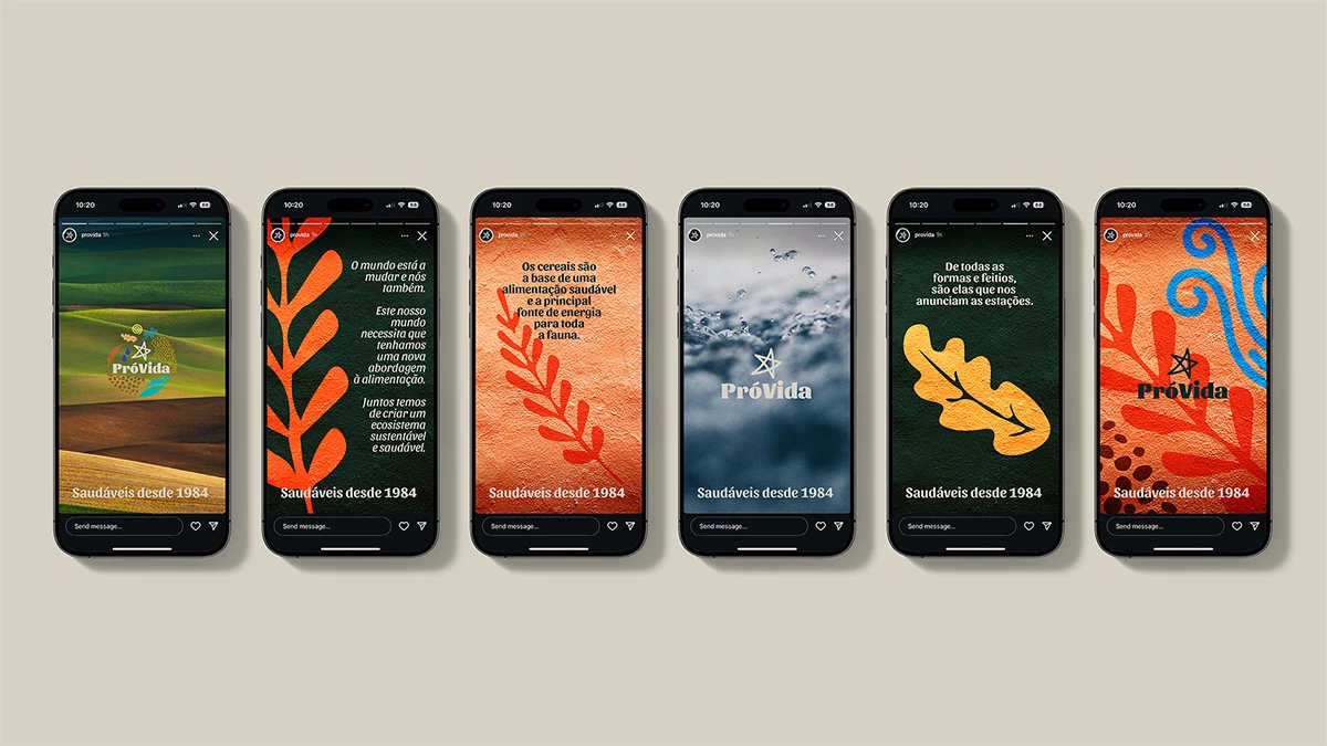
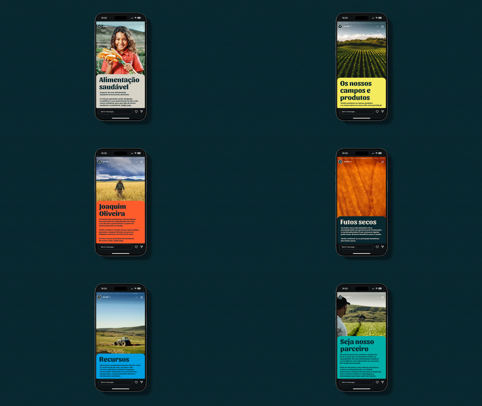
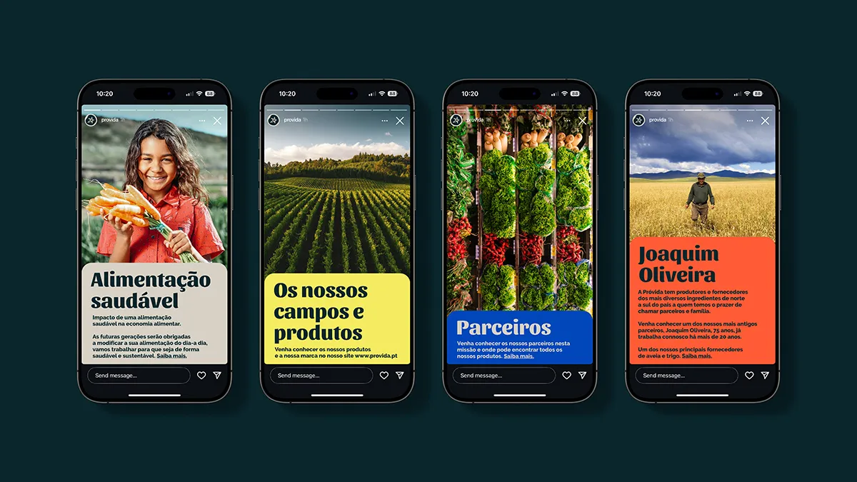
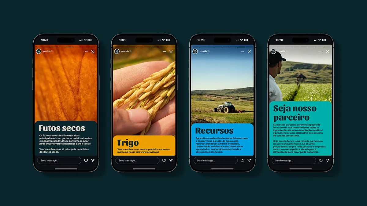
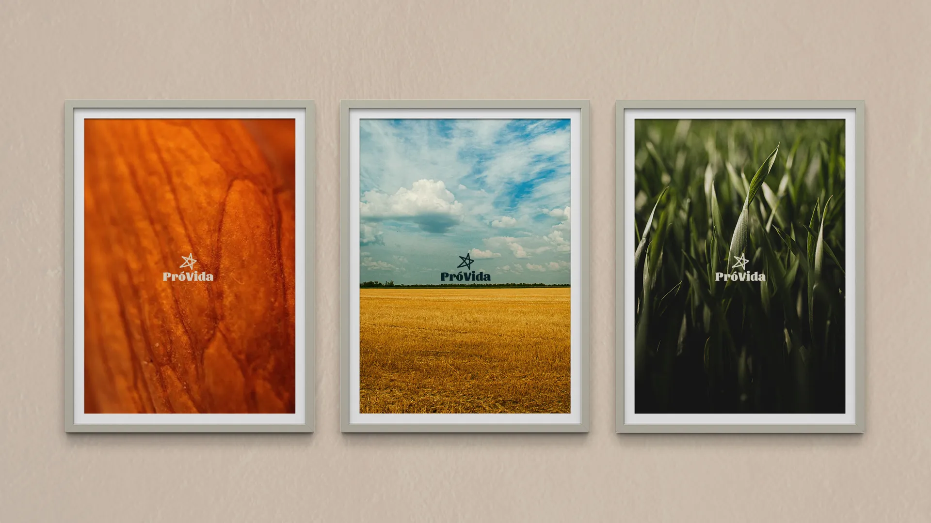
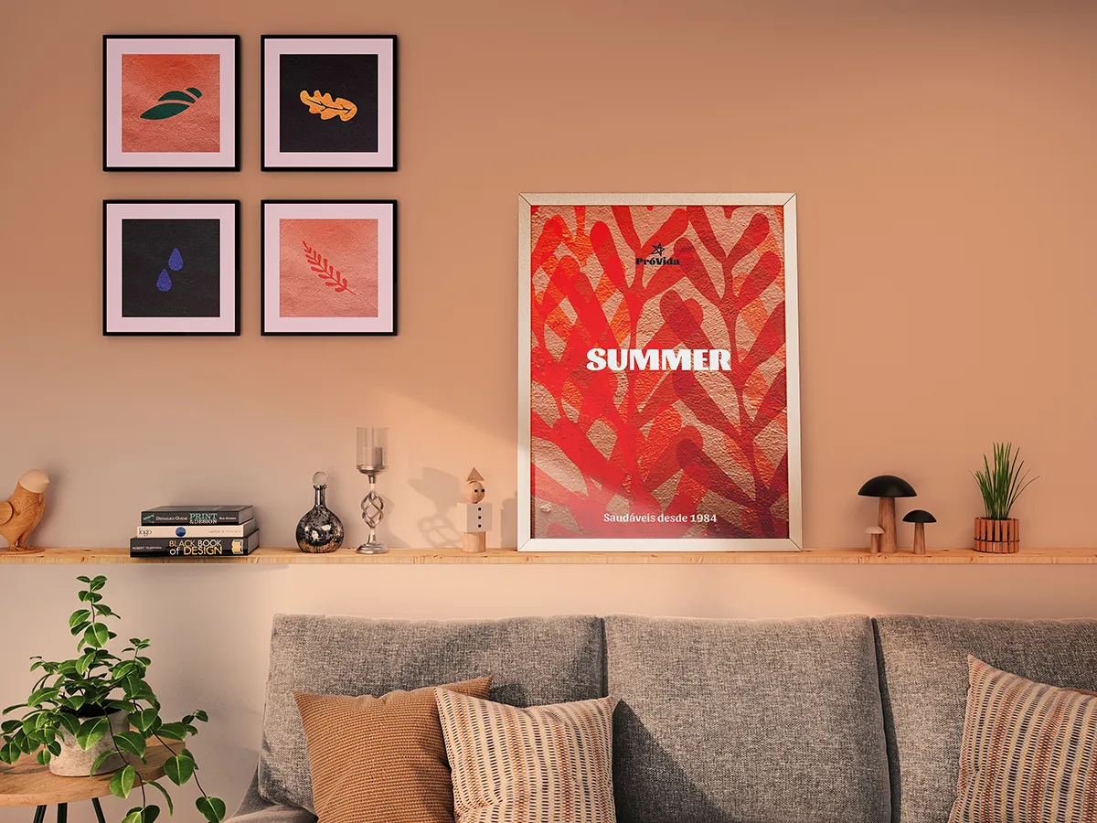
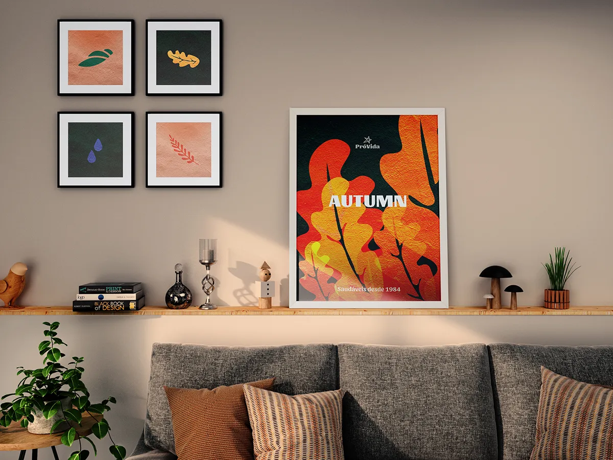
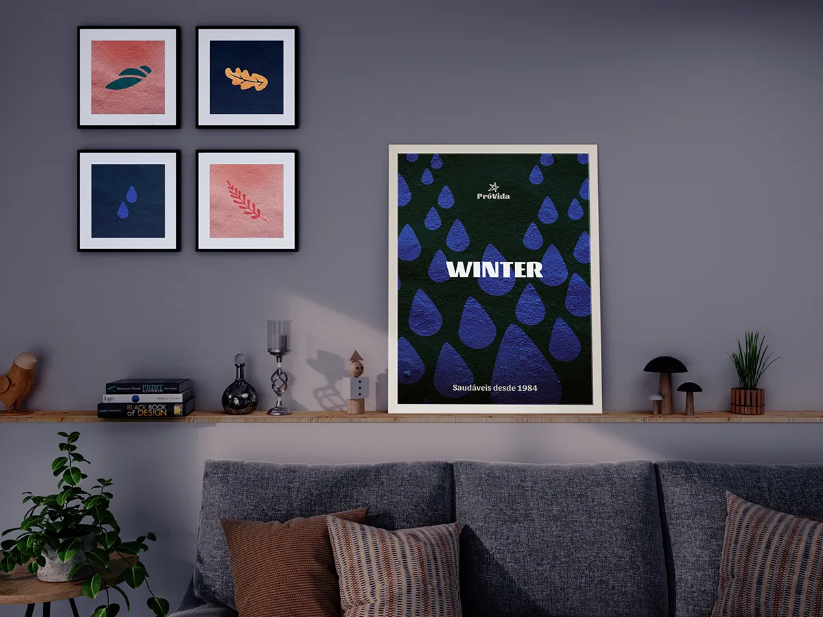
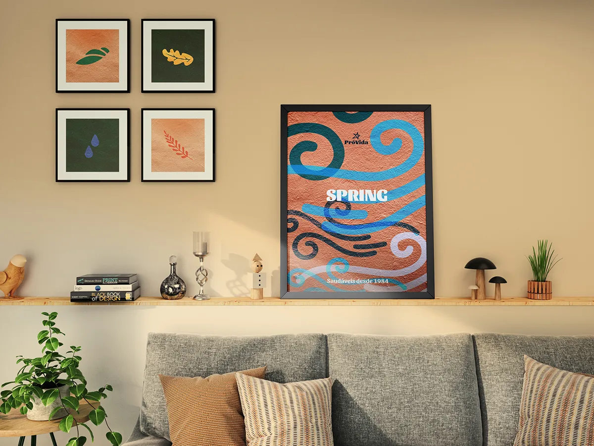
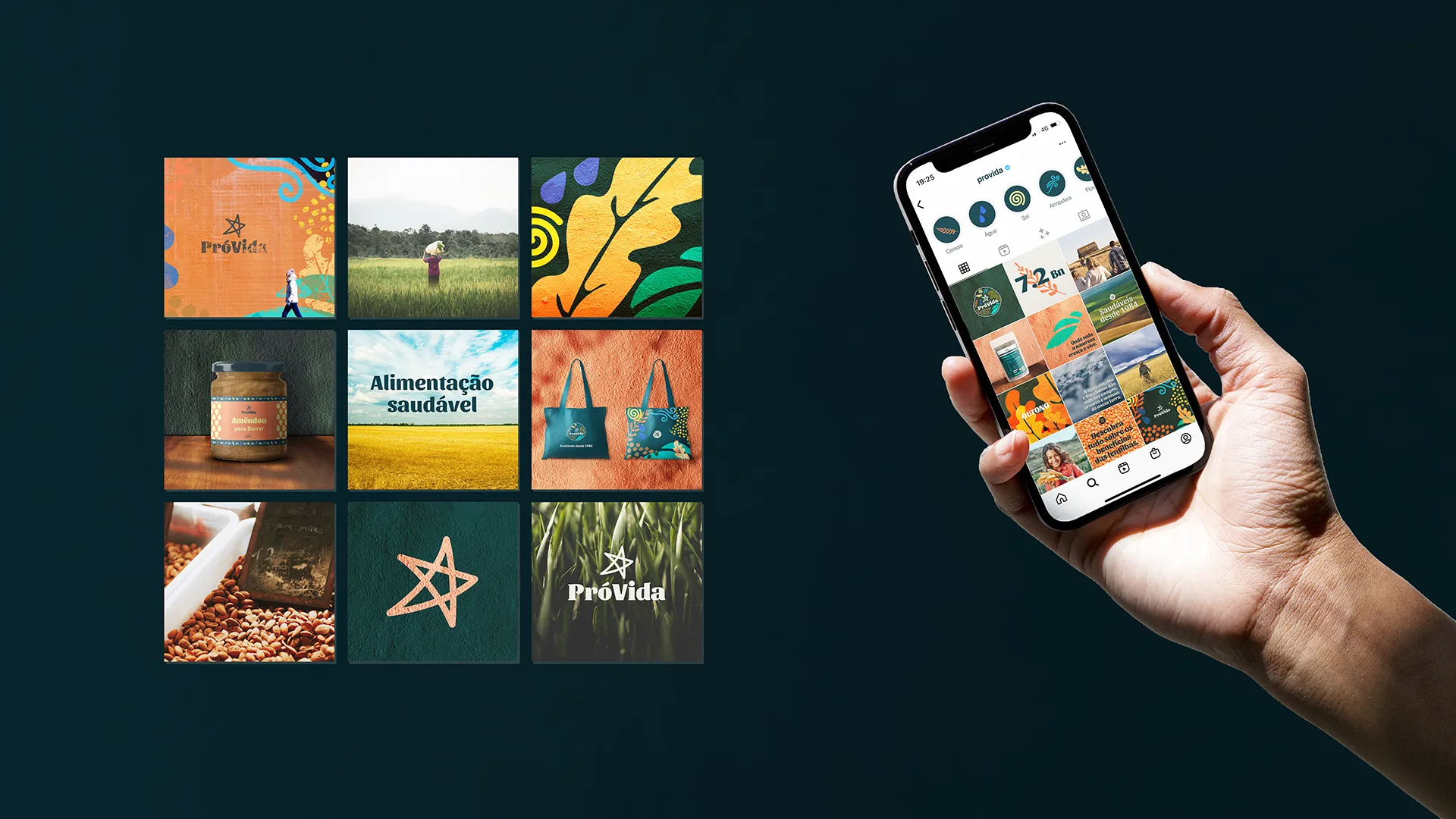
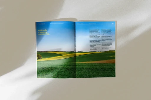
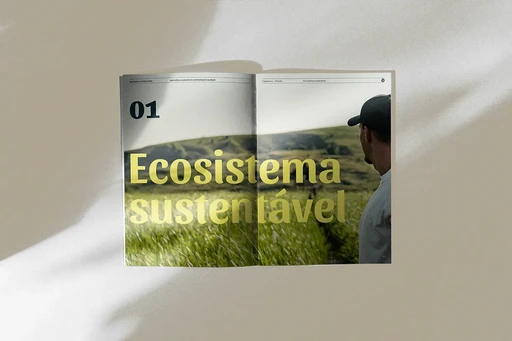
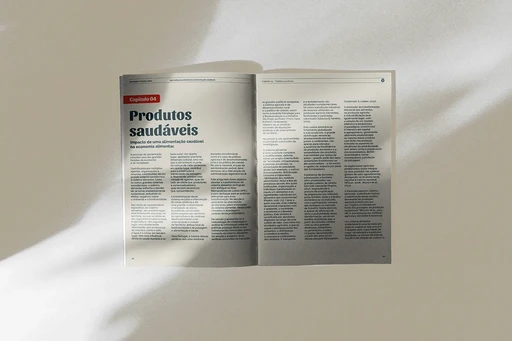
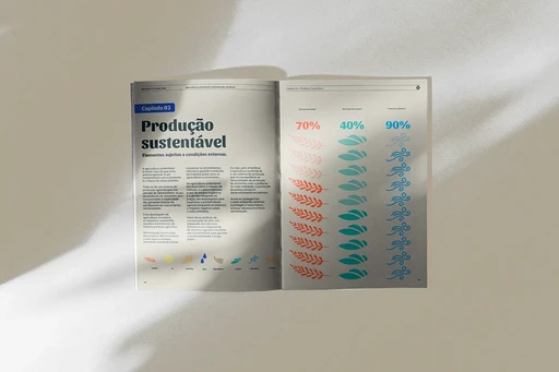
Warm colors, simple, nature based illustrations, friendly type, and natural photography capture both ecosystem elements and daily life - from products and ingredients to workers and producers and everything involved - creating an approachable, authentic look.
Despite its decades-long presence in the market, PróVida has never undergone a comprehensive rebrand. The brand no longer reflects its full potential or resonates with consumers’ expectations, and has fallen behind the expectations of a digitally fluent audience.
Defining a visual identity system aligned with the brand’s values building on the existing assets, leveraging digital platforms like social media for enhanced engagement, especially with a younger audience. Highlighting a new, simple, playful packaging system for the brand based on sustainable materials such as glass and compostable packaging.
Warm colors, simple, nature based illustrations, friendly type, and natural photography capture both ecosystem elements and daily life - from products and ingredients to workers and producers and everything involved - creating an approachable, authentic look.
⮑ Design
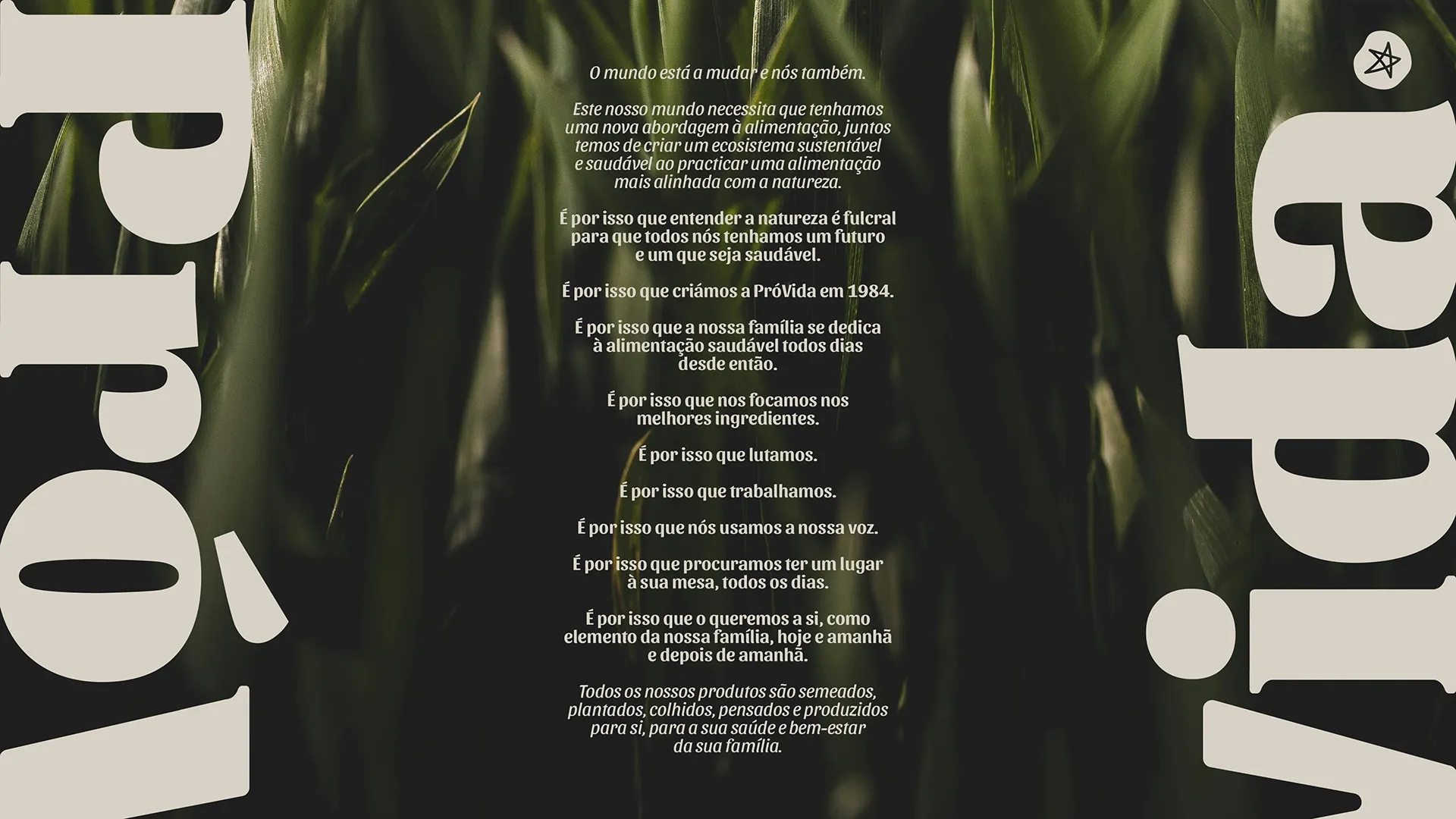
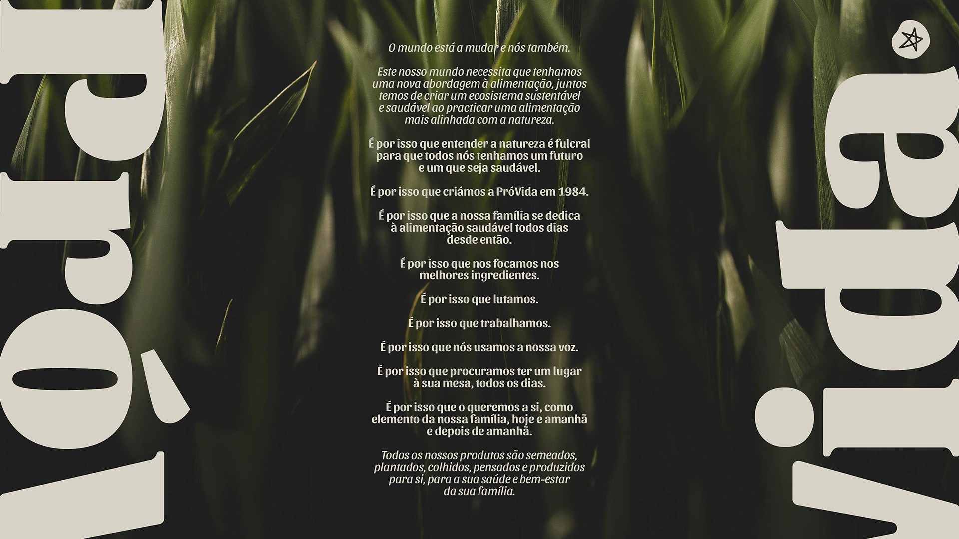
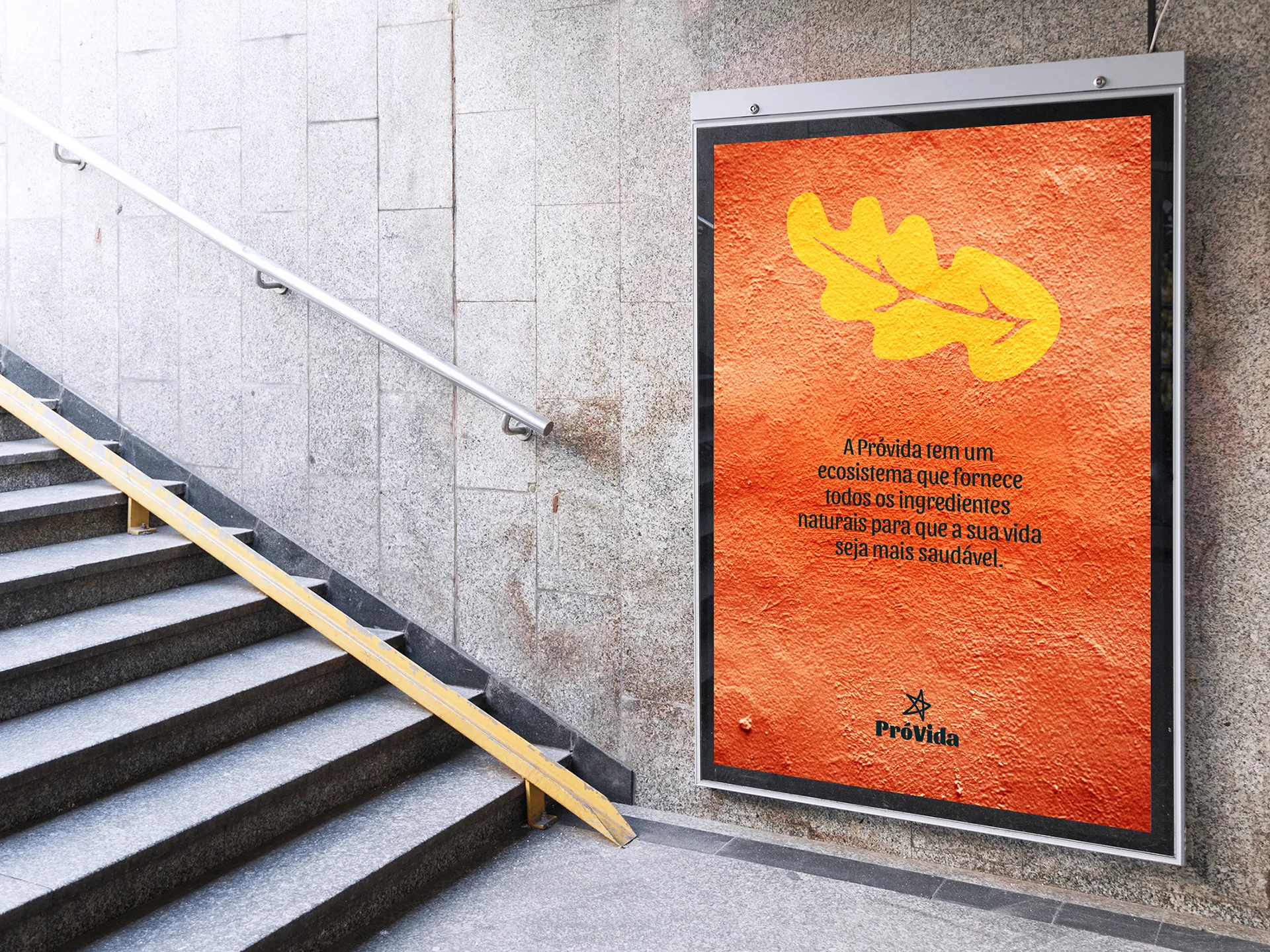
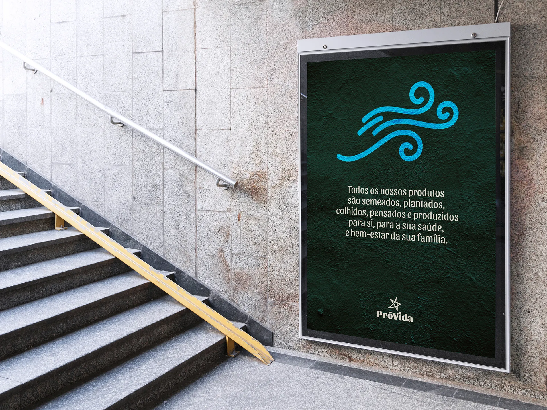
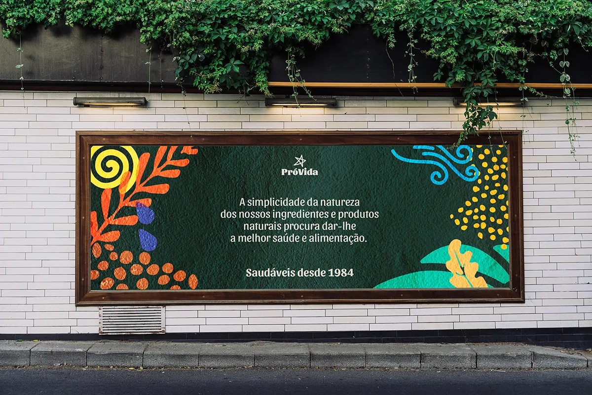
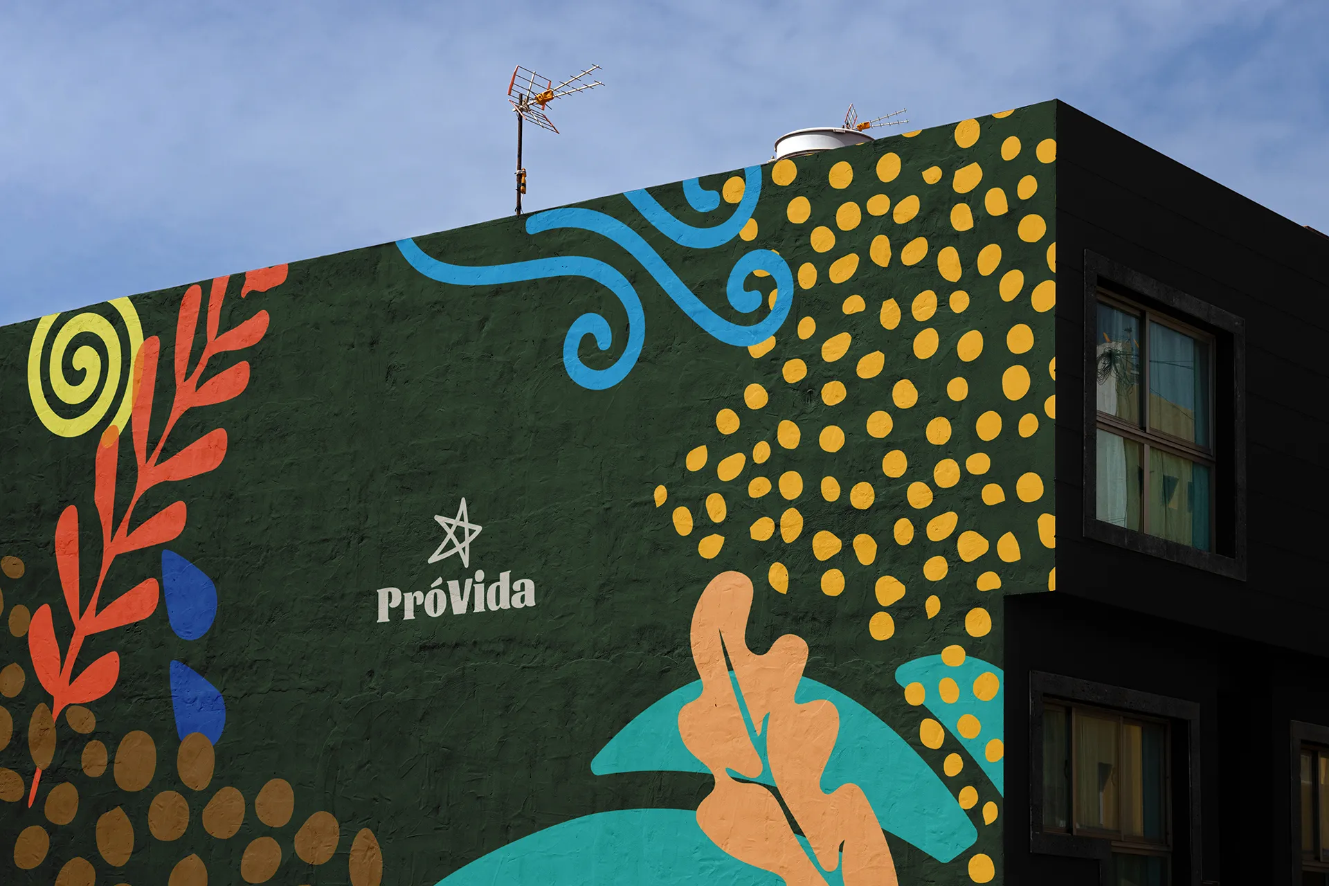
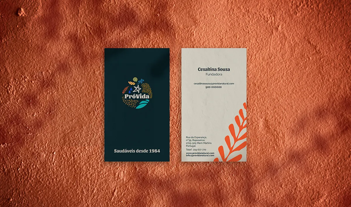
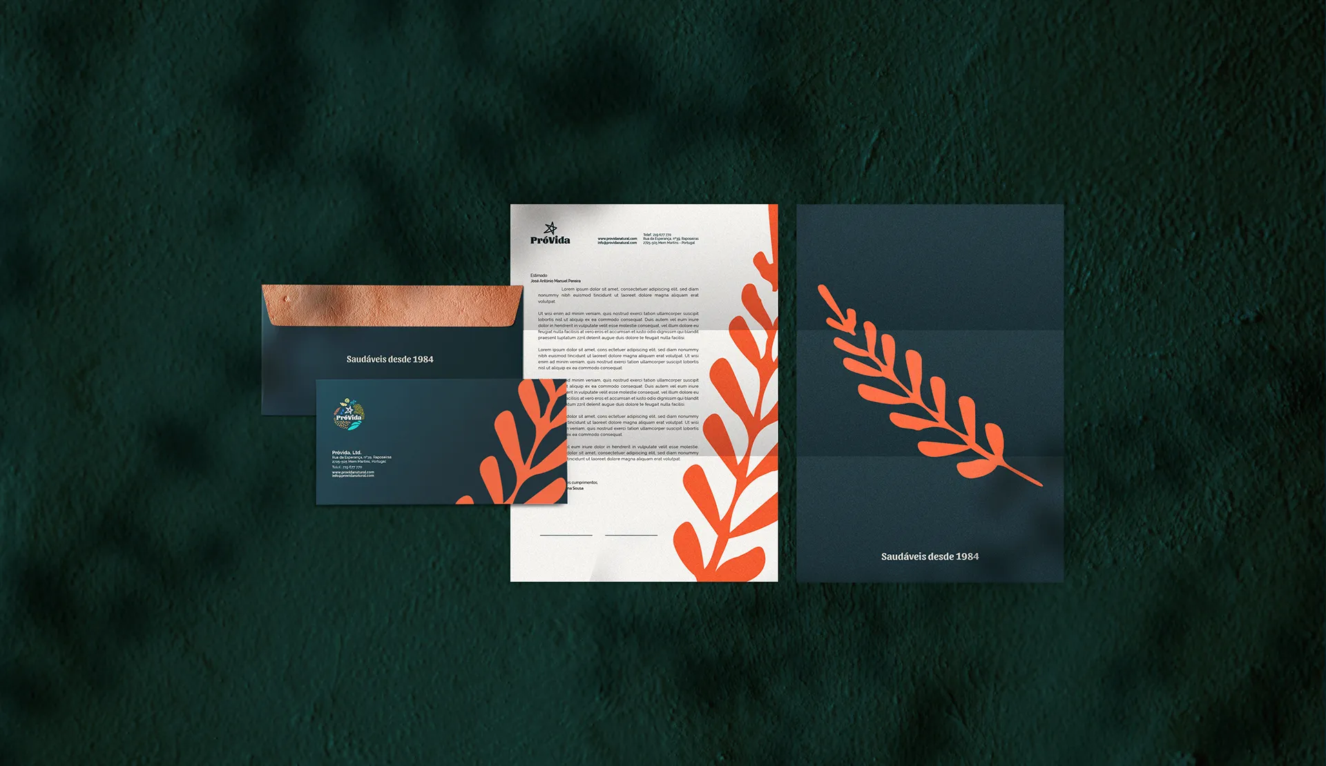
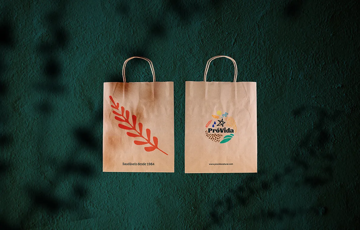
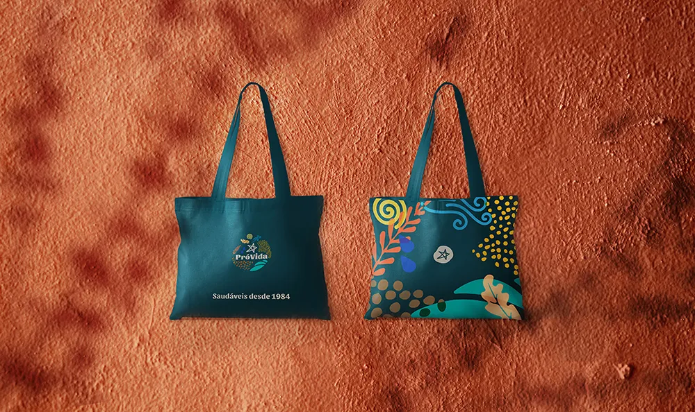
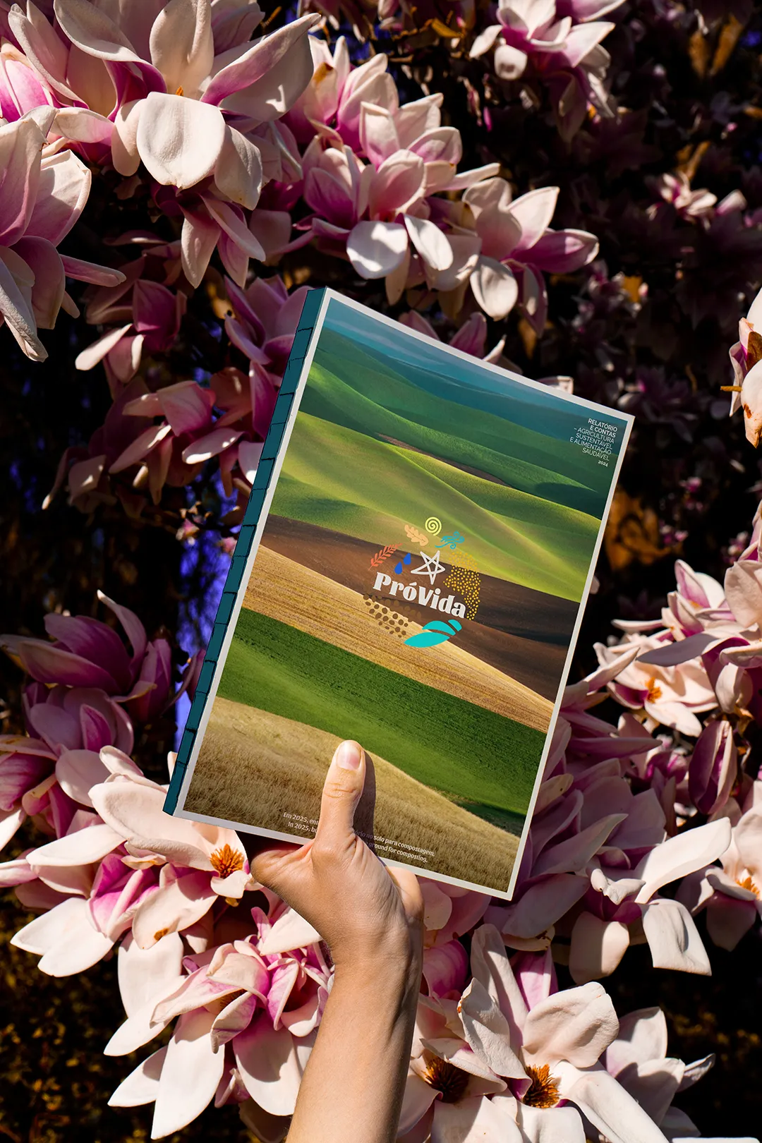
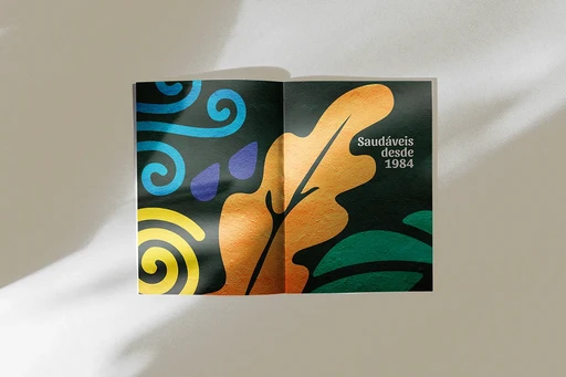
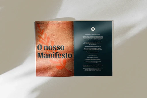
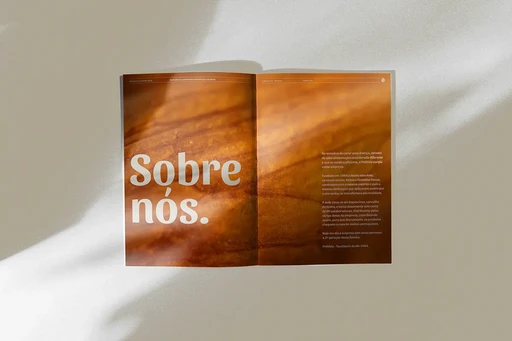
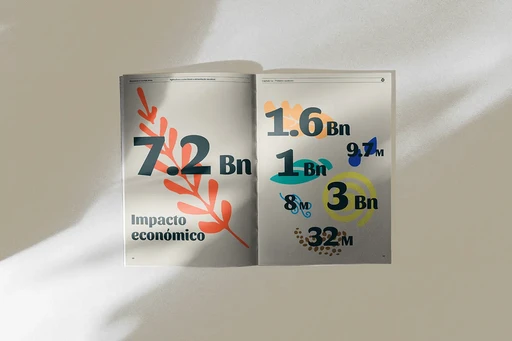
Truly healthy living is an active and personal choice, centred on the brand’s mission to become a leading voice for healthier nutrition in Portugal - the core of its Manifesto.
Positioning the brand at the intersection of artisanal craft and nutritional rigour, appealing to consumers who read labels and expect substance behind the story.
The challenge was to modernise the brand while staying true to its heritage, creating an identity and language that highlight its commitment to healthier food, nature and sustainable practices, and making the brand relevant in the market, industry, and society as an active voice for healthier food.
The new branding emphasises ProVida’s core values: Family, Health, and Sustainability.
Truly healthy living is an active and personal choice, centred on the brand’s mission to become a leading voice for healthier nutrition in Portugal - the core of its Manifesto.
Positioning the brand at the intersection of artisanal craft and nutritional rigour, appealing to consumers who read labels and expect substance behind the story.
The challenge was to modernise the brand while staying true to its heritage, creating an identity and language that highlight its commitment to healthier food, nature and sustainable practices, and making the brand relevant in the market, industry, and society as an active voice for healthier food.
The new branding emphasises ProVida’s core values: Family, Health, and Sustainability.
Life lived with intention.
Life lived with intention.
Life lived with intention.
⮑ Concept & Strategy
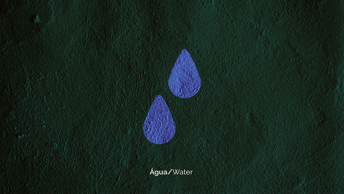

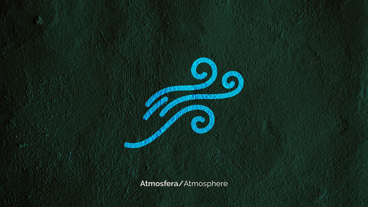
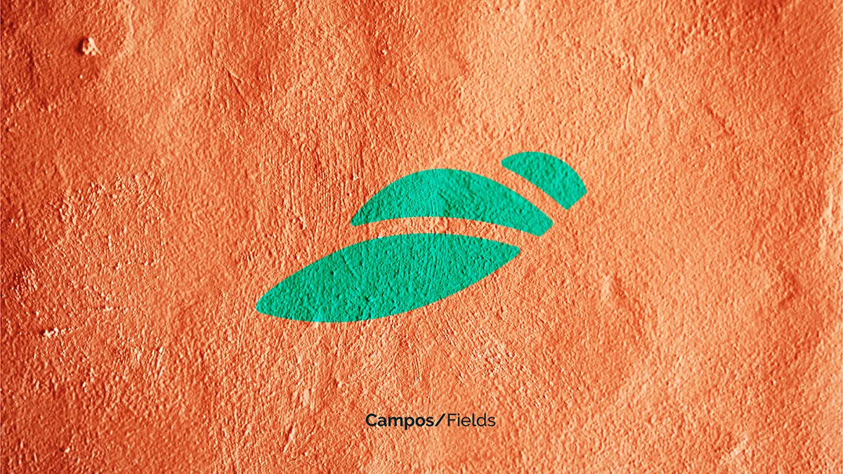
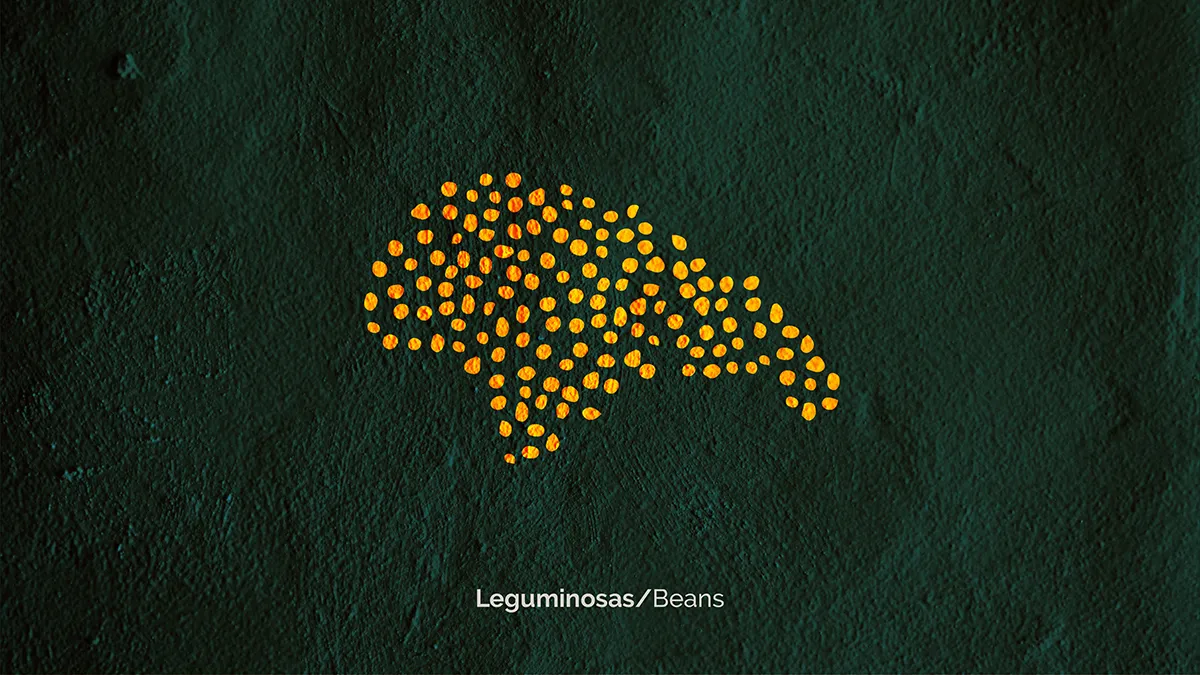
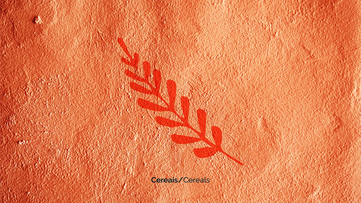
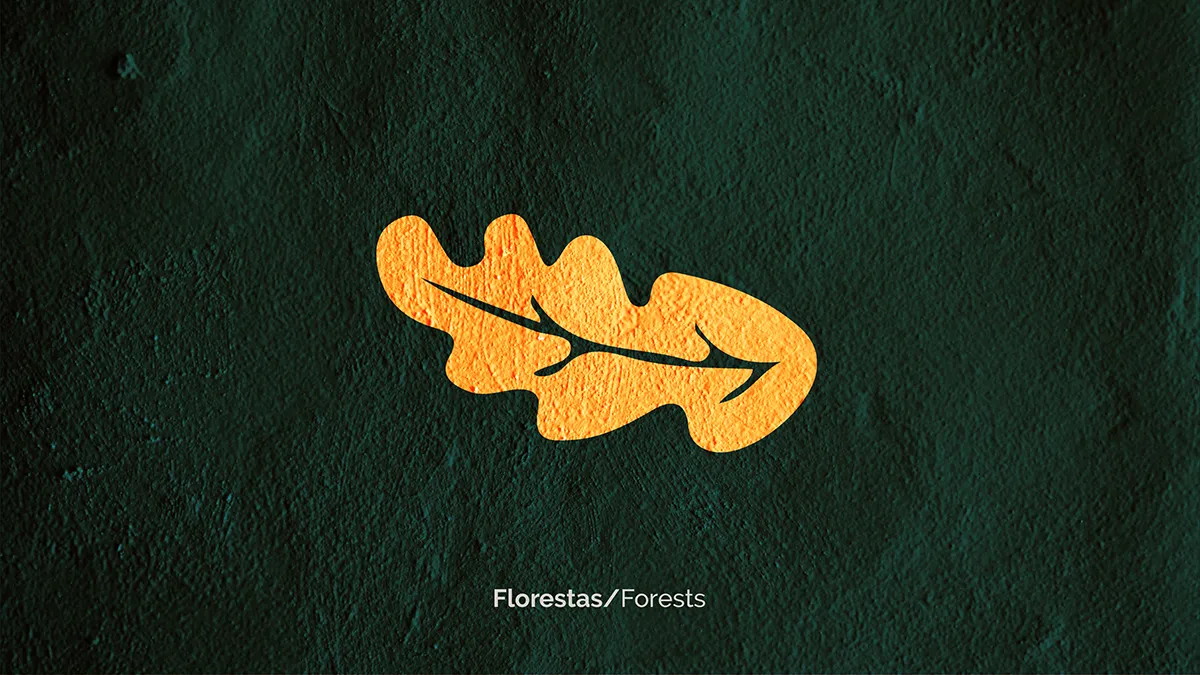
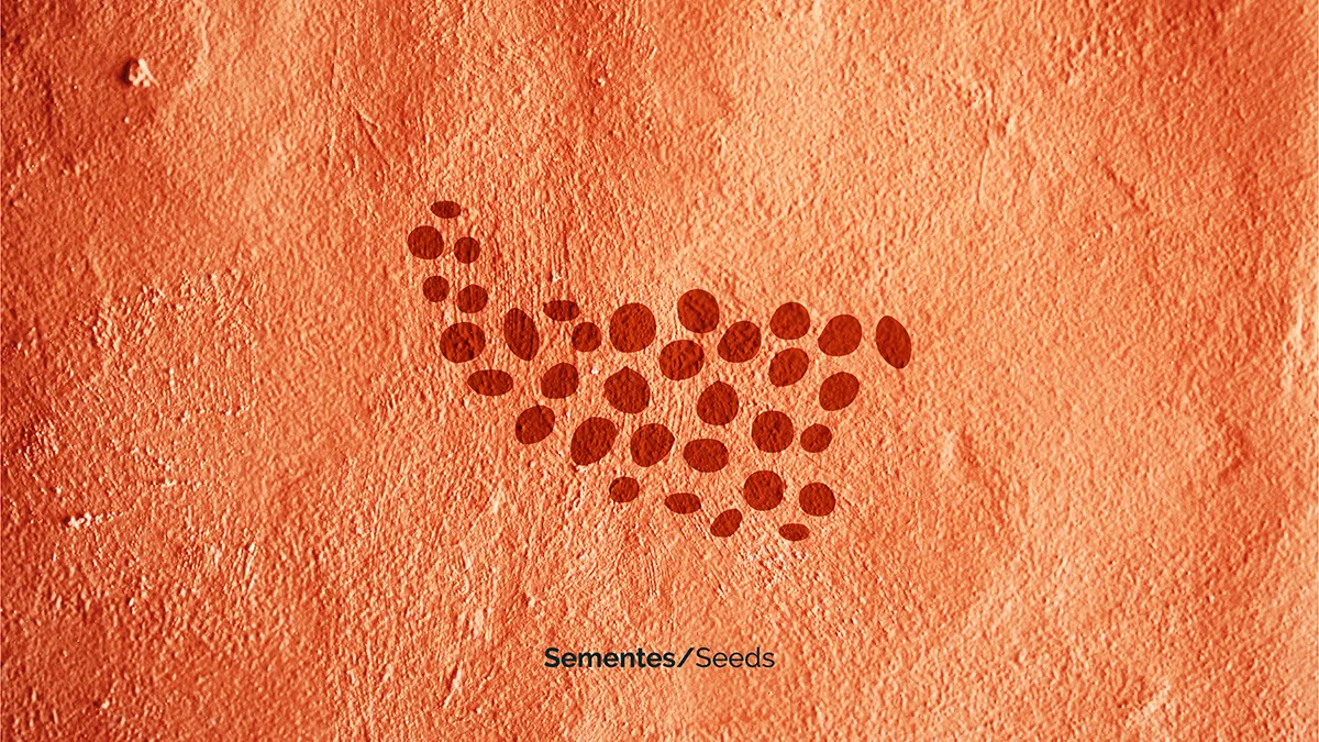


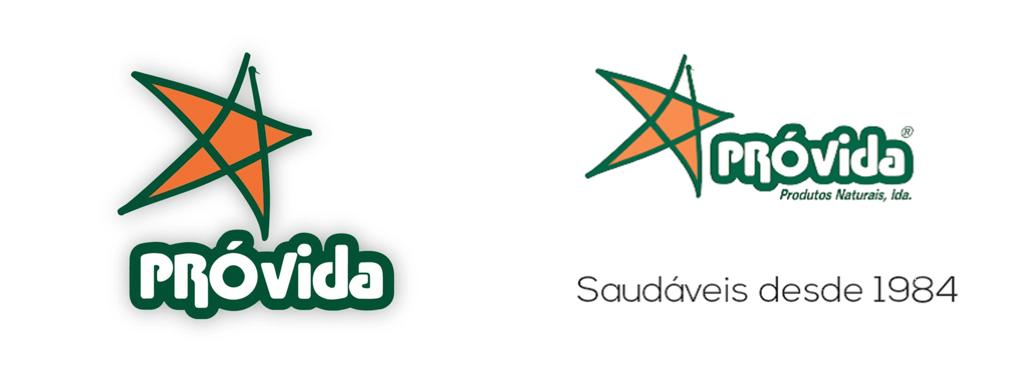
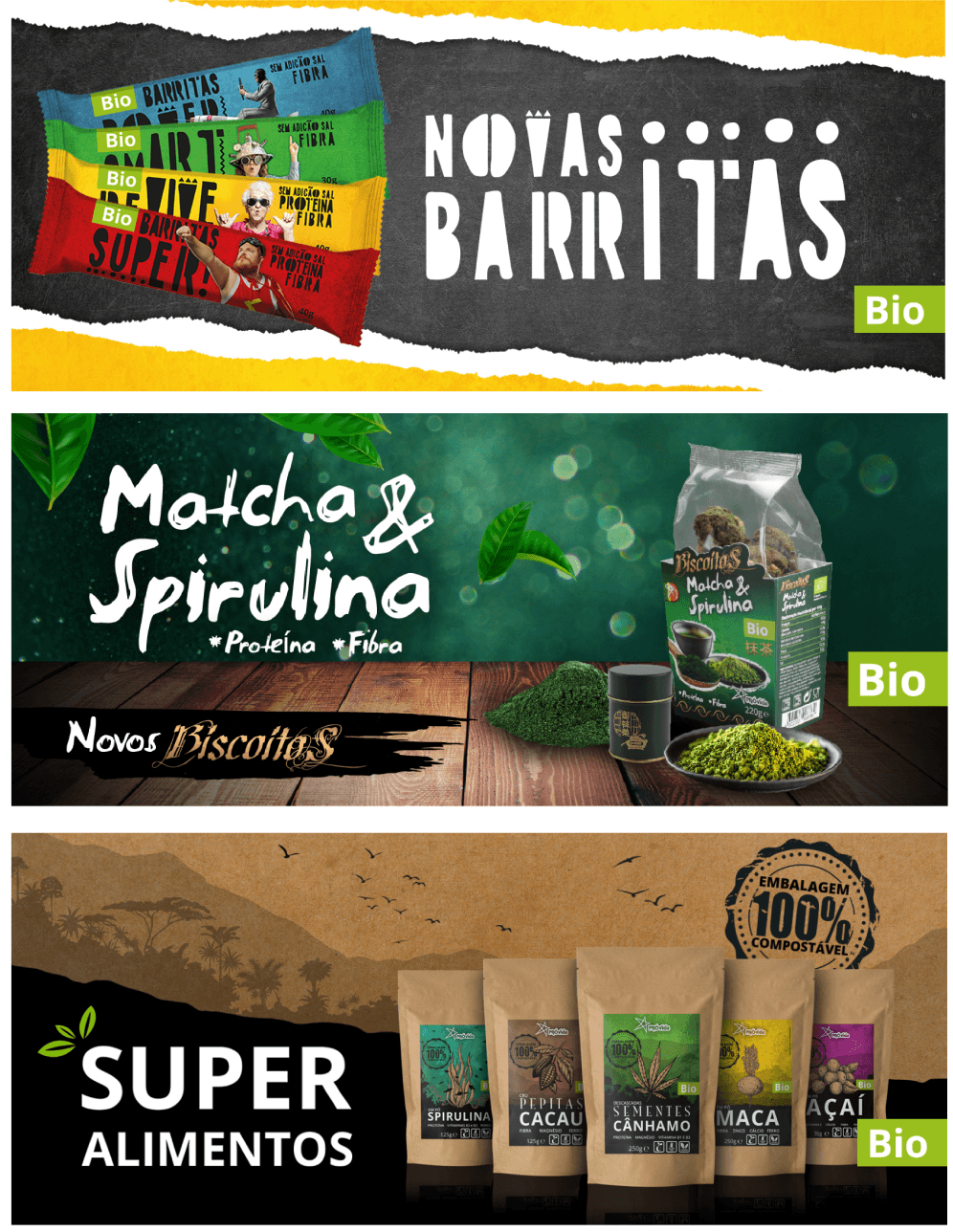
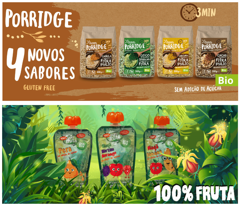
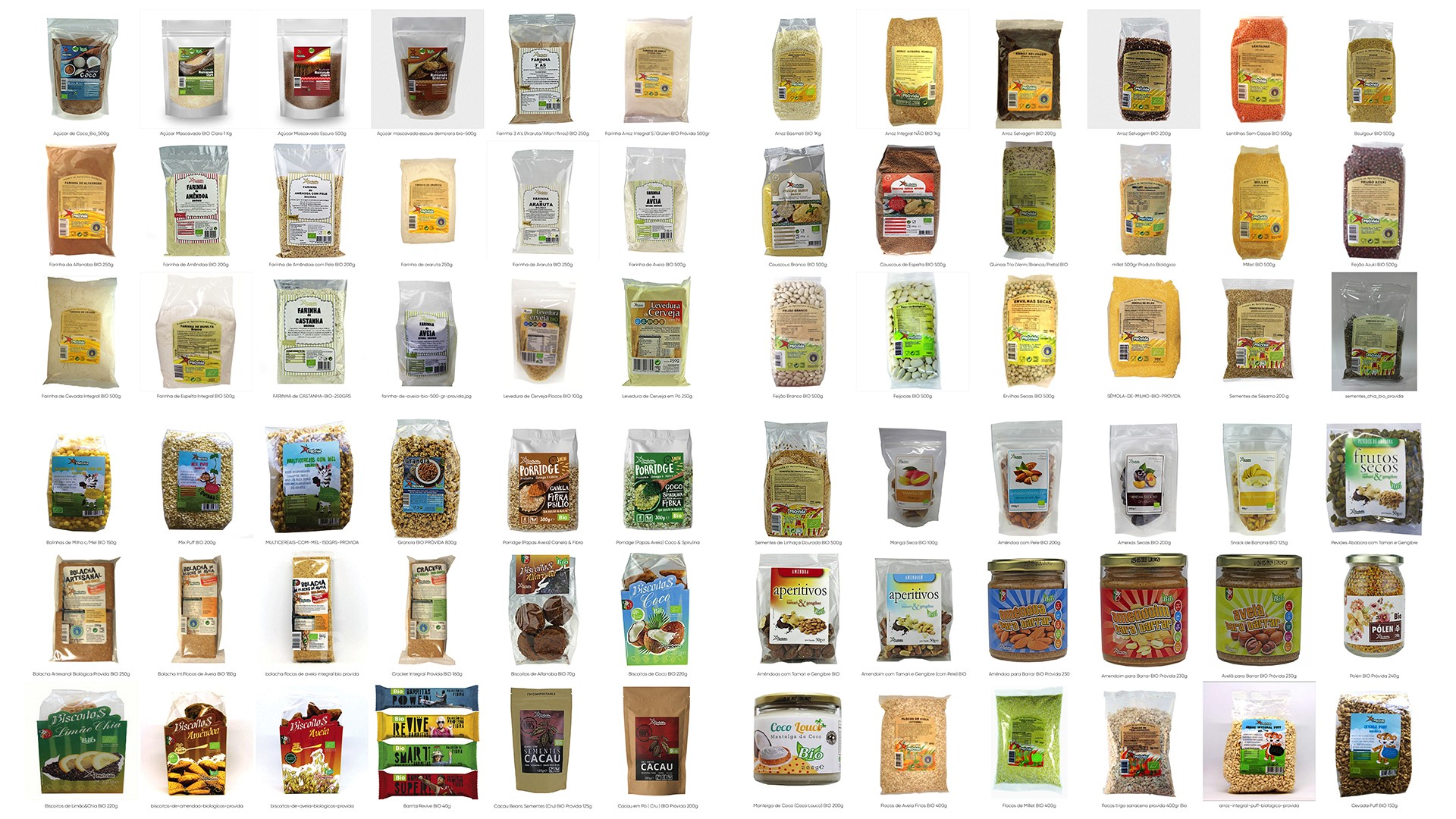
⮑ Current Brand Assets
Food that earns its place on your table.
Food that earns its place on your table.
This rebrand was a proactive creative initiative - As the lead creative, I identified PróVida’s 40th anniversary as a strategic moment to rebuild the brand from the ground up, repositioning it as a serious player in Portugal’s natural, vegetarian and vegan food market.
The challenge was to build a brand with genuine authority - rooted in nutritional integrity and a clear point of view - without relying on the category's tired visual language.
This rebrand was a proactive creative initiative - As the lead creative, I identified PróVida’s 40th anniversary as a strategic moment to rebuild the brand from the ground up, repositioning it as a serious player in Portugal’s natural, vegetarian and vegan food market.
The challenge was to build a brand with genuine authority - rooted in nutritional integrity and a clear point of view - without relying on the category's tired visual language.
This rebrand was a proactive creative initiative - As the lead creative, I identified PróVida’s 40th anniversary as a strategic moment to rebuild the brand from the ground up, repositioning it as a serious player in Portugal’s natural, vegetarian and vegan food market.
The challenge was to build a brand with genuine authority - rooted in nutritional integrity and a clear point of view - without relying on the category's tired visual language.
⮑ Overview

⮑ PróVida
CLIENT
⮑ Rebrand
PROJECT
⮑ Retail Health Food
SECTOR