





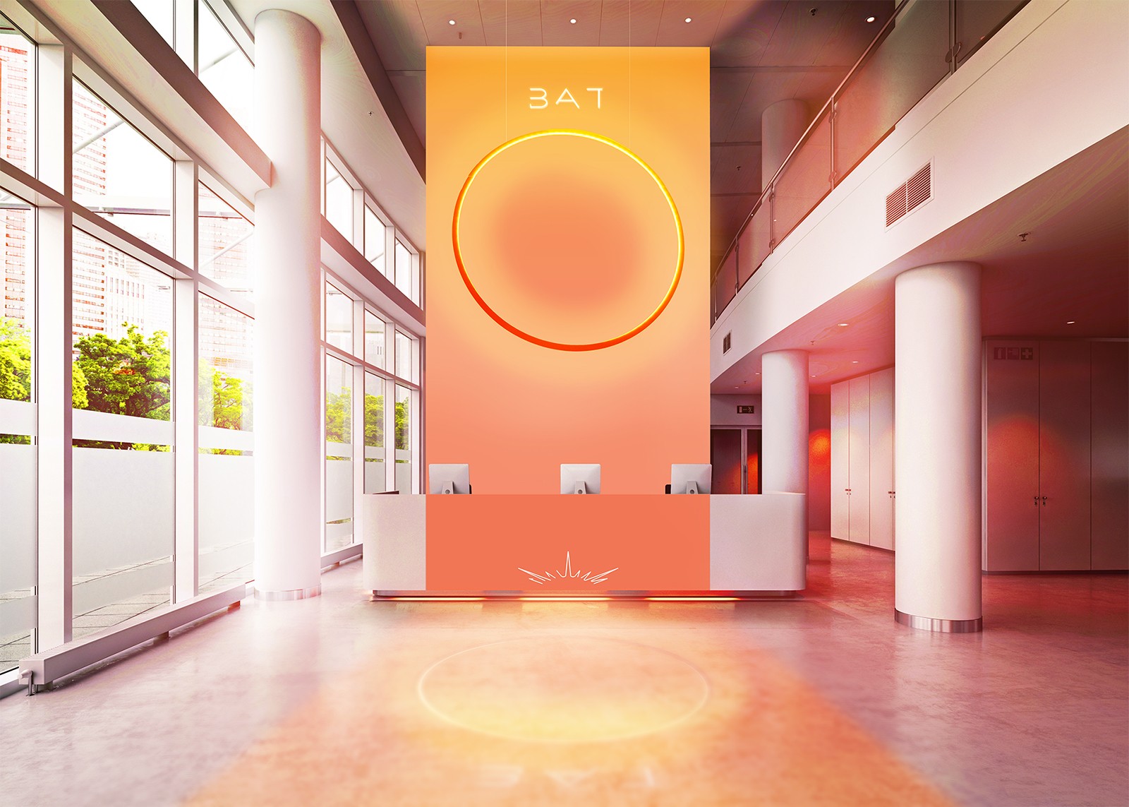
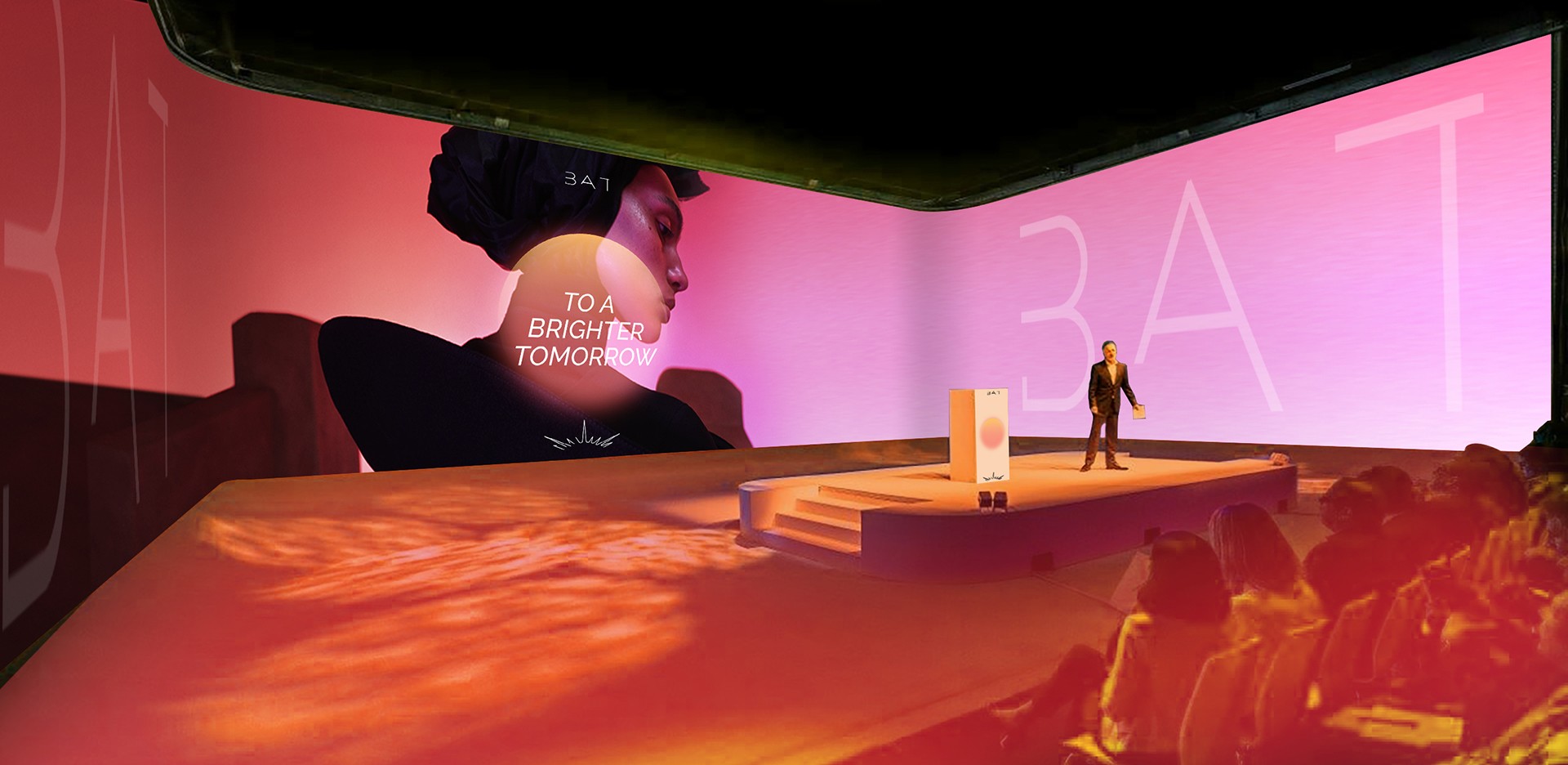
This route became the catalyst for BAT’s transformation.
By introducing a future-facing direction, we repositioned the company with newfound clarity and adaptability - demonstrating how a global legacy brand can evolve beyond its traditional image without losing the trust it has built over decades.
The result is a foundation for a modern, relevant, and unified global presence that led to the brand’s new visual language.
This route became the catalyst for BAT’s transformation.
By introducing a future-facing direction, we repositioned the company with newfound clarity and adaptability - demonstrating how a global legacy brand can evolve beyond its traditional image without losing the trust it has built over decades.
The result is a foundation for a modern, relevant, and unified global presence that led to the brand’s new visual language.
A brand ready for a different conversation.
A brand ready for a different conversation.
⮑ Outcome

Redesigning the Future.
Redesigning the Future.
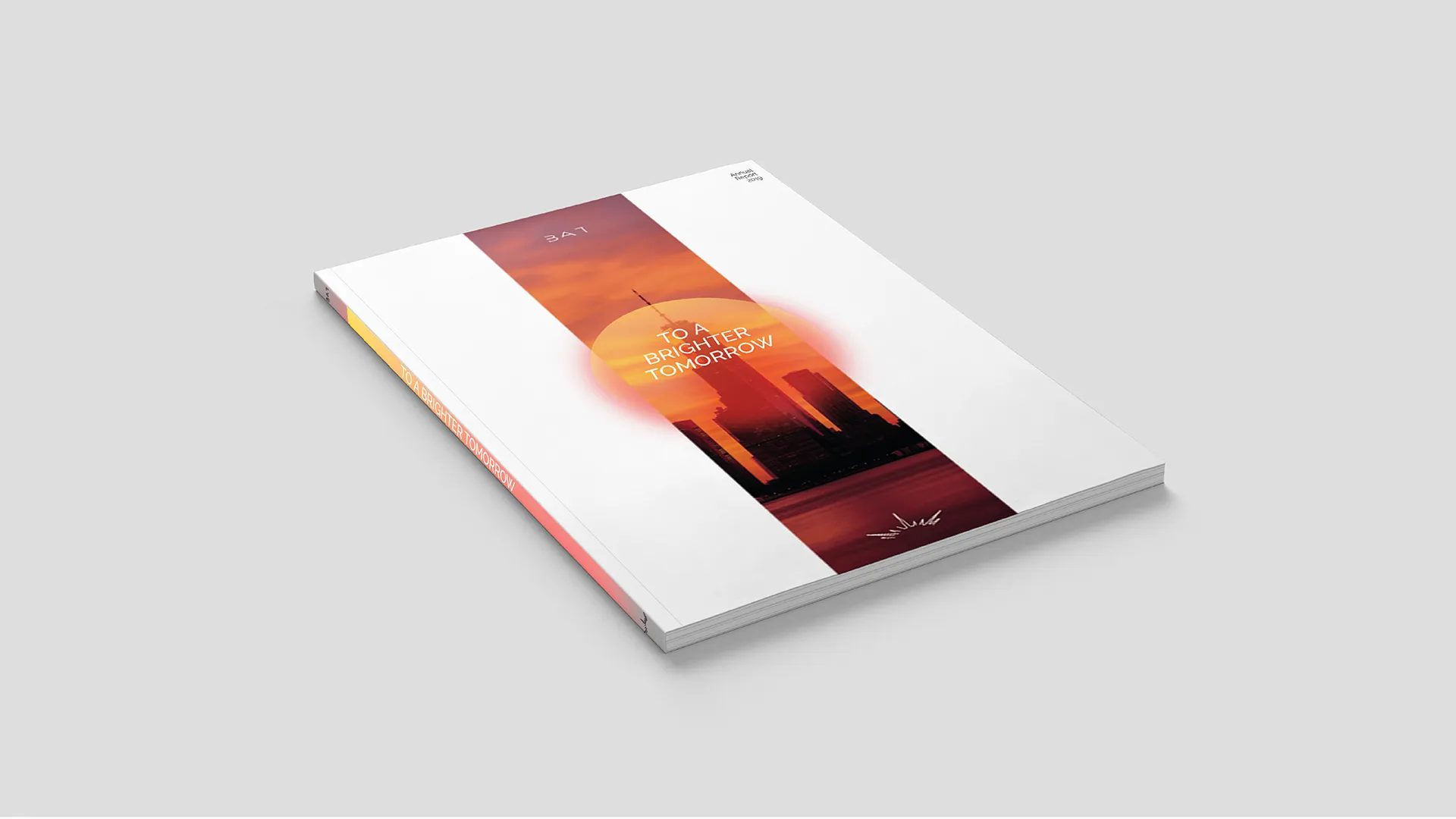
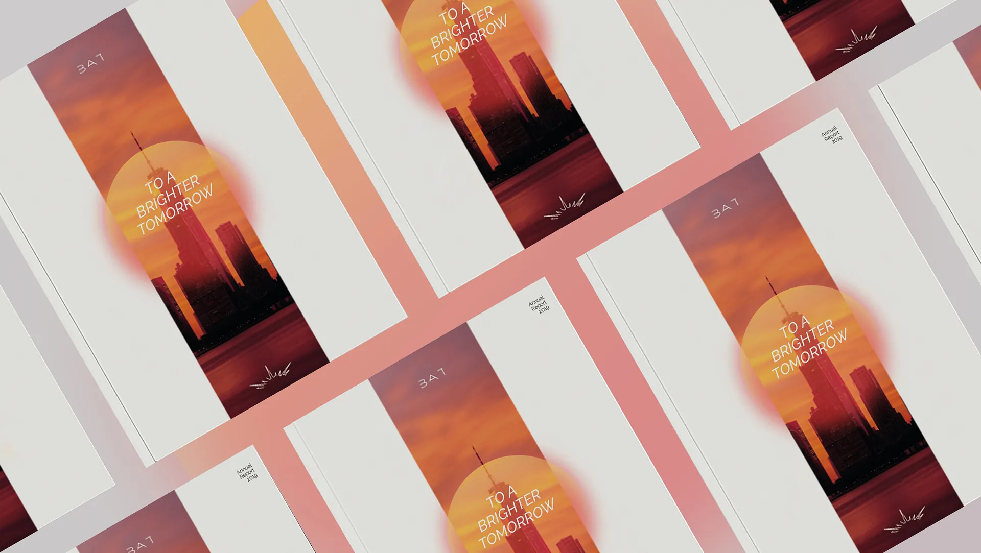
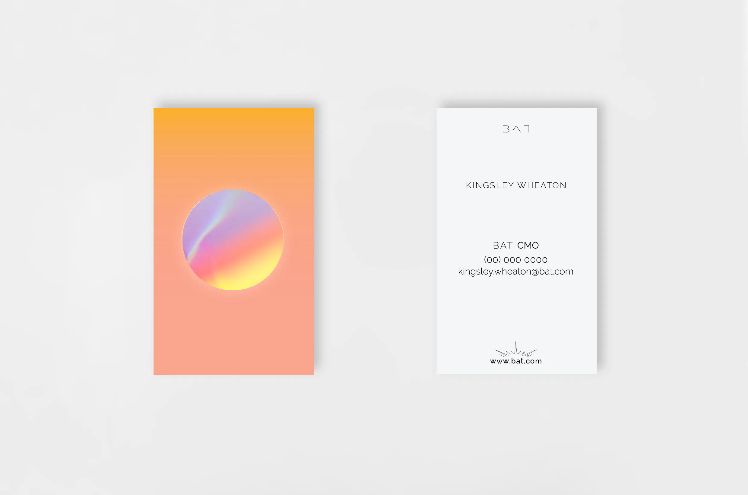
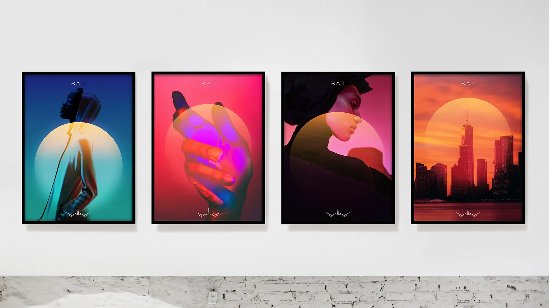
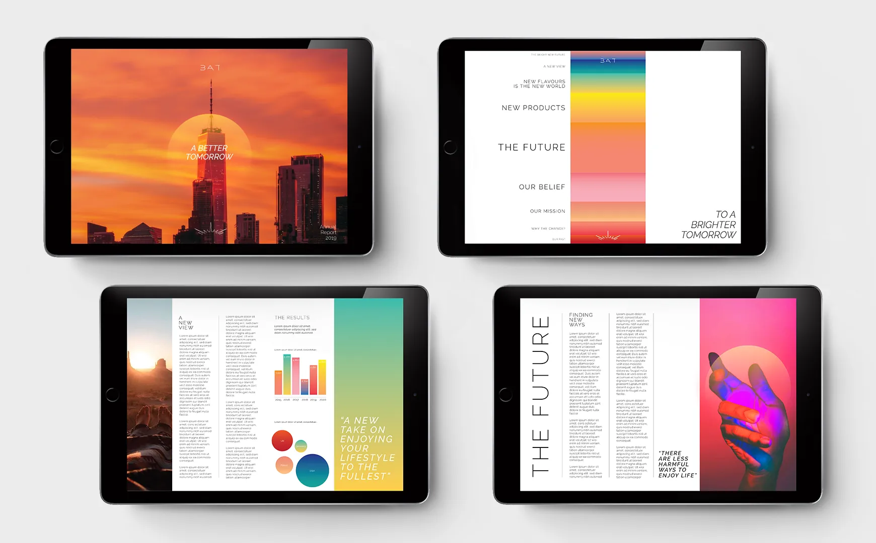
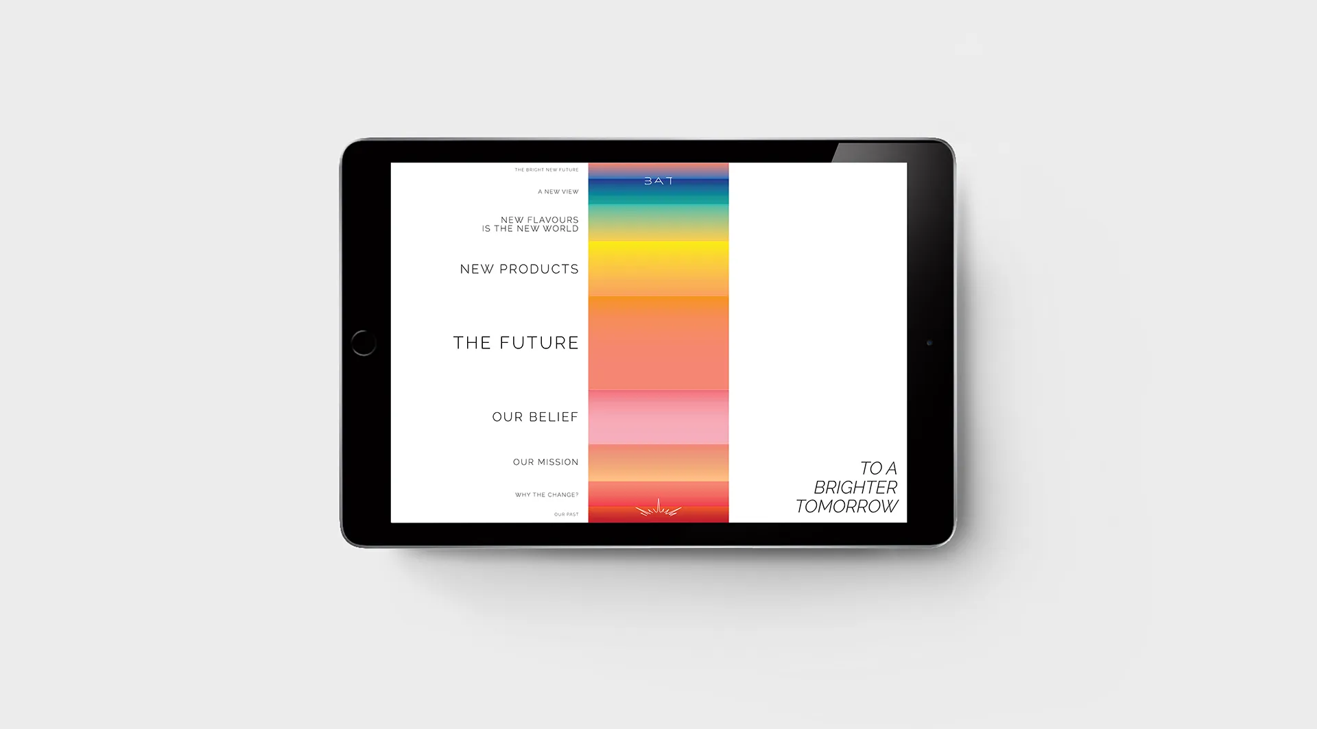
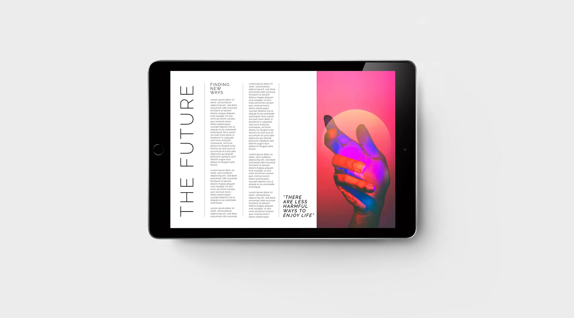
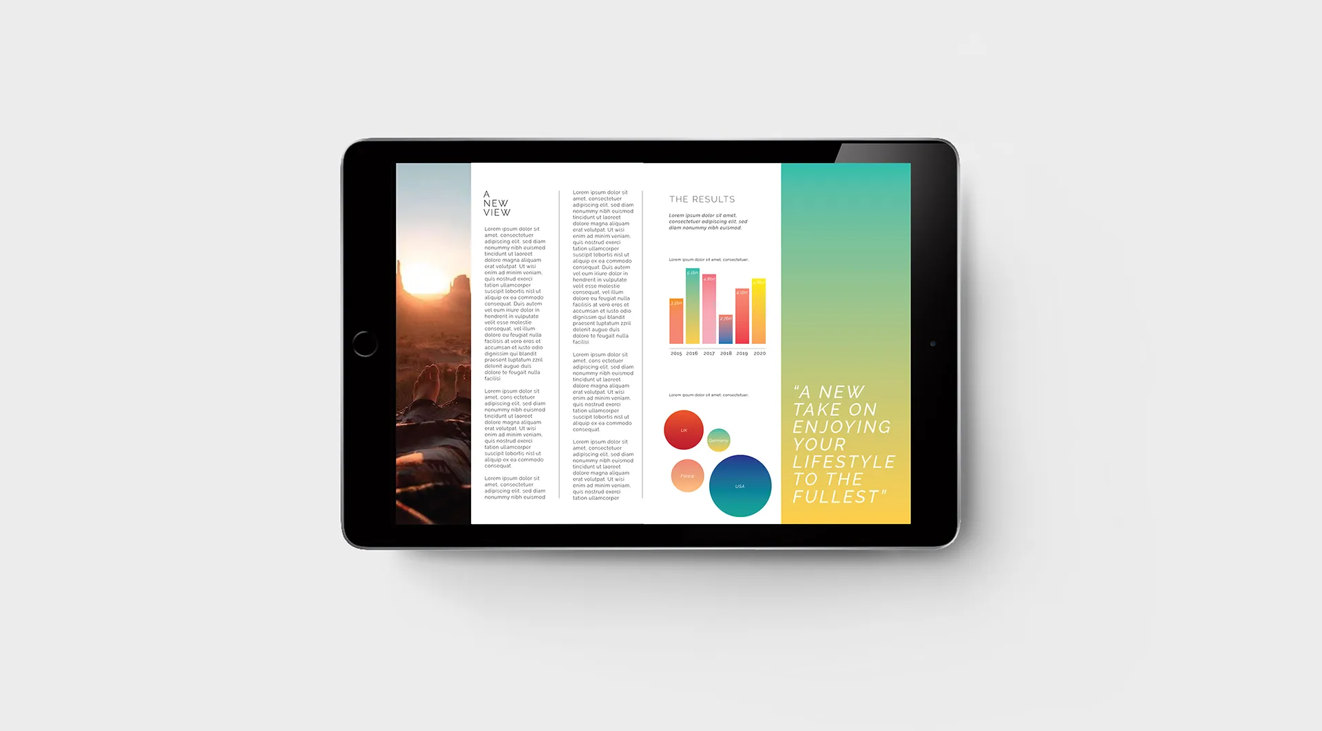
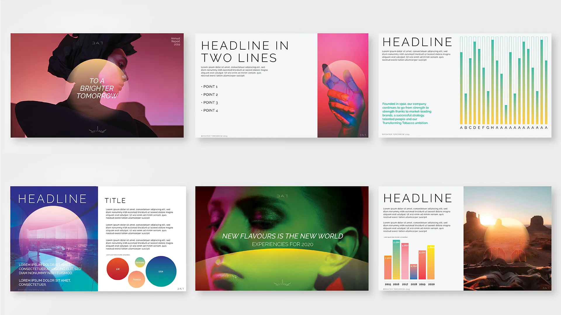
The new visual system retained enough equity to signal continuity to institutional audiences while adopting the design confidence of a technology company. A vertical clean layout, a refined, sober colour palette that expands when needed, and a photographic language centred on lifestyles - not product - communicated the shift from commodity to purpose-led brand.
The system is designed to adapt across multiple touchpoints, ensuring consistency while remaining adaptable across regulated markets worldwide and applications. Reinforcing BAT's position as a responsible leader in the industry, prioritising innovation and safety for a better future.
The new visual system retained enough equity to signal continuity to institutional audiences while adopting the design confidence of a technology company. A vertical clean layout, a refined, sober colour palette that expands when needed, and a photographic language centred on lifestyles - not product - communicated the shift from commodity to purpose-led brand.
The system is designed to adapt across multiple touchpoints, ensuring consistency while remaining adaptable across regulated markets worldwide and applications. Reinforcing BAT's position as a responsible leader in the industry, prioritising innovation and safety for a better future.
⮑ Design
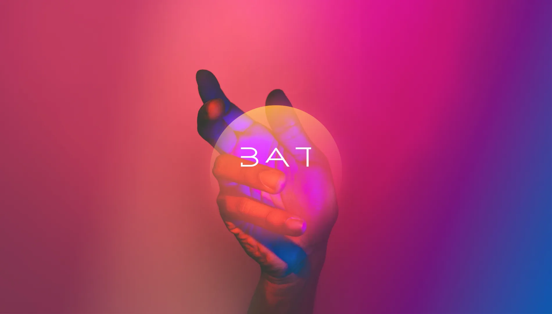
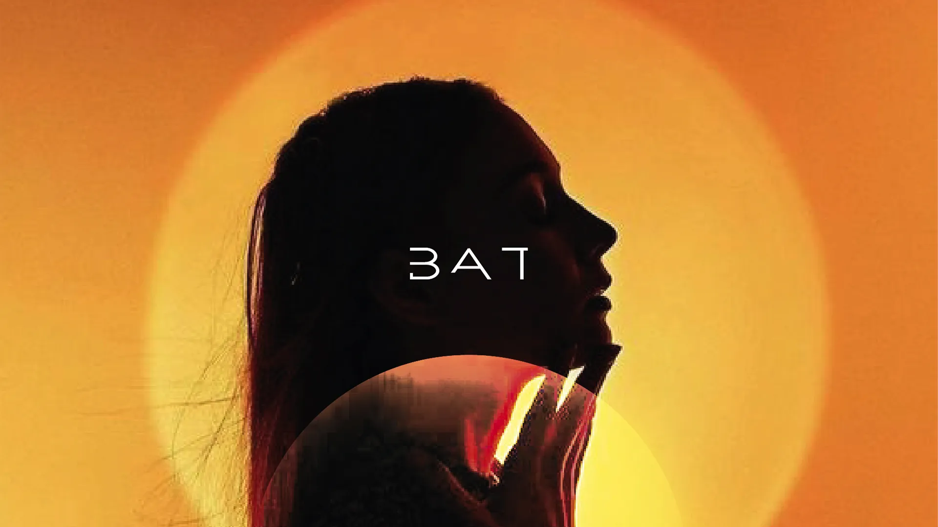
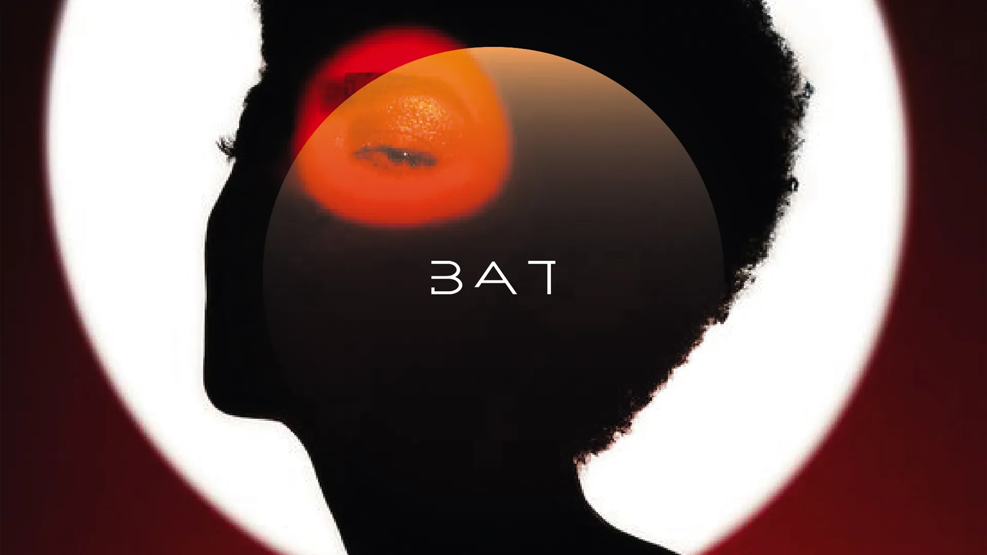
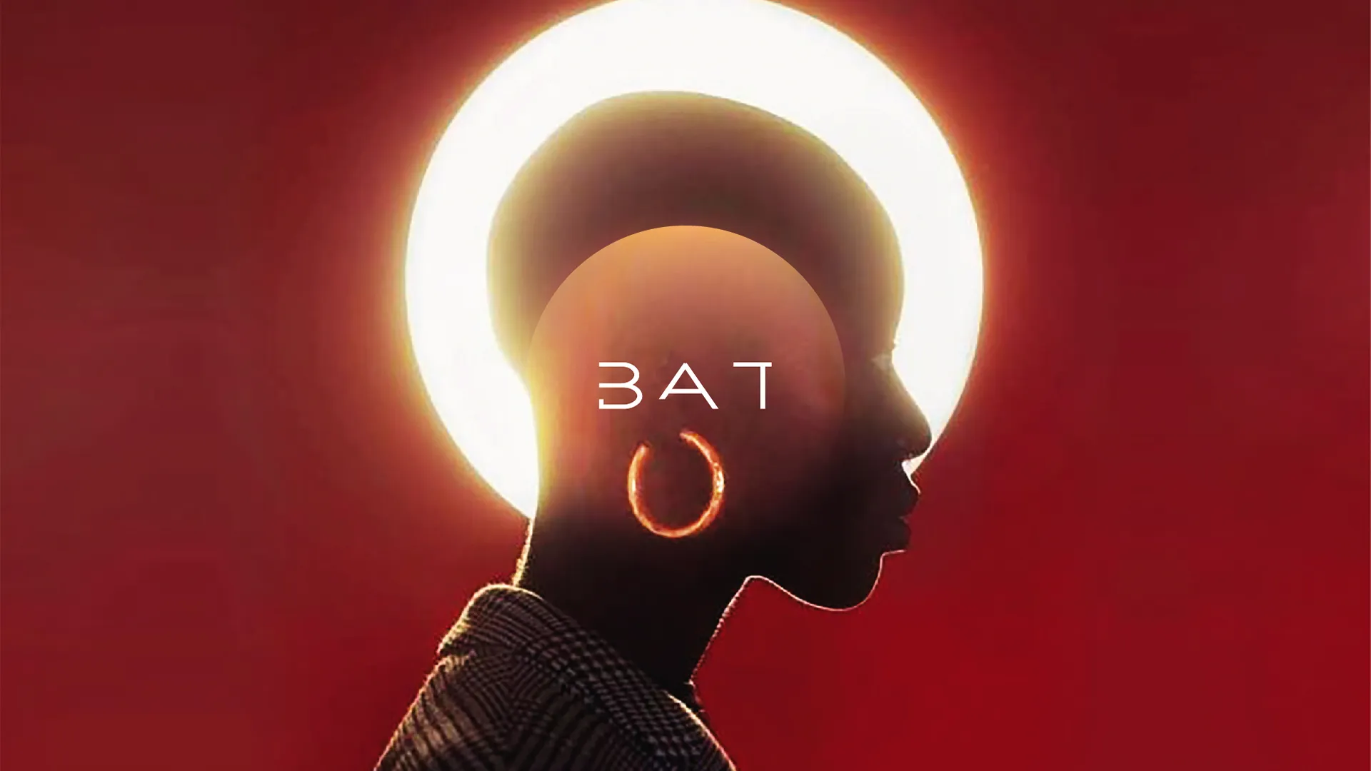

The strategic pivot required more than a visual refresh - it needed a narrative shift. We positioned BAT not as a tobacco company modernising, but as a lifestyle goods company evolving. The concept 'Better Tomorrow' became the strategic anchor: a forward-looking commitment that reframes the corporate mission without pretending the past doesn't exist.
This forward-thinking concept emphasised harm reduction, technological innovation, and a positive, aspirational future for people who choose alternatives.
A shift towards innovation and responsability.
A shift towards innovation and responsability.
⮑ Concept & Strategy


A century-old giant, reframed for the future.
A century-old giant, reframed for the future.
British American Tobacco faced a defining inflexion point: a regulated industry in decline for its core product, but significant investment in next-generation alternatives - vaping, heated tobacco, oral nicotine. The rebrand had to acknowledge heritage while making a credible claim on innovation and responsibility.
I led concept development and visual direction as a freelancer at Landor Associates. I was part of an international team on multiple routes and led concept development that could better reflect innovation, modernity, and a more human brand expression at a global scale.
British American Tobacco faced a defining inflexion point: a regulated industry in decline for its core product, but significant investment in next-generation alternatives - vaping, heated tobacco, oral nicotine. The rebrand had to acknowledge heritage while making a credible claim on innovation and responsibility.
I led concept development and visual direction as a freelancer at Landor Associates. I was part of an international team on multiple routes and led concept development that could better reflect innovation, modernity, and a more human brand expression at a global scale.
British American Tobacco faced a defining inflexion point: a regulated industry in decline for its core product, but significant investment in next-generation alternatives - vaping, heated tobacco, oral nicotine. The rebrand had to acknowledge heritage while making a credible claim on innovation and responsibility.
I led concept development and visual direction as a freelancer at Landor Associates. I was part of an international team on multiple routes and led concept development that could better reflect innovation, modernity, and a more human brand expression at a global scale.
⮑ Overview
⮑ Overview
⮑ BAT
CLIENT
⮑ Rebrand
PROJECT
⮑ Tobacco
SECTOR