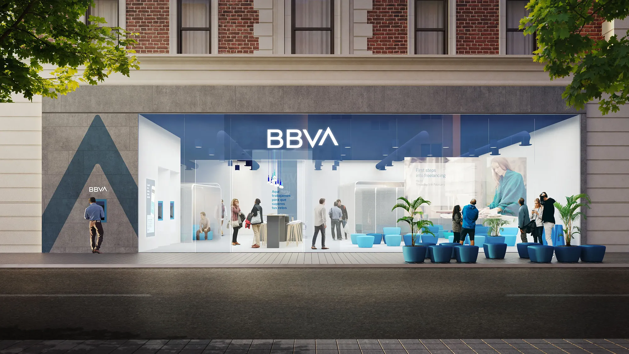





BBVA rebrand logotype signage building Banking MOC85

The new identity unified BBVA's visual presence across all markets, with a measurable increase in digital brand visibility and agility of 42%.


Focus on Opportunities, solidifying the motto "Creating Opportunities" to emphasize a positive, empathetic, and forward-looking customer relationship.


The system successfully bridged the trust of a heritage institution with the design confidence of a technology company. Within one year of the, launch 80-90% of branches, corporate buildings, and ATMs were updated, and the rebrand was highly rated by brand specialists for bringing consistency to the group.


The new identity unified BBVA's visual presence across all markets, with a measurable increase in digital brand visibility and agility of 42%.


Focus on Opportunities, solidifying the motto "Creating Opportunities" to emphasize a positive, empathetic, and forward-looking customer relationship.


The system successfully bridged the trust of a heritage institution with the design confidence of a technology company. Within one year of the, launch 80-90% of branches, corporate buildings, and ATMs were updated, and the rebrand was highly rated by brand specialists for bringing consistency to the group.


A system built to hold across 30 markets.

A system built to hold across 30 markets.

⮑ Outcome

⮑ Outcome

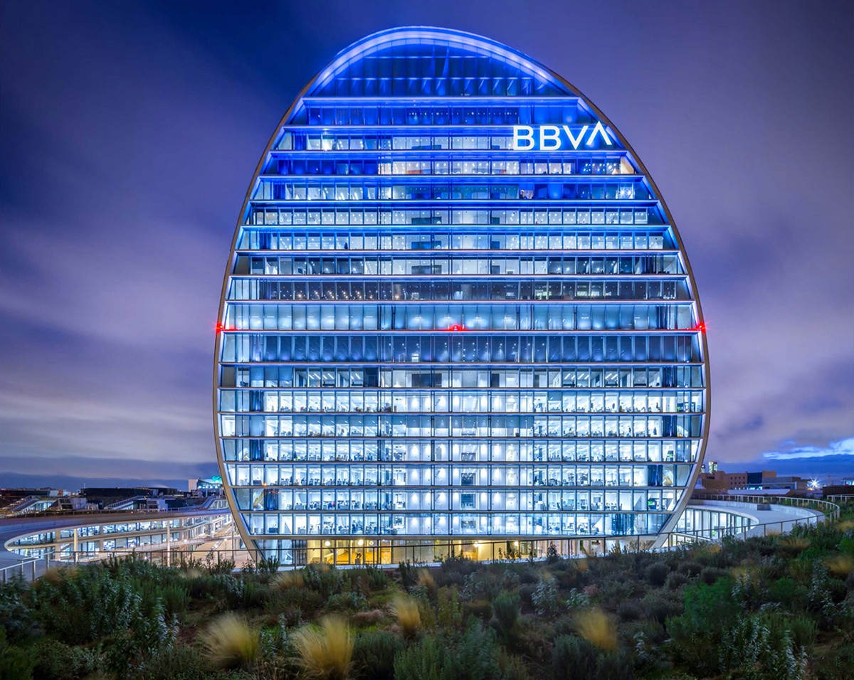
BBVA rebrand main branch Banking MOC85
BBVA rebrand stand Banking MOC85
BBVA rebrand bank cards Banking MOC85
BBVA rebrand app intro screen Banking MOC85
BBVA rebrand app icons set Banking MOC85
BBVA rebrand website Banking MOC85
BBVA rebrand bank cards Banking MOC85
BBVA rebrand app intro screen Banking MOC85
BBVA rebrand app icons set Banking MOC85
BBVA rebrand website Banking MOC85
BBVA rebrand bank cards Banking MOC85
BBVA rebrand app intro screen Banking MOC85
BBVA rebrand app icons set Banking MOC85
BBVA rebrand website Banking MOC85

Simplicity at global scale.

Simplicity at global scale.

Collaborating closely with Landor’s team and BBVA’s in-house team to align creative strategies with the brand’s vision, making sure every element is designed to support readability and usability, particularly across digital platforms where clarity is critical. 


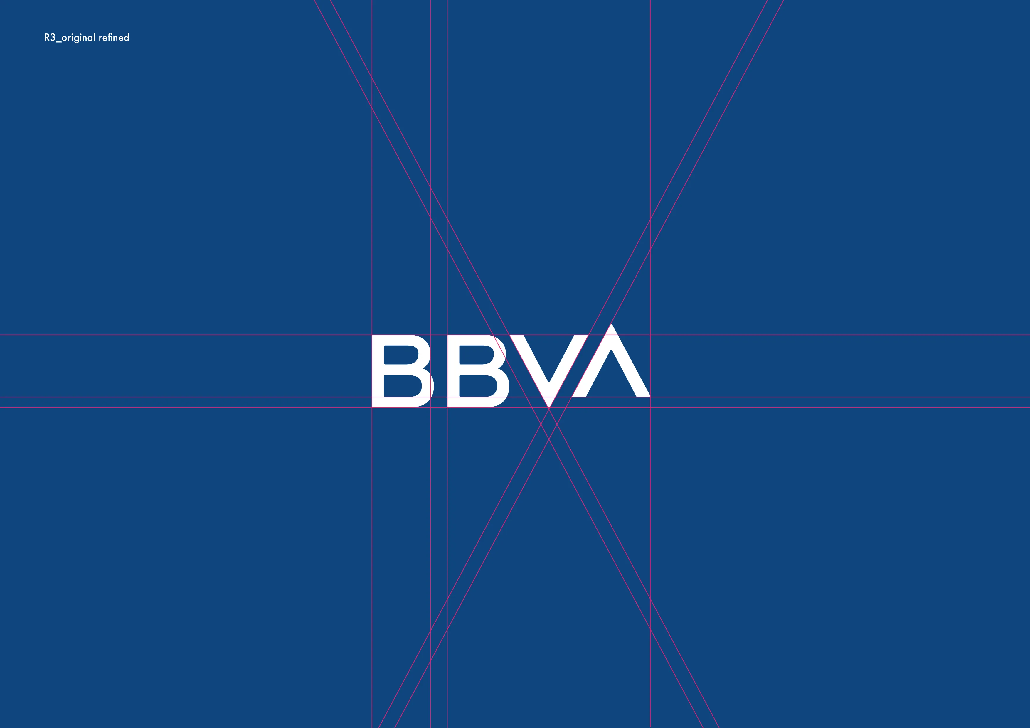
The updated logo distils BBVA to its most elemental mark - clean, confident, and engineered for motion and digital environments. The raised 'A' - the ascender - became a purposeful signature: a subtle gesture of aspiration embedded in the wordmark.


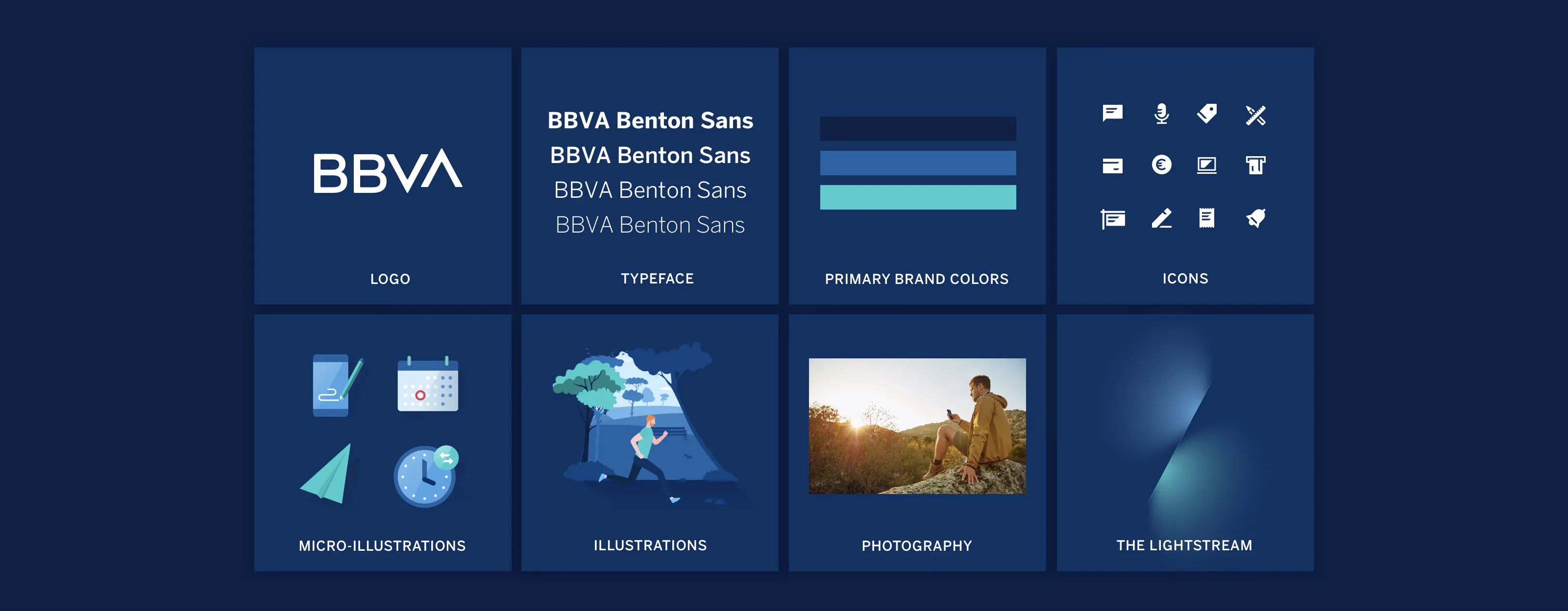
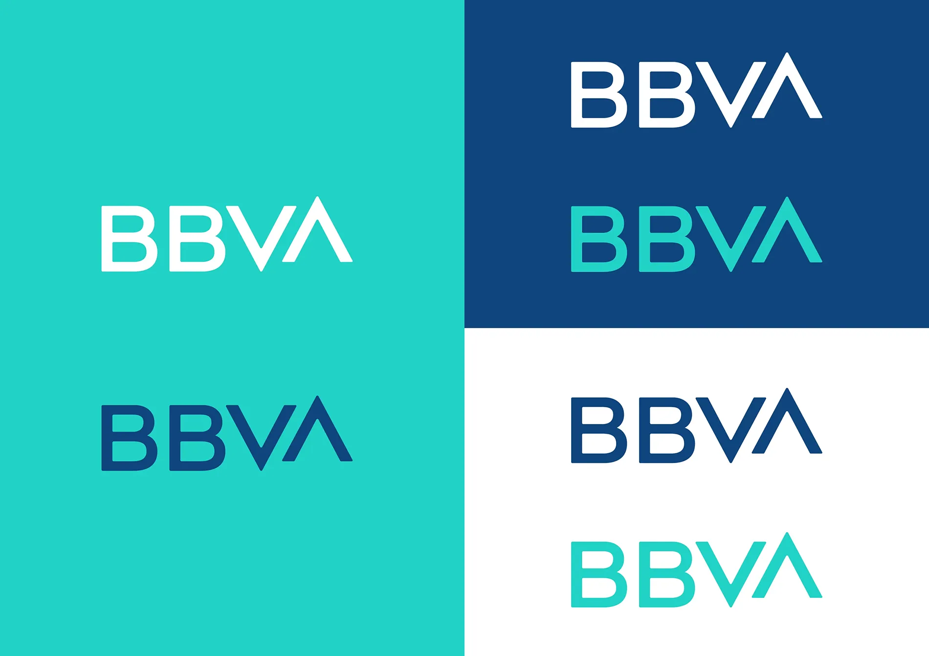
A deeper primary blue conveys institutional weight, while teal introduces dynamism across digital and animation contexts. The typeface was chosen for neutrality at scale, with no cultural bias and maximum legibility across scripts.
⮑ Design

⮑ Design

BBVA rebrand identity structure_MOC85
BBVA rebrand identity colour Banking MOC85
BBVA rebrand visual identity system Banking MOC85
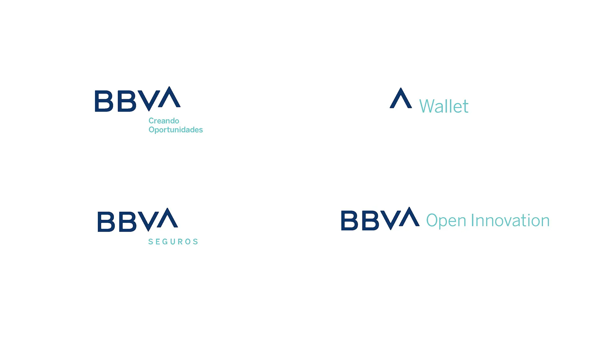
BBVA rebrand product identities Banking MOC85
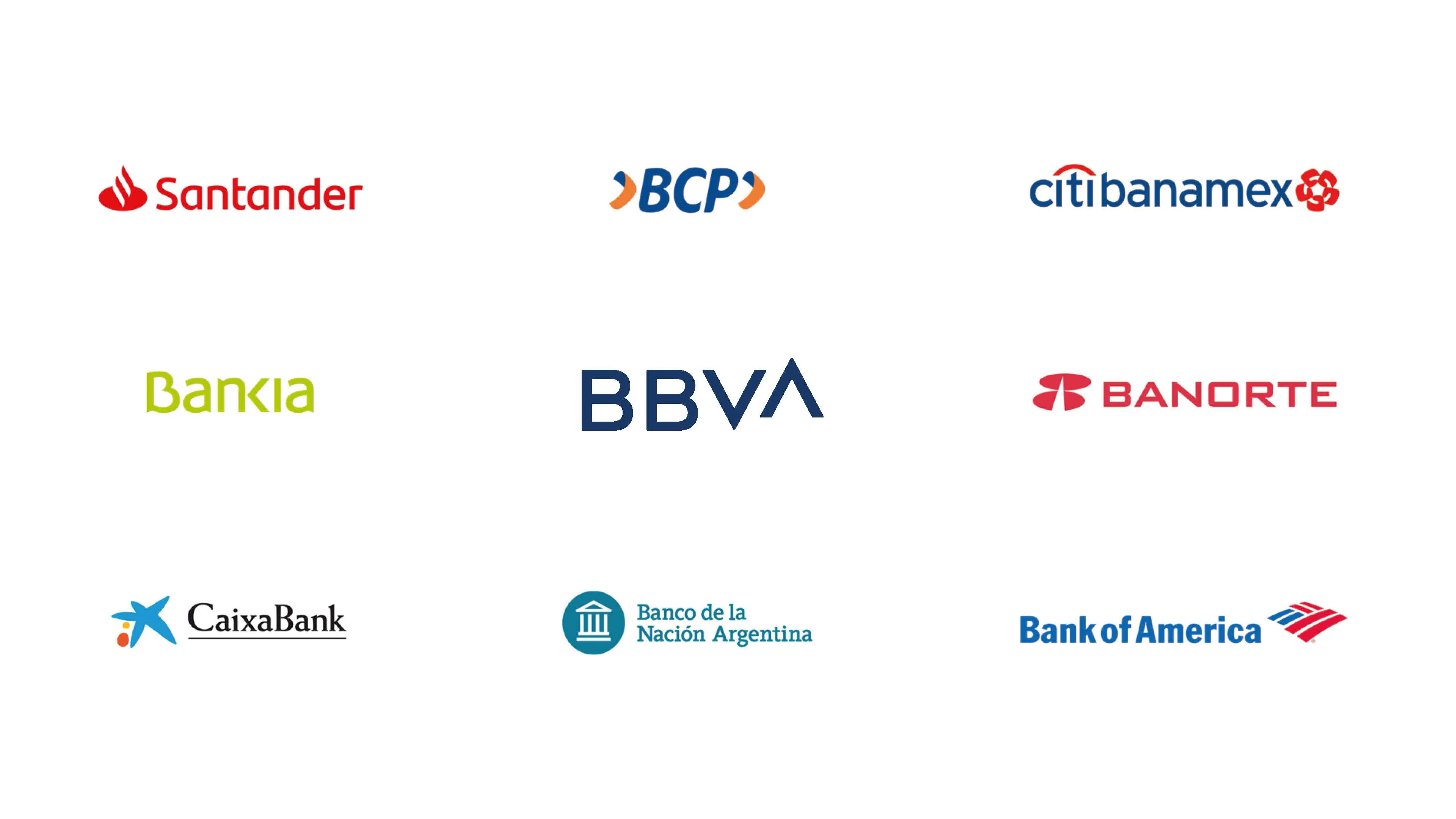
BBVA rebrand identity competitors Banking MOC85

The focus was to make BBVA feel less like a traditional bank and more like a platform - trusted but forward-thinking, established but ready. We grounded the concept in BBVA's core belief: To bring the age of opportunity to everyone.


To emphasise the ideas of opportunity and ascension, we infused two concepts into every decision across the design system. Light: the promise of new opportunity and growth. Elevation: the ability to ascend and prosper in life.


The identity system had to carry this democratic ambition at every touchpoint, from mobile UI to building signage in Mexico City or Istanbul, embodying the values of unity, innovation, and customer-centricity.

Digital-first, globally coherent.

Digital-first, globally coherent.

⮑ Concept & Strategy

BBVA rebrand identity symbol Banking MOC85
BBVA rebrand identity logotype Banking MOC85
BBVA rebrand identity motion Banking MOC85
BBVA rebrand identity lightstream Banking MOC85
BBVA rebrand identity symbol Banking MOC85
BBVA rebrand identity logotype Banking MOC85
BBVA rebrand identity motion Banking MOC85
BBVA rebrand identity lightstream Banking MOC85
BBVA rebrand identity symbol Banking MOC85
BBVA rebrand identity logotype Banking MOC85
BBVA rebrand identity motion Banking MOC85
BBVA rebrand identity lightstream Banking MOC85

One identity, global presence.

One identity, global presence.

I was embedded in the Landor team as the lead creative, along with the BBVA internal creative team, on identity, colour architecture, and typography - the foundational decisions that define how BBVA is perceived globally.


With operations across 30+ markets and a legacy of regional visual inconsistency, BBVA needed a single, scalable identity capable of uniting a global institution without erasing its local relevance. The rebrand had to signal digital maturity at a moment when fintech challengers were rewriting the rules of the category. 

I was embedded in the Landor team as the lead creative, along with the BBVA internal creative team, on identity, colour architecture, and typography - the foundational decisions that define how BBVA is perceived globally.


With operations across 30+ markets and a legacy of regional visual inconsistency, BBVA needed a single, scalable identity capable of uniting a global institution without erasing its local relevance. The rebrand had to signal digital maturity at a moment when fintech challengers were rewriting the rules of the category. 

⮑ Overview

Banking

SECTOR

Rebrand

PROJECT

BBVA

CLIENT

Miguel Cruz MOC85 — Brand Designer London Logo