
Opella's first major commercial milestone after launch was securing a sizeable Private Equity investment - a direct validation that the brand had the credibility and differentiation to stand independently from Sanofi.
Internally, employees embraced the rebel positioning, creating the cultural foundation a newly spun-off organisation needs to move fast and with confidence.
Today, Opella continues its mission to simplify self-care for all, standing proud as a game-changing force in consumer health.
Standing proud from the crowd.
Standing proud from the crowd.
⮑ Outcome


The rebel of the health aisle.
The rebel of the health aisle.
The visual identity is built around contrast: a Bold Green that dominates the category, a clean wordmark always paired with bold copy, and an illustration system full of wit and warmth. Visually, the brand relies on big, bold statements and attitude. We developed the brand’s typography, the Opella Sans for the statements, clarity and directness, and Opella Serif typography, incorporating the truthful, human position of the brand.
The focus was on the message, TOV and delivery. The tone of voice matches - direct, frank, occasionally playful. Enamel pins, stickers, and campaign posters give the brand subcultural energy that traditional pharma simply cannot replicate.
Our strategy centered on one powerful idea: Simplicity as rebellion.
Stripping away the jargon, challenging the conventions, creating a brand that makes self-care accessible, usable, and empowering.
⮑ Design


The category norm for consumer health is clinical reassurance - safe, cautious, institutional. We identified this as both the strategic problem and the creative opportunity. Opella's brand concept, 'Revolutionary Simplicity,' positions the company as the self-care rebel: a business that believes health doesn't have to be complicated, and a brand willing to prove it. Bold, direct, and deliberately uncorporate.
Our strategy centered on one powerful idea: Simplicity as rebellion.
Stripping away the jargon, challenging the conventions, creating a brand that makes self-care accessible, usable, and empowering.
Revolutionary simplicity. Dare to Care.
Revolutionary simplicity. Dare to Care.
⮑ Concept & Strategy


Sanofi's self-care division needed its own voice.
Sanofi's self-care division needed its own voice.
I was the Senior Designer leading the Opella branding project at Landor.
Sanofi’s Consumer Healthcare division identified a fundamental problem: self-care had become anything but simple. A category meant to empower people had grown complex, jargon-heavy, and hard to navigate. The opportunity was clear - create a bold new brand that cuts through the noise, and in doing so, redefine what consumer healthcare could look and feel like.
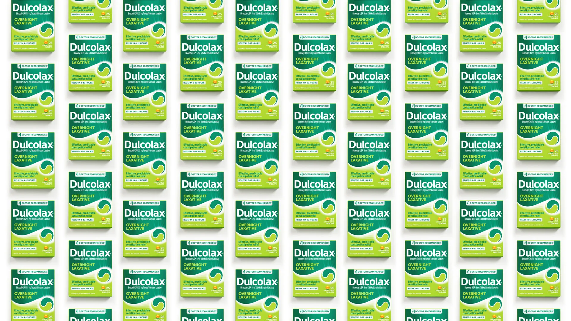
That’s where we came in, to help them separate, reinvent, and reimagine what consumer healthcare could be. The result? Opella, a bold new brand with simplicity at its core. The challenge was double: establish a credible brand to attract Private Equity investment, while galvanising a newly formed internal team around a shared cultural identity.
I was the Senior Designer leading the Opella branding project at Landor.
Sanofi’s Consumer Healthcare division identified a fundamental problem: self-care had become anything but simple. A category meant to empower people had grown complex, jargon-heavy, and hard to navigate. The opportunity was clear - create a bold new brand that cuts through the noise, and in doing so, redefine what consumer healthcare could look and feel like.
That’s where we came in, to help them separate, reinvent, and reimagine what consumer healthcare could be. The result? Opella, a bold new brand with simplicity at its core. The challenge was double: establish a credible brand to attract Private Equity investment, while galvanising a newly formed internal team around a shared cultural identity.
⮑ Overview
⮑ Overview
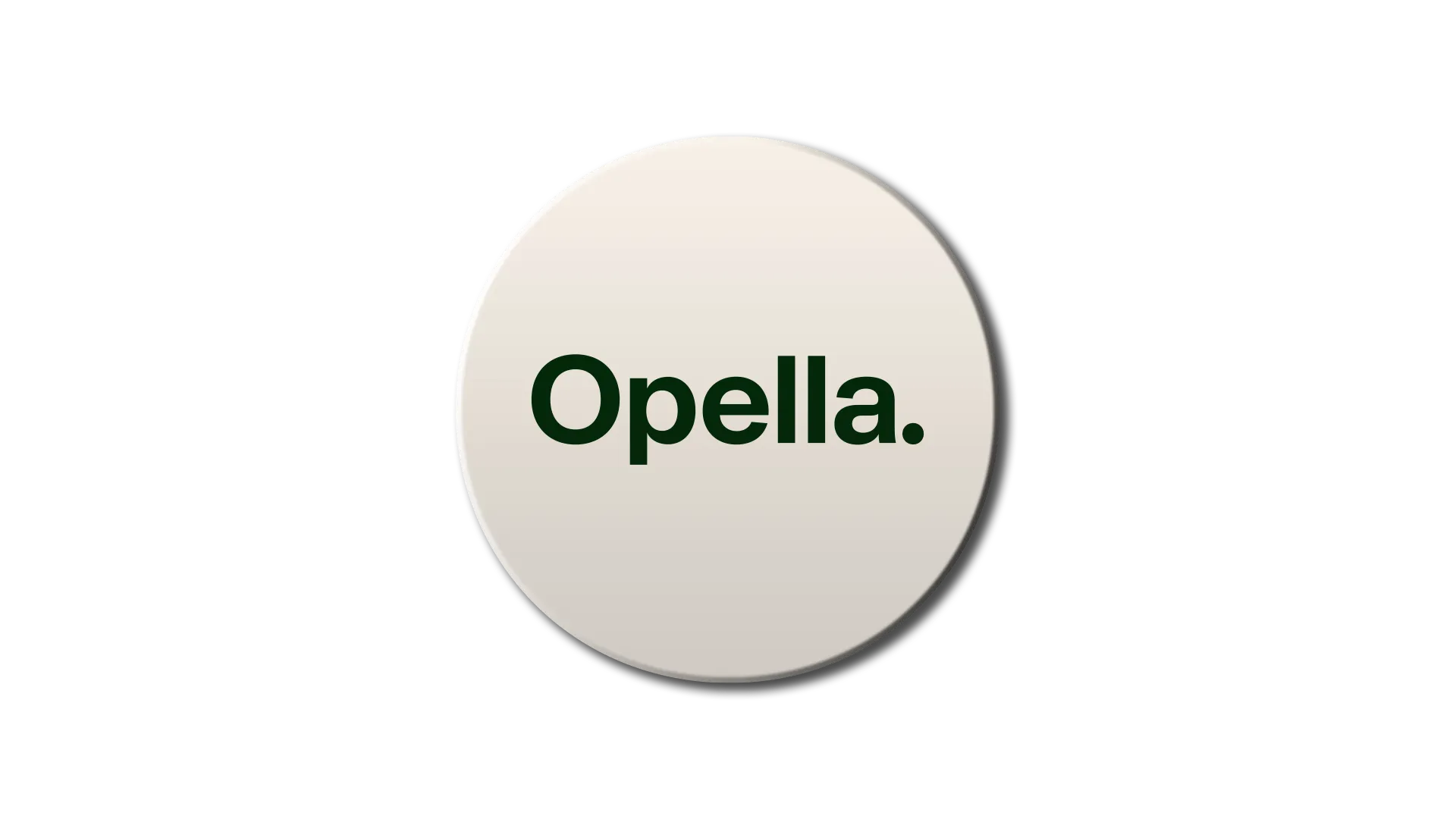
⮑ Opella
CLIENT
⮑ Branding
PROJECT
⮑ Healthcare
SECTOR

