


A complete identity system that blends the brands's tradition with modernity.
A complete identity system that blends the brands's tradition with modernity.
The updated packaging system and visual identity system stand out in retail environments, enhancing shelf appeal and differentiating PróVida from competitors and similar products.
Its warmth and earth-toned help connect to the audience that values healthy food, stay in shape, sustainability and the environmental causes as well as great tasting food across multiple products.
A creative strategy was developed, centering on the brand’s mission to become a leading voice for healthier nutrition in Portugal.
The rebrand aimed to create a holistic brand ecosystem, incorporating agricultural and environmental elements that embody the natural and sustainable ethos of PróVida.
Key steps included:
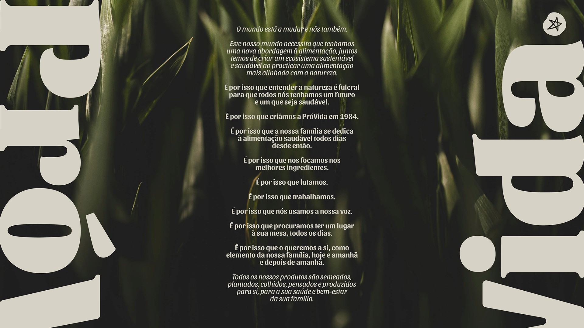
Establishing a brand mission and manifesto, building an authentic voice for the brand.
Defining a visual identity system aligned with the brand’s values, that builds on the existing assets.
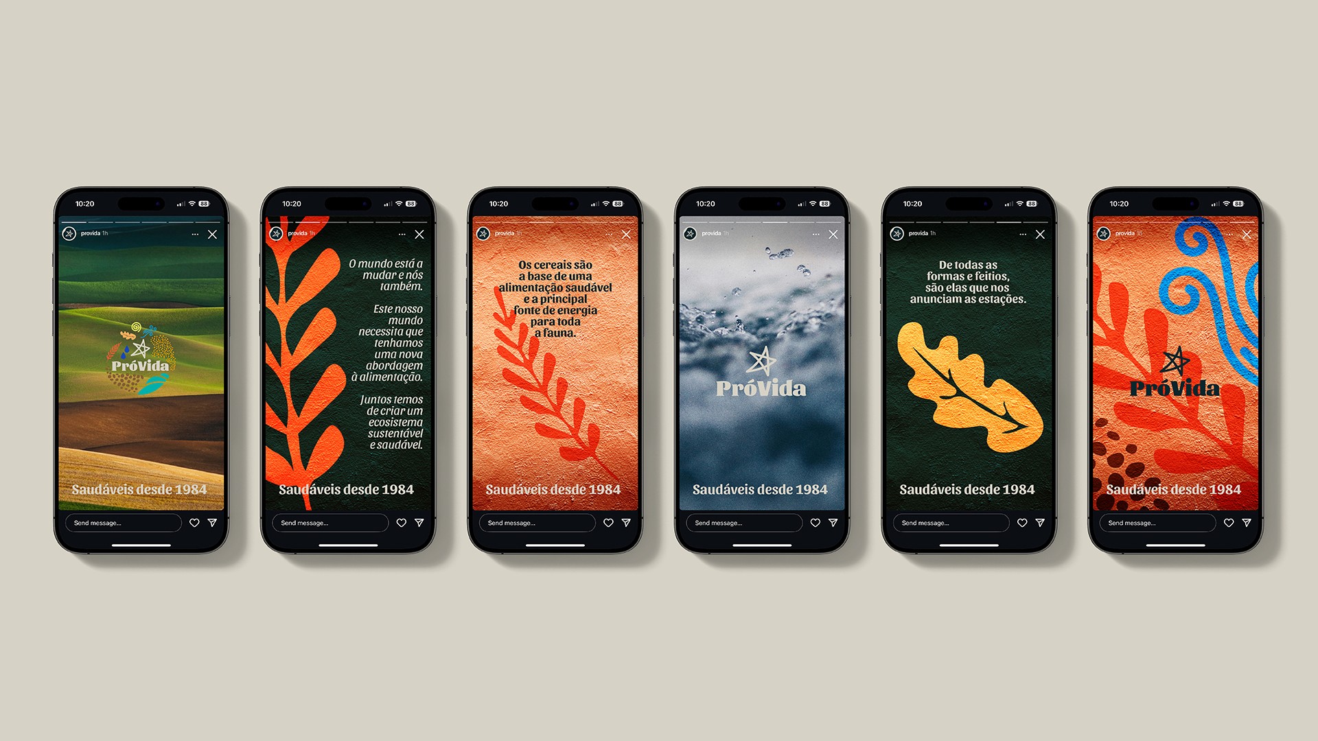
Leveraging digital platforms like social media for enhanced engagement, specially with an younger audience.
Define a new packaging system for the brand based on sustainable materials such as glass and compostable packaging.
⮑ Outcome


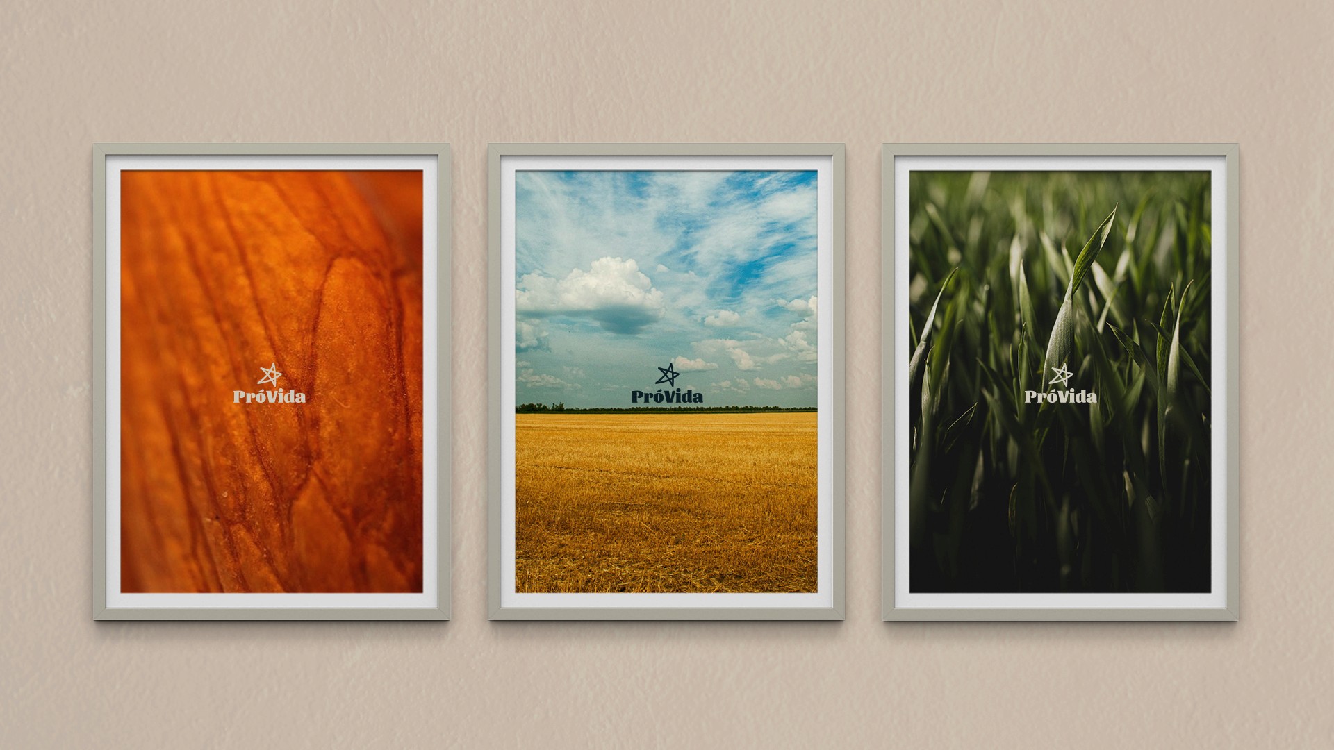


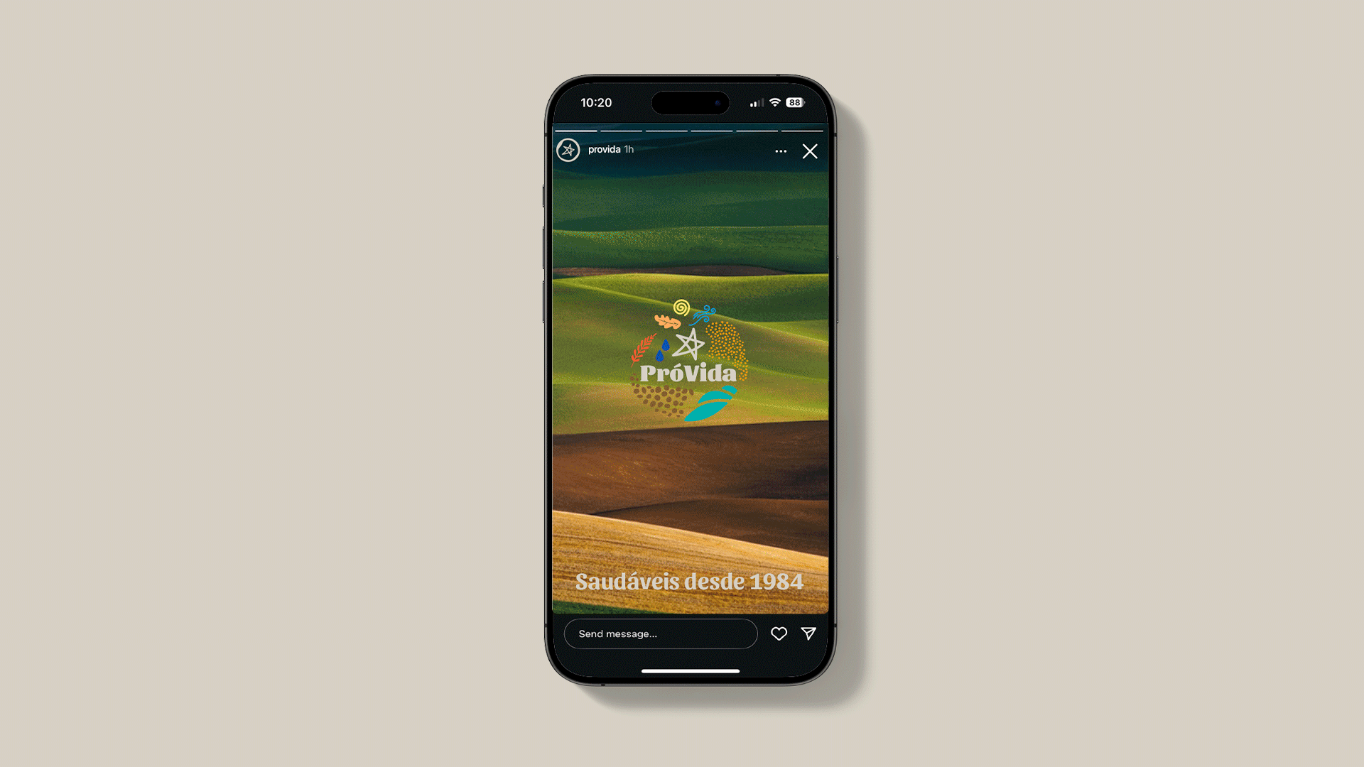
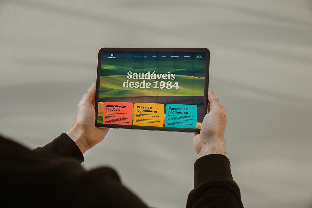
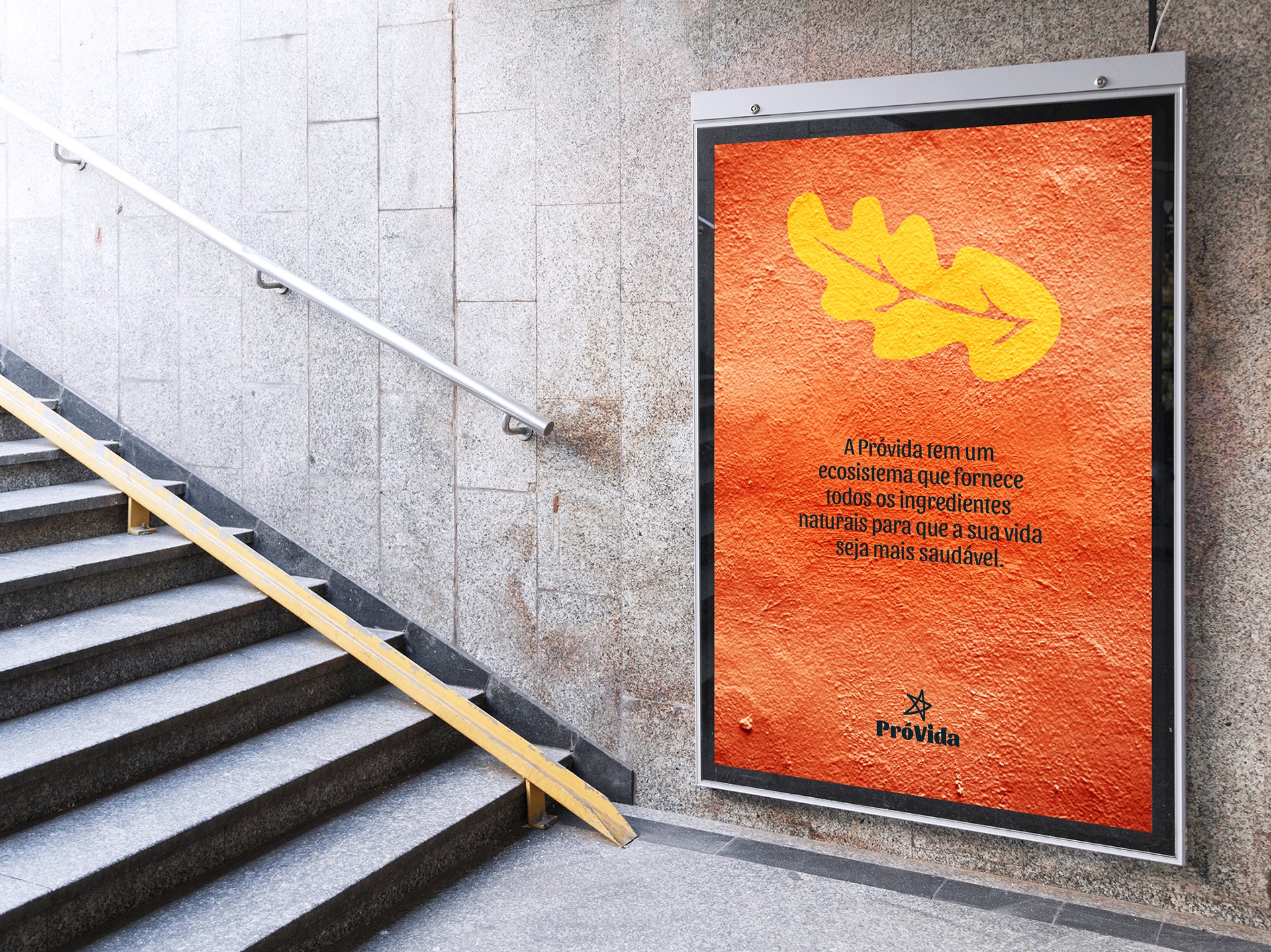
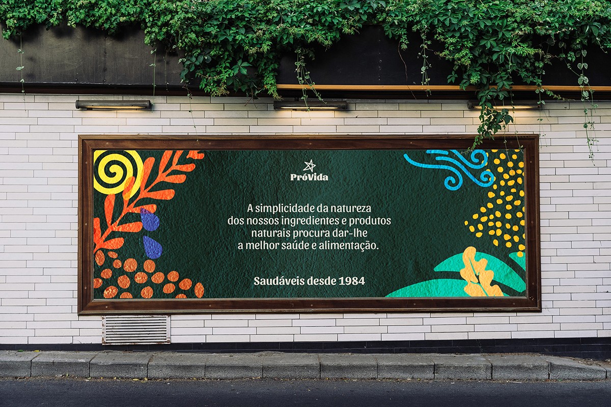
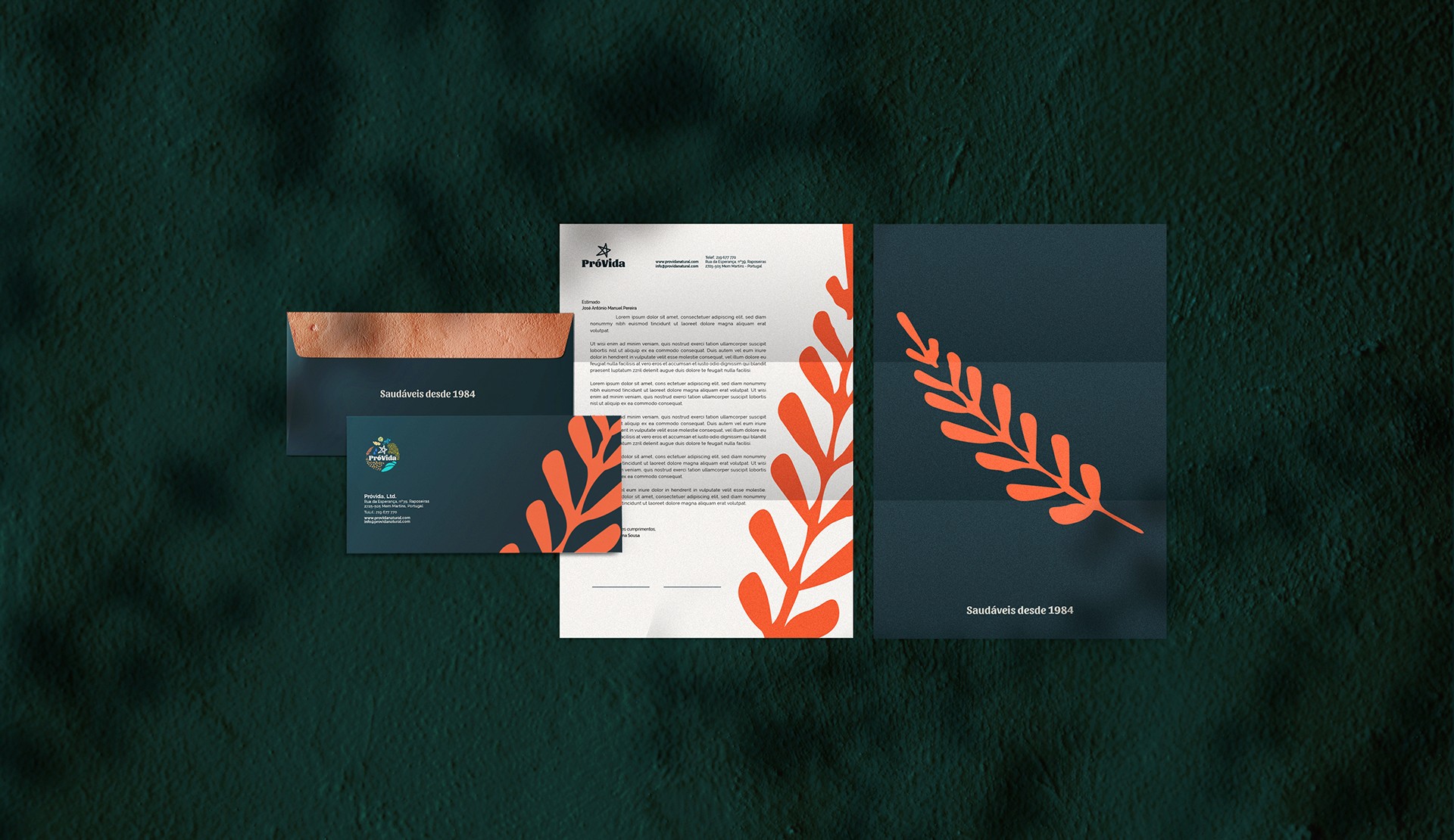
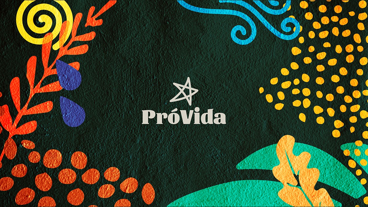
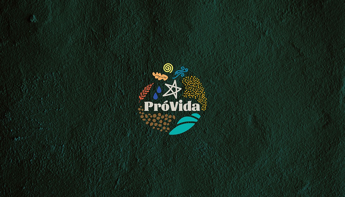
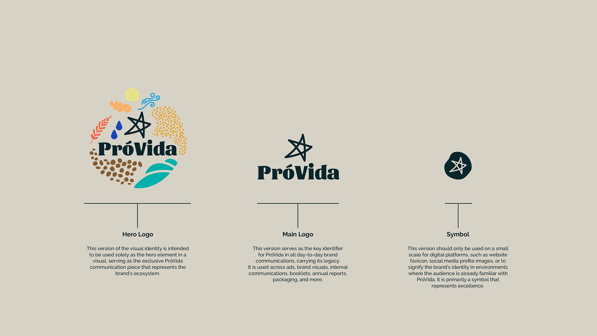
Visual Identity: A hero identity inspired by the natural ecosystem elements, highlights PróVida’s commitment to healthy, sustainable products. The day-to-day key identity emphasizes the name with custom typography and a star symbol of excellence.
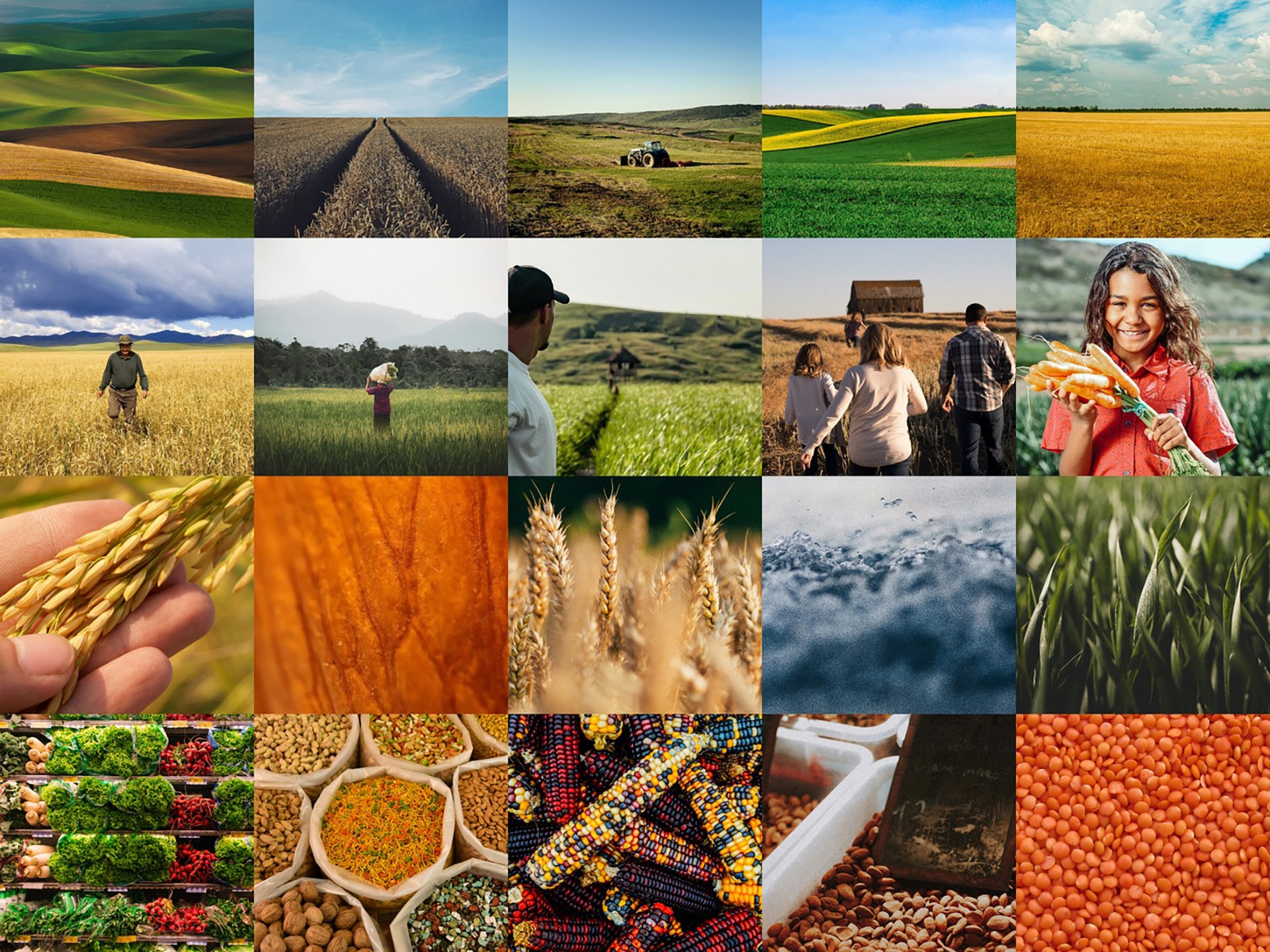
Visual Language: Warm colors, simple illustrations, friendly type, and natural photography capture both ecosystem elements and daily life - from products and ingredients to workers and producers and everything involved - creating an approachable, authentic look.
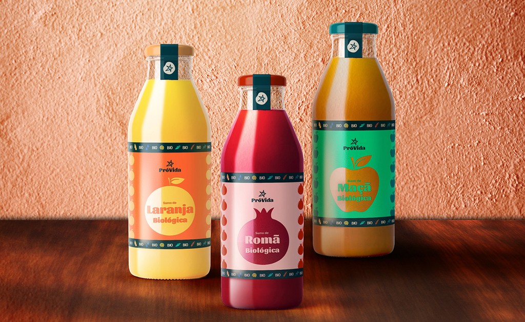
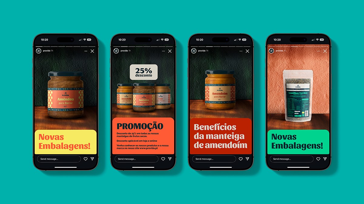
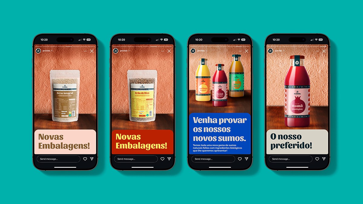
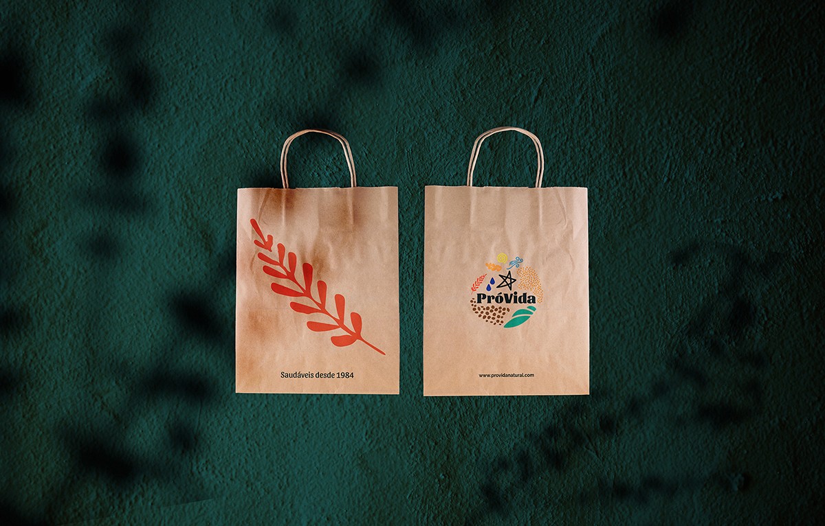
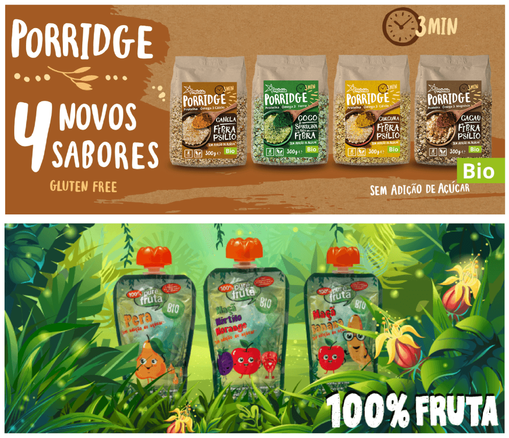
Packaging: Simple, Bold & Vibrant – Natural colors highlight the organic product inside. The brand only uses Eco-Friendly Materials ensuring sustainability and trust.
Additionally, social media strategies were designed to engage younger audiences and amplify the brand’s voice in healthier nutrition sharing brand stories, recipes, product updates and sustainability:
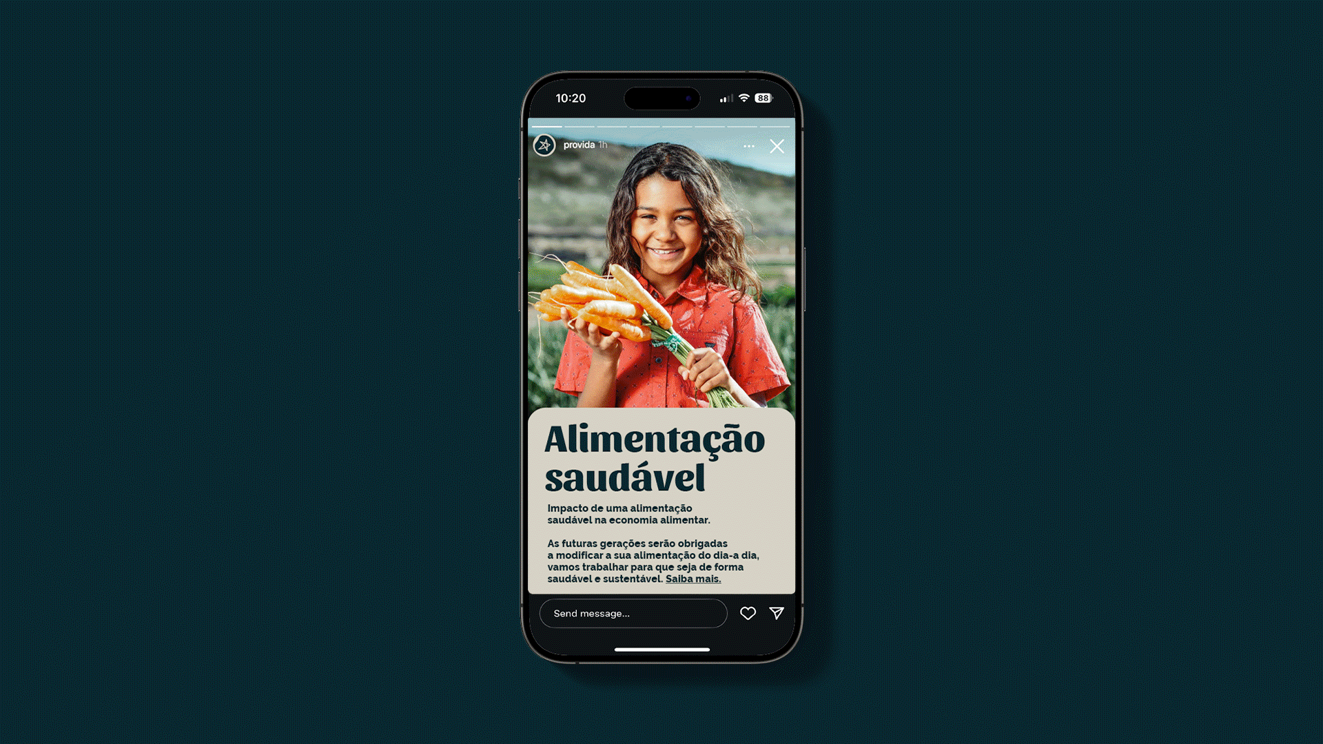
Brand Stories: Highlighting heritage, values, mission, and vision.
Article Stories: Featuring content such as partnerships, ingredient sourcing, production processes, day-to-day activities, and recipes.
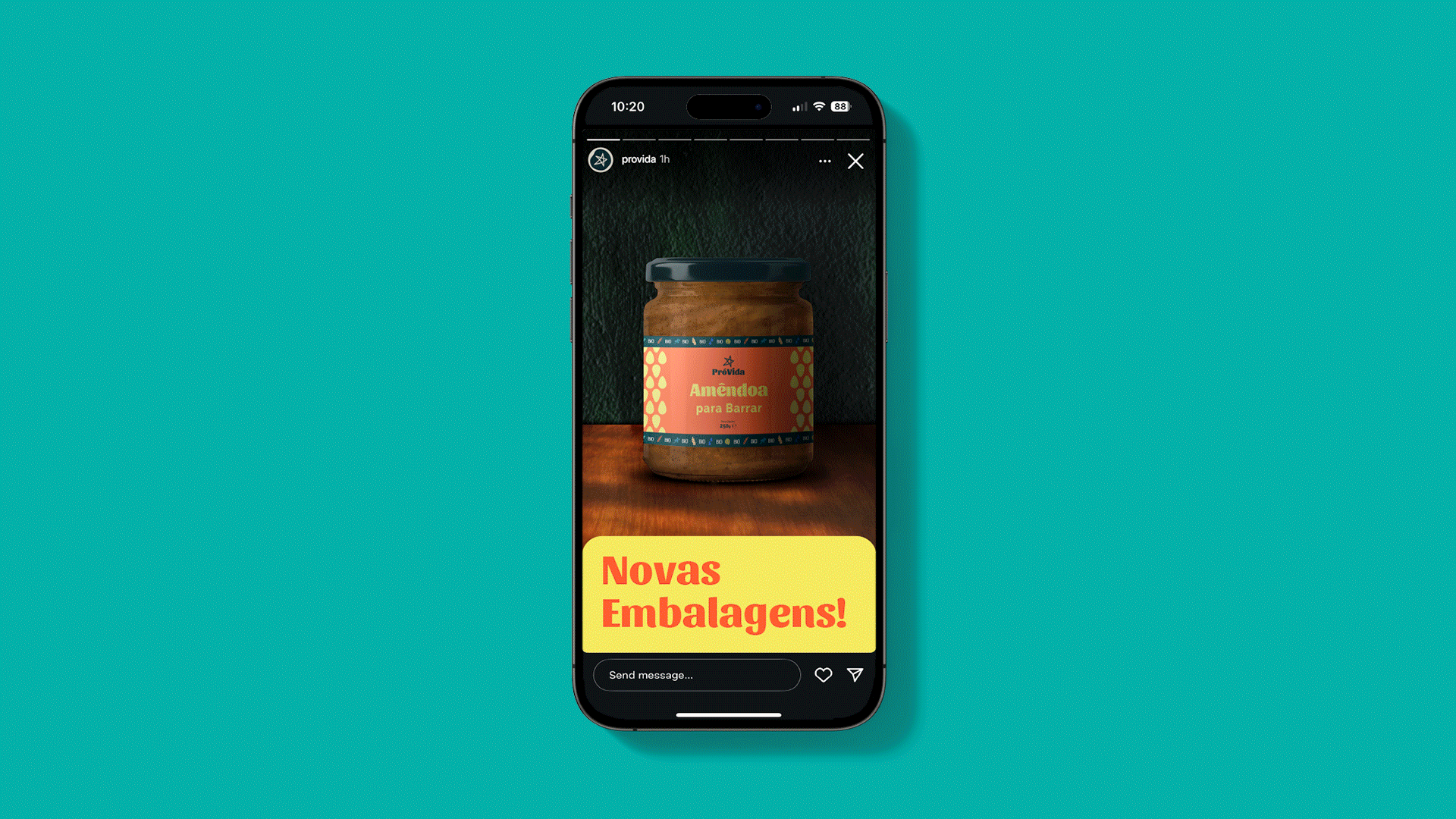
Product Stories: Promoting specific products, offering discounts, and unveiling new products or collections.
Visual Identity: A hero identity inspired by the natural ecosystem elements, highlights PróVida’s commitment to healthy, sustainable products. The day-to-day key identity emphasizes the name with custom typography and a star symbol of excellence.
Visual Language: Warm colors, simple illustrations, friendly type, and natural photography capture both ecosystem elements and daily life - from products and ingredients to workers and producers and everything involved - creating an approachable, authentic look.
Packaging: Simple, Bold & Vibrant – Natural colors highlight the organic product inside. Eco-Friendly Materials include reusable glass, compostable cellulose, recycled paper, and water-based inks, ensuring sustainability and trust.
Additionally, social media strategies were designed to engage younger audiences and amplify the brand’s voice in healthier nutrition sharing brand stories, recipes, product updates and sustainability, amplifying brand visibility, ensuring PróVida’s values and offerings are communicated effectively across channels:
Brand Stories: Highlighting heritage, values, mission, and vision.
Article Stories: Featuring content such as partnerships, ingredient sourcing, production processes, day-to-day activities, and recipes.
Product Stories: Promoting specific products, offering discounts, and unveiling new products or collections.
Blending tradition with modernity.
⮑ Solution


A new ecosystem for the brand;
a new voice in the market.
A new ecosystem for the brand;
a new voice in the market.
A creative strategy was developed, centering on the brand’s mission to become a leading voice for healthier nutrition in Portugal.
The rebrand aimed to create a holistic brand ecosystem, incorporating agricultural and environmental elements that embody the natural and sustainable ethos of PróVida.
Key steps included:
Establishing a brand mission and manifesto, building an authentic voice for the brand.
Defining a visual identity system aligned with the brand’s values, that builds on the existing assets.
Leveraging digital platforms like social media for enhanced engagement, specially with an younger audience.
Define a new packaging system for the brand based on sustainable materials such as glass and compostable packaging.
⮑ Approach


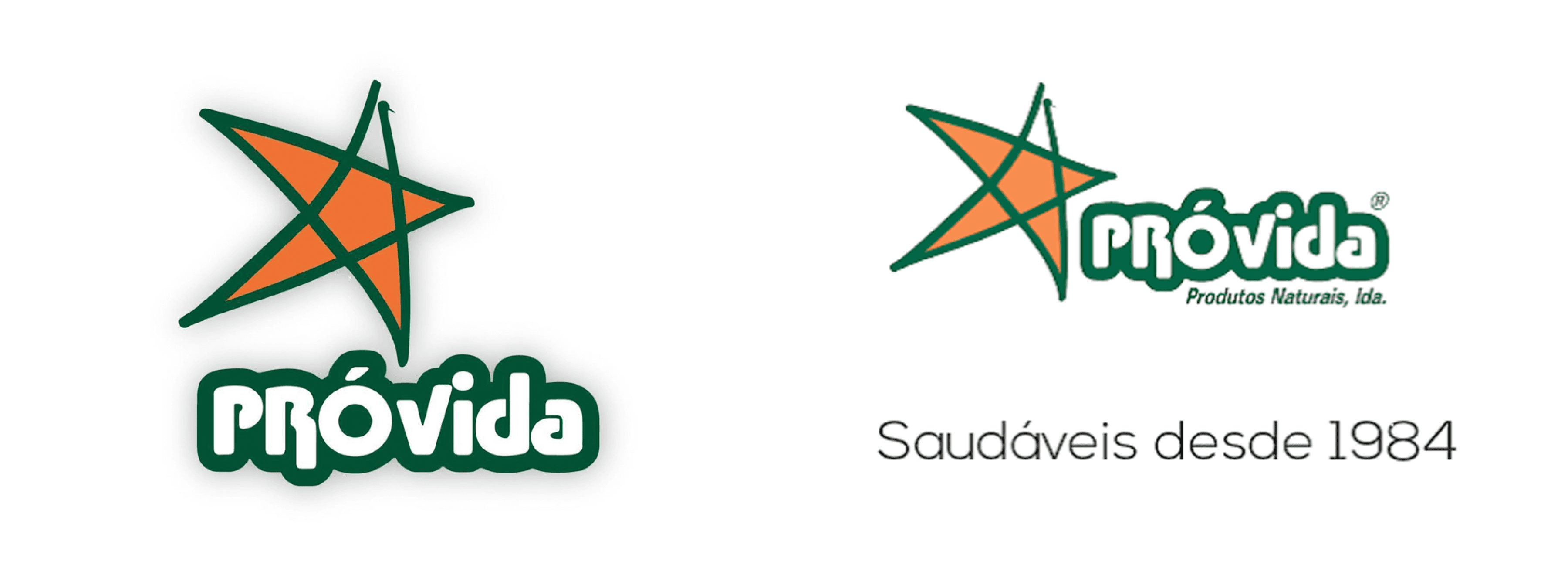
Despite its decades-long presence in the market, ProVida has never undergone a comprehensive rebrand.
Its existing design elements and branding no longer reflect its full potential or resonate strongly with evolving consumer expectations and definitely were not up to date in a digital world.
The challenge was to modernize the brand while staying true to its heritage and creating an identity and language that highlights its commitment to healthier food and sustainable practices while making the brand relevant in the market, industry and society as an active voice for healthier food.
Revolutionize a brand
Revolutionize a brand
⮑ Challenge


⮑ Current Brand Assets
From the food on your table to the values you live by.
From the food on your table to the values you live by.
From the food on your table to the values you live by.
This rebrand started as a self-initiated endeavour as I recognised a great opportunity to bring a new life to PróVida.
As a family business established in 1984, it has long been a staple in Portuguese households for its health-focused and sustainable products.
Inspired by personal experience and a deep appreciation for the brand, this self-initiated rebranding project aims to celebrate PróVida’s 40th anniversary with a fresh identity, positioning it as a key player in the natural, vegetarian and vegan food industry.
The new branding emphasises ProVida’s core values: Family, Health, and Sustainability.
⮑ Overview

⮑ PróVida
CLIENT
⮑ Rebrand
PROJECT
⮑ Retail Health Food
SECTOR
⮑ PróVida
CLIENT
⮑ Rebrand
PROJECT
⮑ Retail Health Food
SECTOR